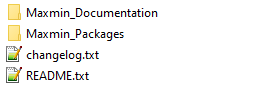
Documentation
Welcome to Maxmin Documentation! Here all guides how to use the Maxmin Theme.
Welcome to Maxmin Documentation! Here all guides how to use the Maxmin Theme.
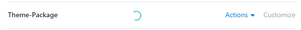
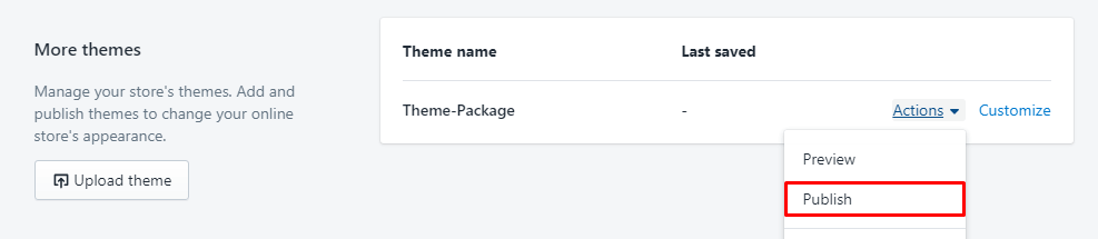
The installing is easy and quick. Shopify support auto installation with a single click. Only need select theme package and wait a min, then publish and customize the Theme.
There are a lot of Shopify Apps released. So, we can not install all of they and test to make they work right in our theme. So, we will NOT warrant our theme will work right 100% in all Shopify Apps!
Here is the listing Apps that used or tested in the theme:
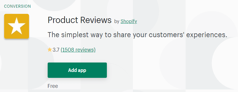
Link to install Product Review App
This is free App and developed by Shopify, so we recommend this app to create the review function. The simplest way to share your customers' experiences.
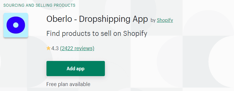
Link to install Orbelo App
The App has Free plan. Find products to sell on Shopify. This is awesome App, it helps import and control products from AliExpress site. It's the best solution to create the Dropshipping site.
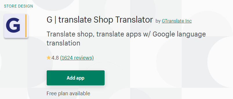
Link to install G | translate Shop Translator
The App has Free plan. Translate shop, translate apps w/ Google language translation.
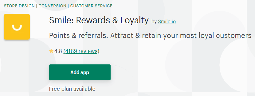
Link to install Smile: Rewards & Loyalty
The App has Free plan. Points & referrals. Attract & retain your most loyal customers.
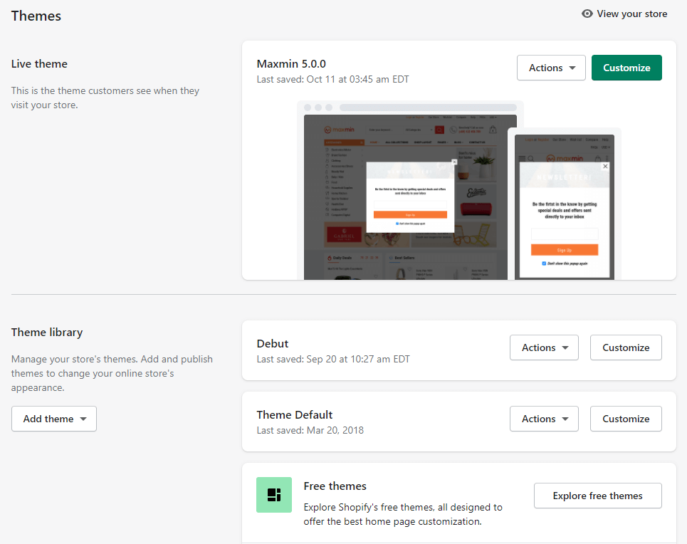
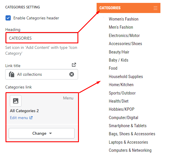
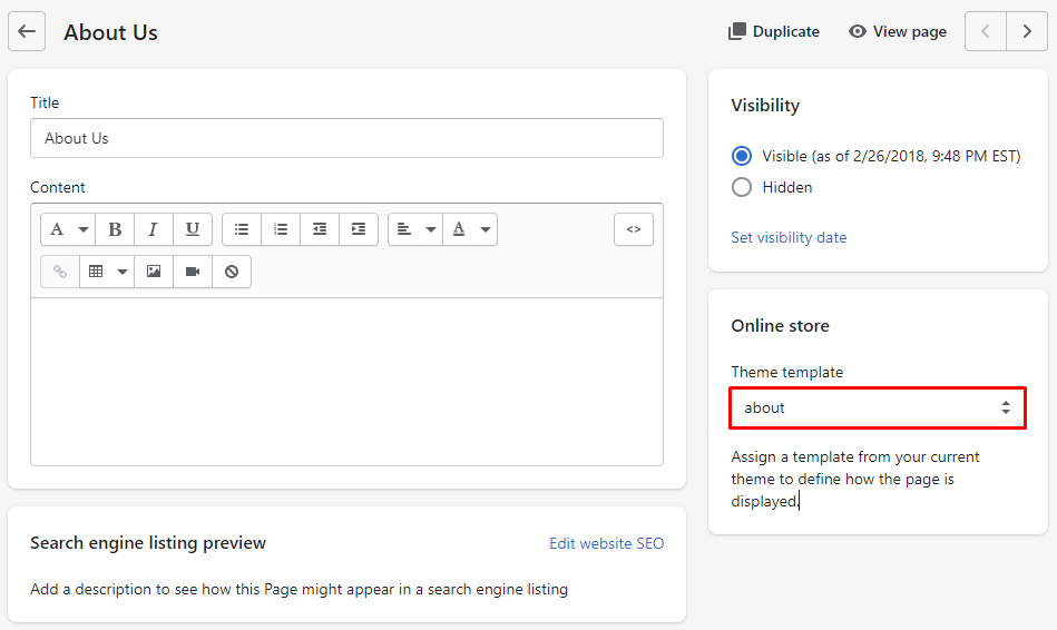
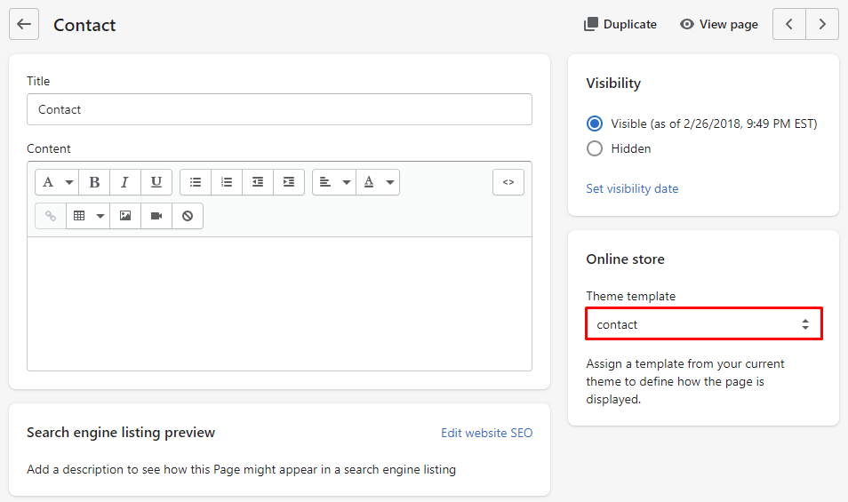
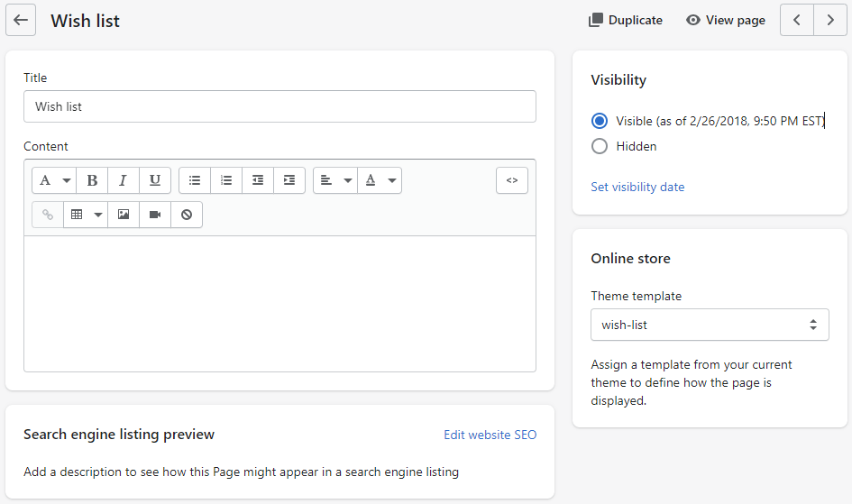
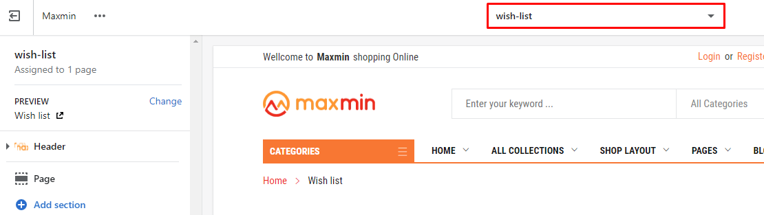
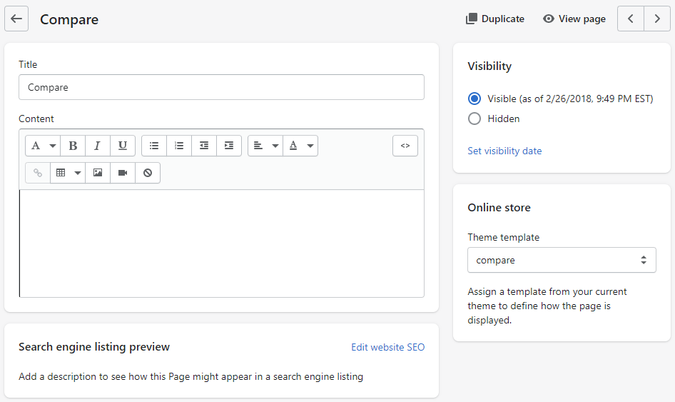
From Your Shopify AdminOnline StoreThemes . Here is area that you can control the theme style.
Theme page have 2 areas:
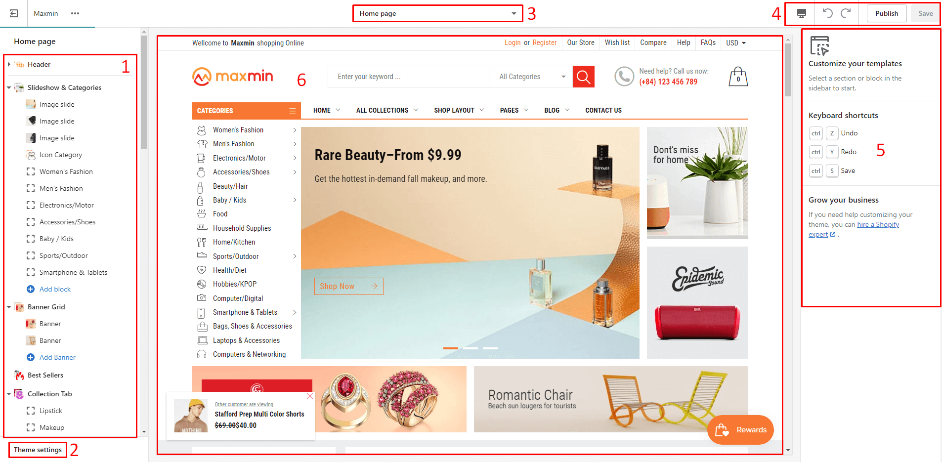
Click to Customize button of the Publish or Draft theme to edit. The Customize page appear look like:
There are 6 group area:
The Theme settings is where you’ll be able to make global changes to your store or sections, including text and background color changes, typography selection, and more. All settings will appear in the Right sidebar after you click to Theme settings text at the bottom of Left Sidebar.
CustomizeTheme Settings (2)Right Panel (5)These group settings of the Theme Settings inclide (click to title to read):
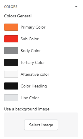
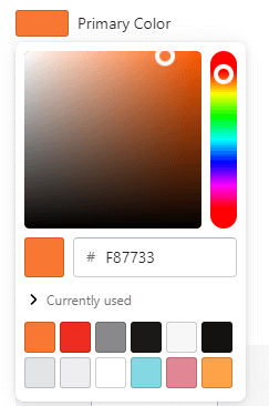
The group include a lot of Color options use to change the color style of the theme. Each color option have the description which area it will change to. Color option support color picker will easily to pick the idea color.
Group Colors settings include color options:
Easy to change the color by click to the Color and pick the value that you want.
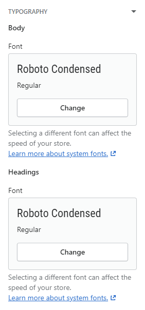
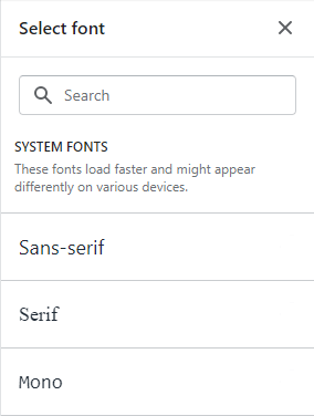
Pick the Font that you want use.
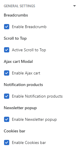
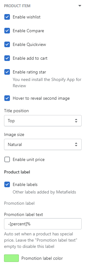
Listing all options to enable/disable the Theme functions.
Listing all options to control elements related to Product elements.
options include:
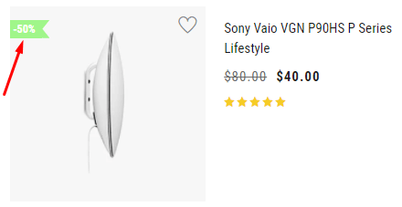
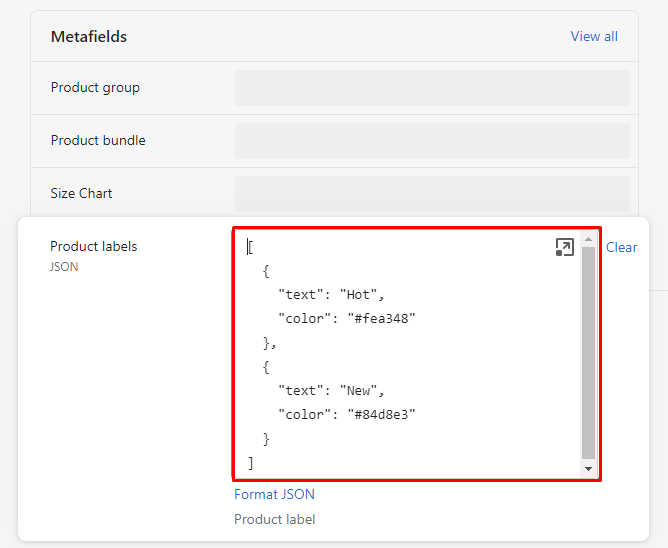
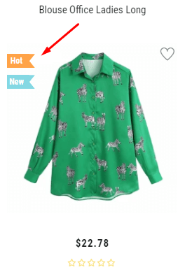
-[percent]% and changing the label color.
                                                    [

                                                        {

                                                                "text": "Hot",

                                                                "color": "#fea348"

                                                                },

                                                                {

                                                                        "text": "New",

                                                                        "color": "#84d8e3"

                                                                }
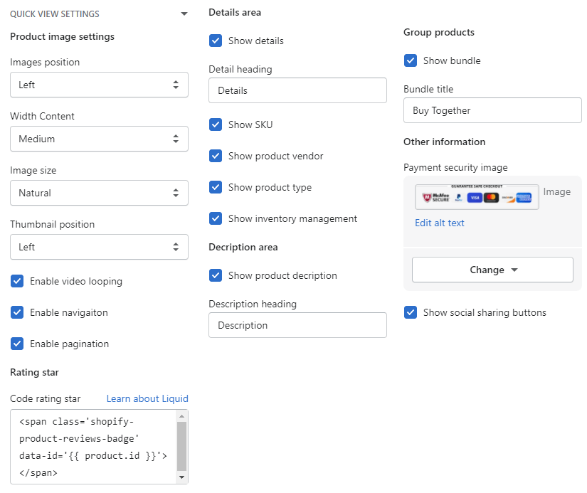
]Listing all options to control the Quickview popup.
options include:
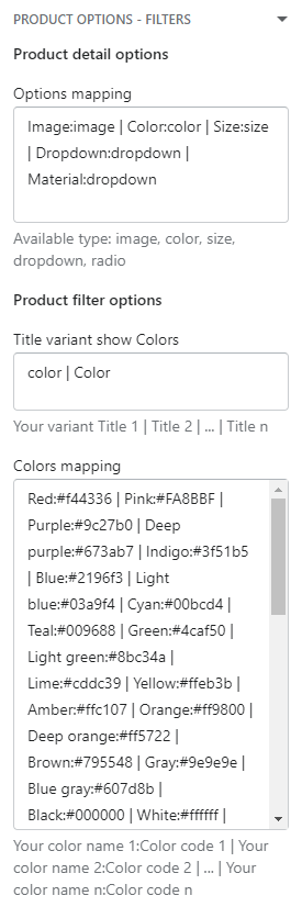
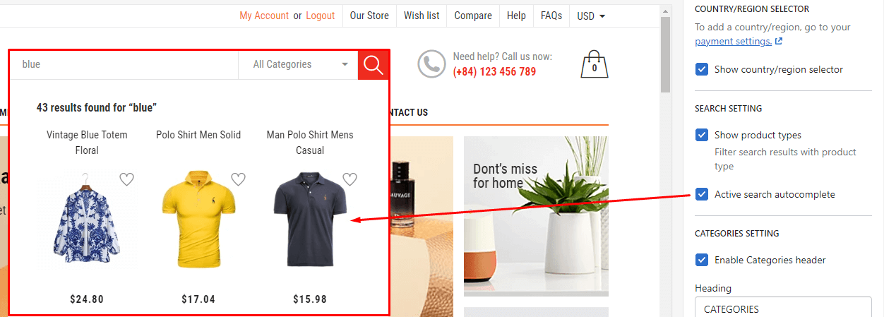
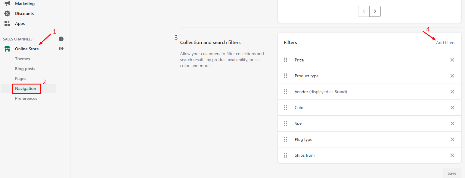
Listing all options to control the Filter.
Option is the setting for the type of product option in Detail page.
There are 5 type:
Syntax is: product_option_name : type | other_product_option_name : type
Example:
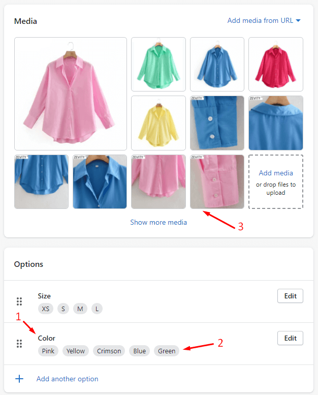
Option to set the color text in your language.
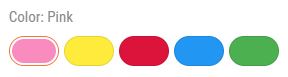
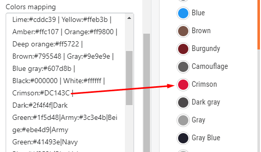
Option is the setting for the custom color (hex color) of variant in Filter (Collection Page)).
Syntax is: color_name : color_hex_code | color_name : color_hex_code
Example: you have custom color called Crimson and want set the hex color #DC143C for it. You need input Crimson:#DC143C
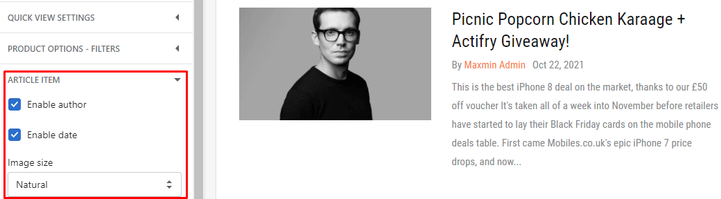
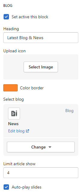
Listing all options to control the Article item.
Listing all options to control the Account page.
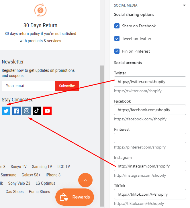
Listing all options to control the Social icons.
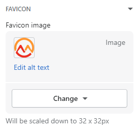
Listing option to upload the Favicon.
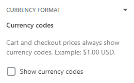
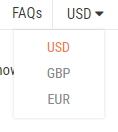
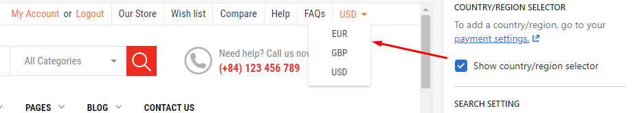
You also can control the Currency code in here such as USD, EUR,...
Maxmin theme support to show multi currencty, to have it need follow these steps:
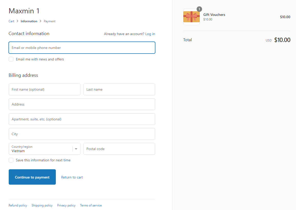
This settings use to Customize the Checkout page. This option automatically render by Shopify. Because the Checkout page was controlled by Shopify. They only allow the field to custom the page such as upload Logo, change font, color,... these fields can not change.
There are 6 actions function:
There are 8 actions function:
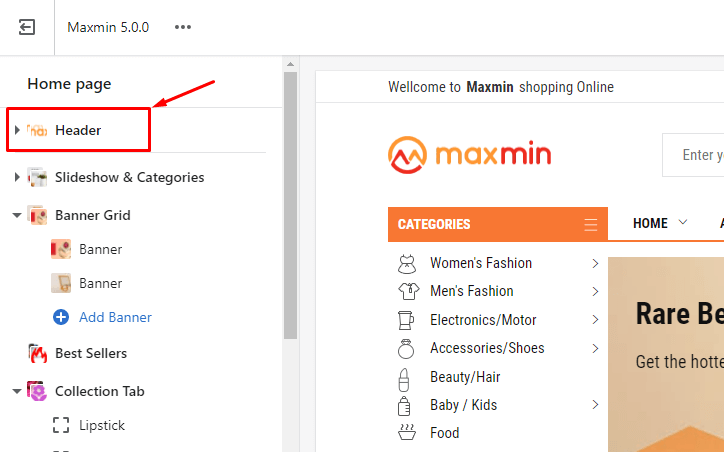
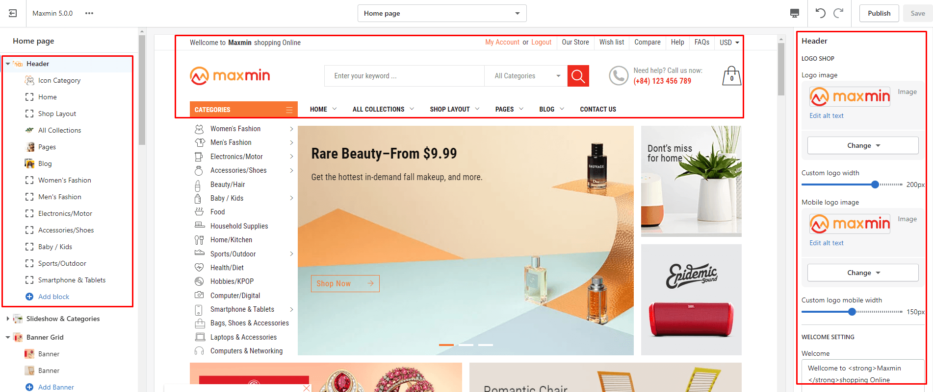
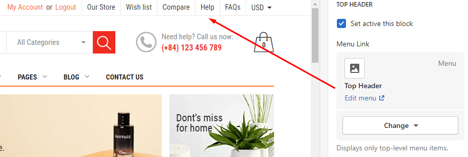
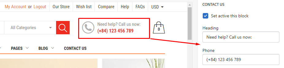
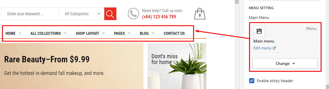
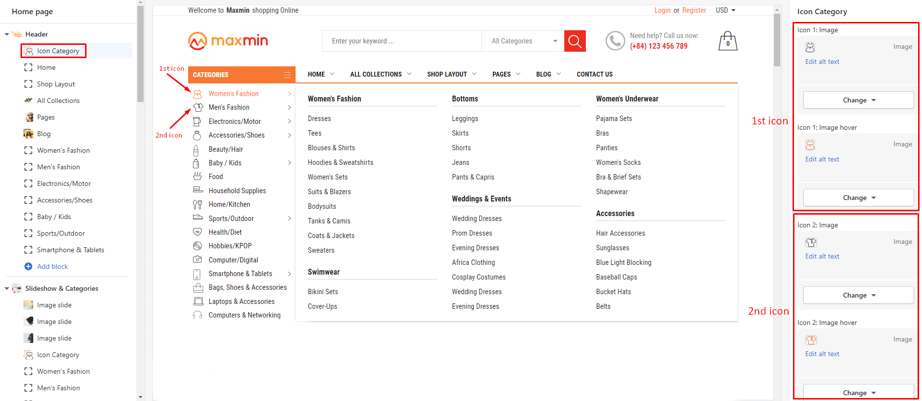
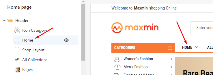
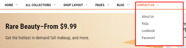
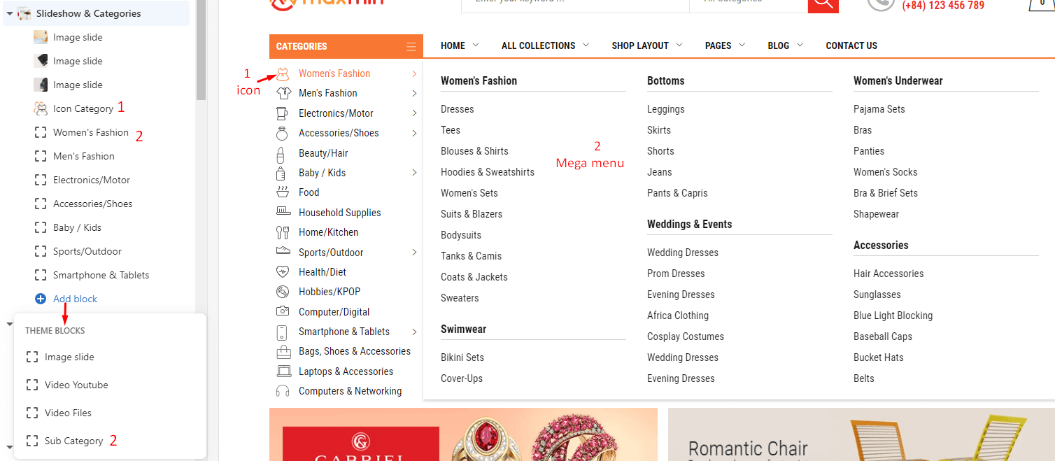
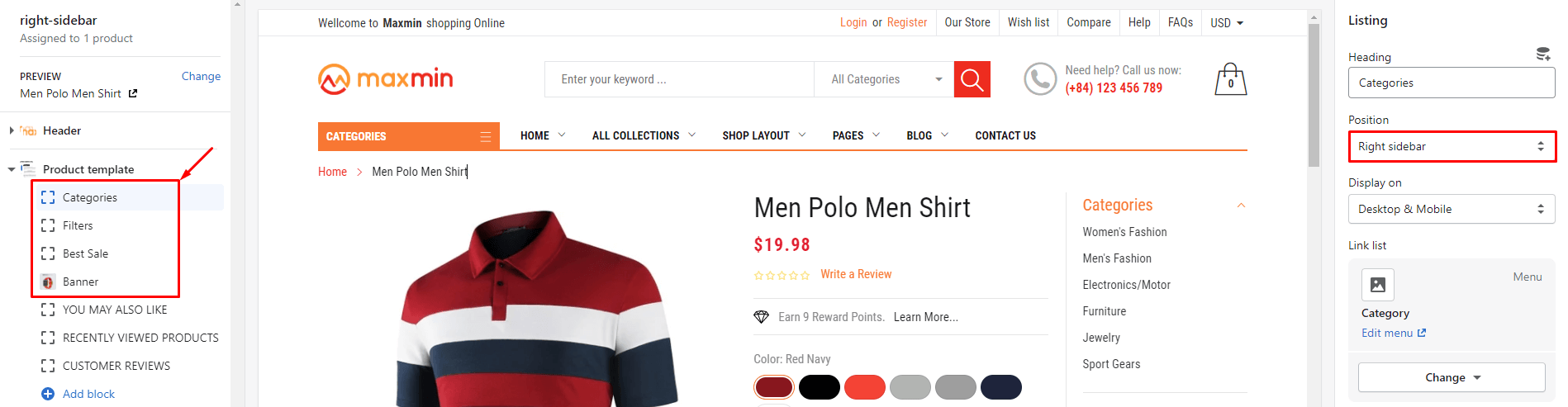
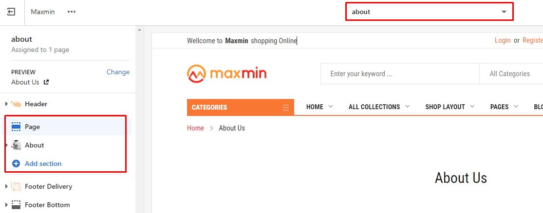
From Sections listing of Customize (Theme Editor)Header section
All options of appear in the Right sidebar
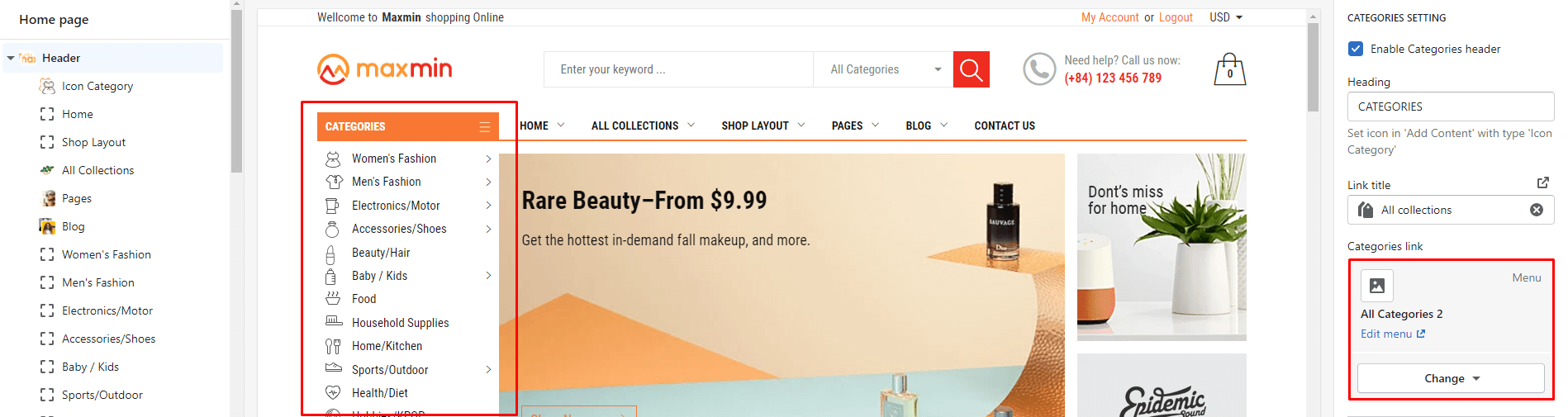
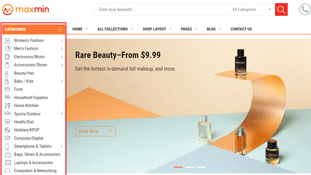
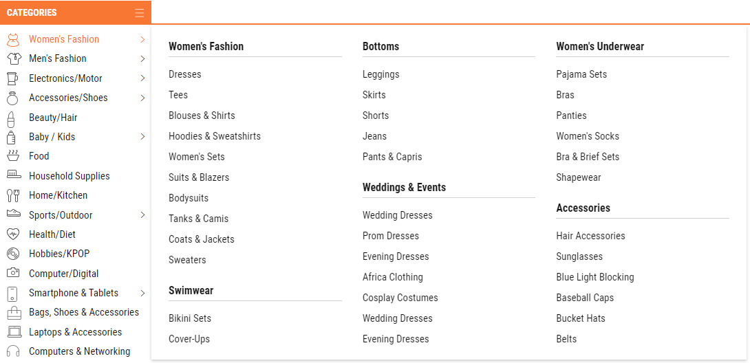
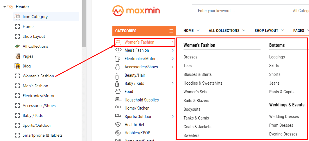
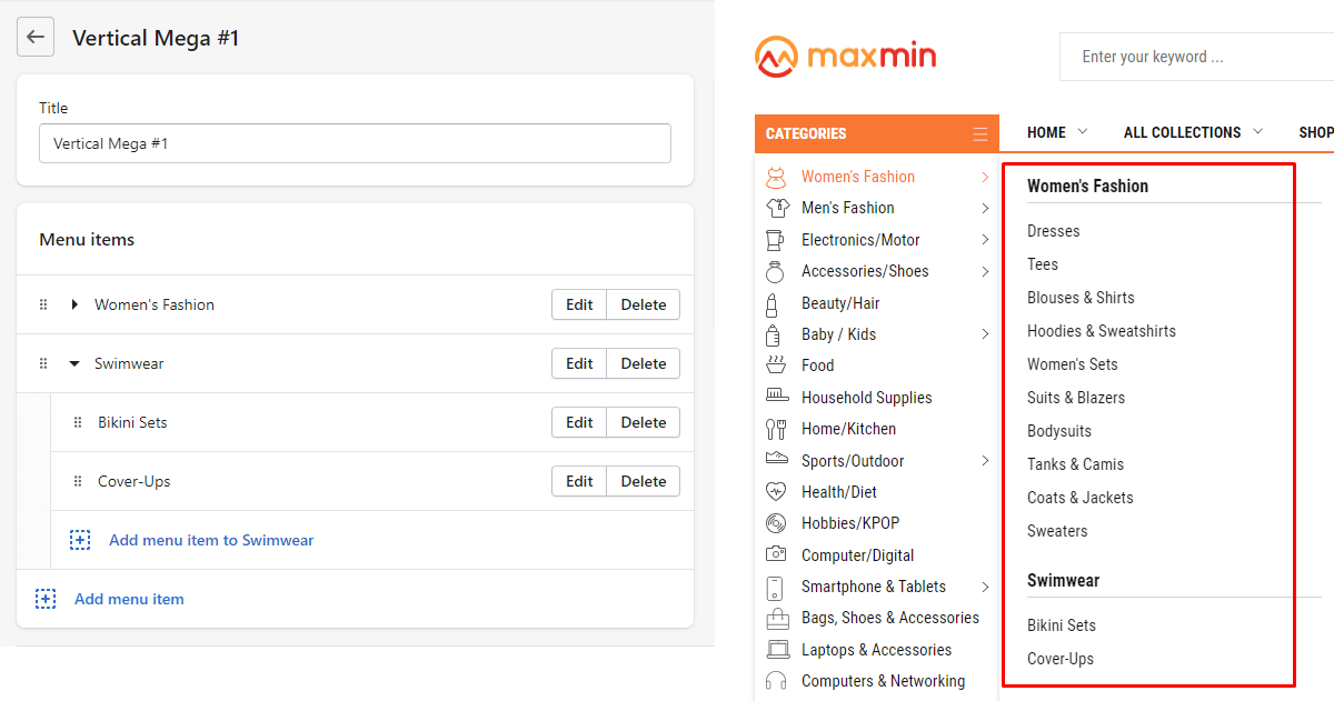
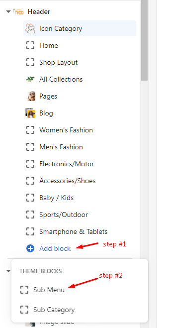
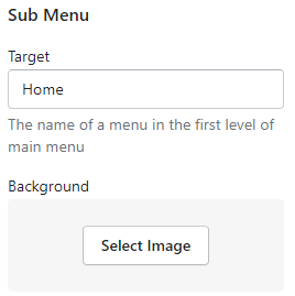
Click here to read how to setup Left Categories: menu, icons and Mega menu
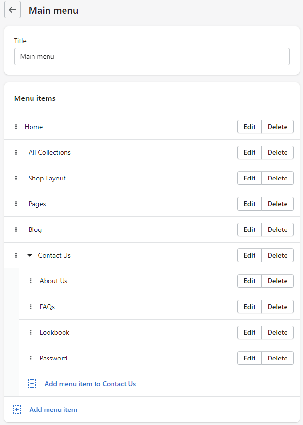
Click here to read how to setup Main menu Categories: menu and Mega menu
The Left Categories only includes in Home package #1 & #2.
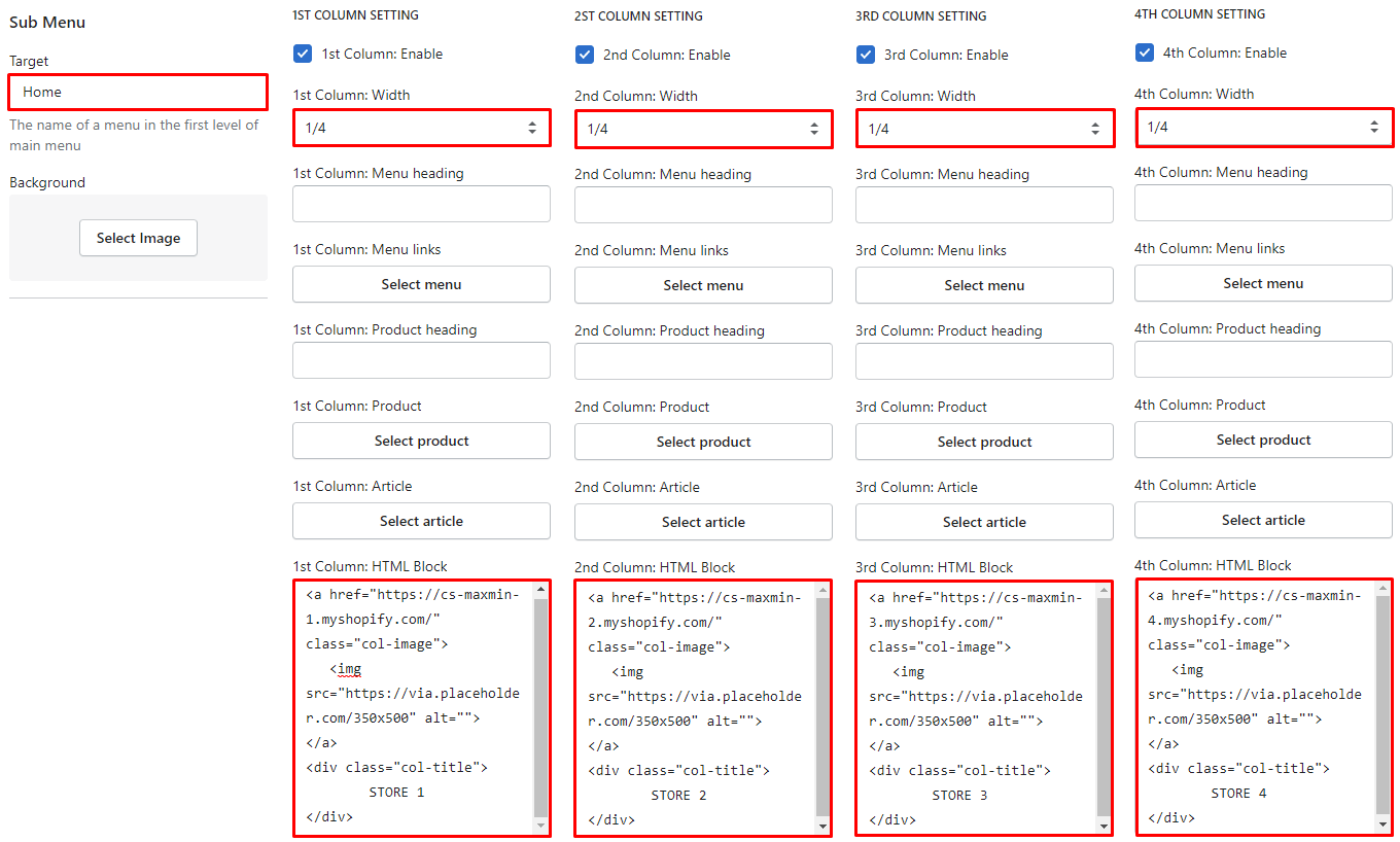
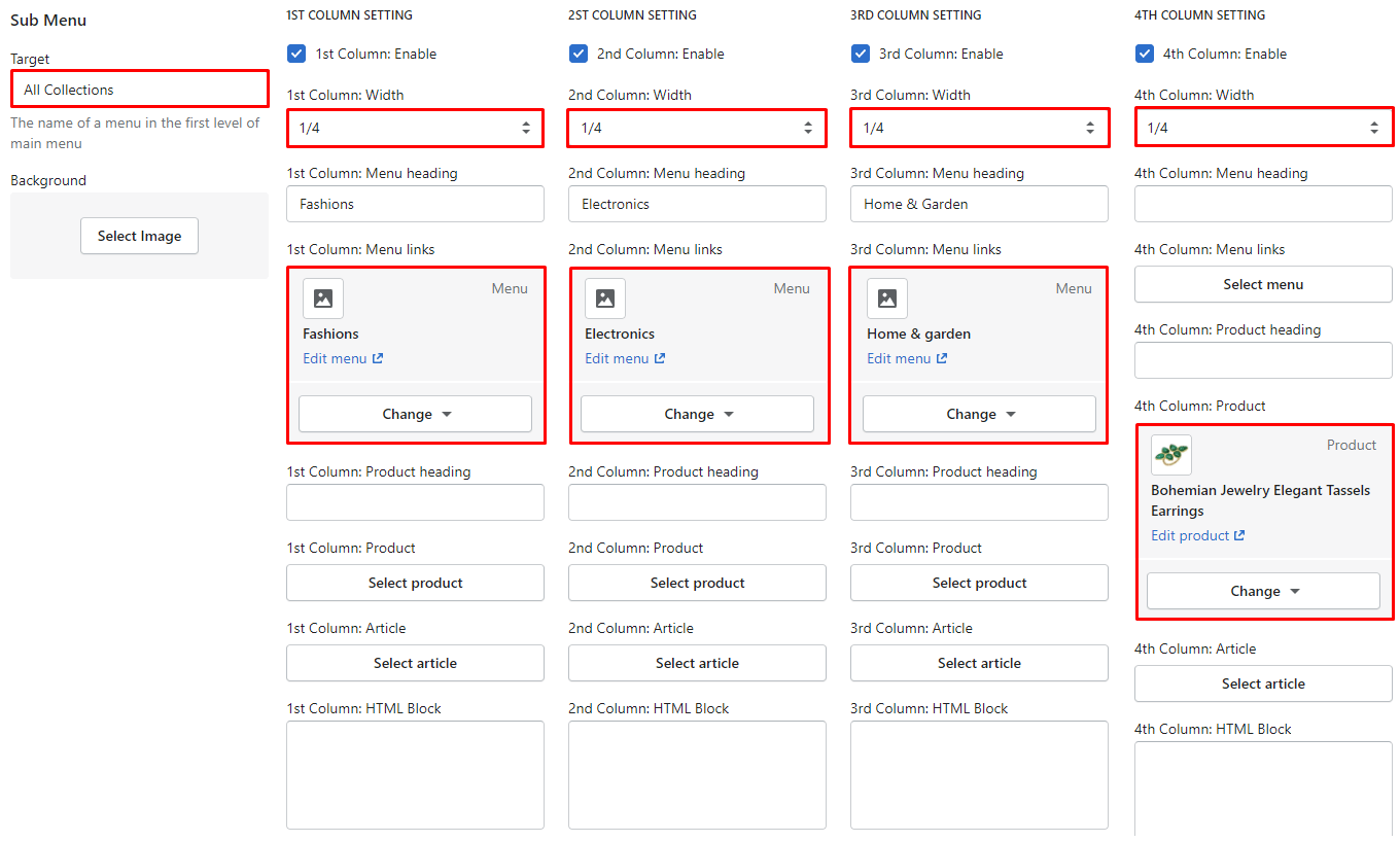
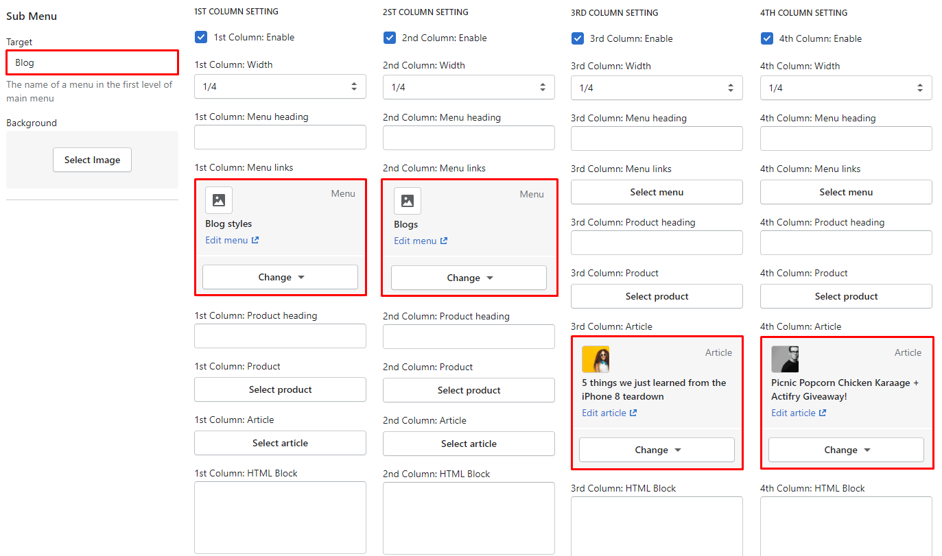
Here is guide how to show the Left Categories list, setup icons and Mega menu dropdown appear in the Header of inner pages (not Home page).
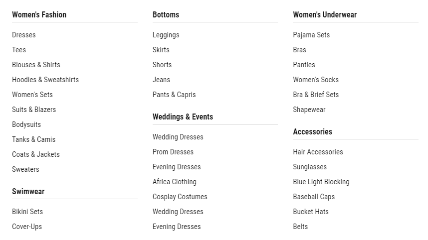
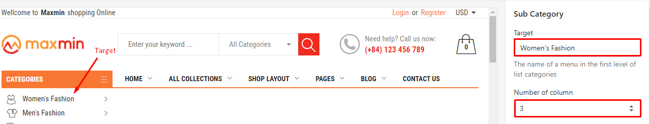
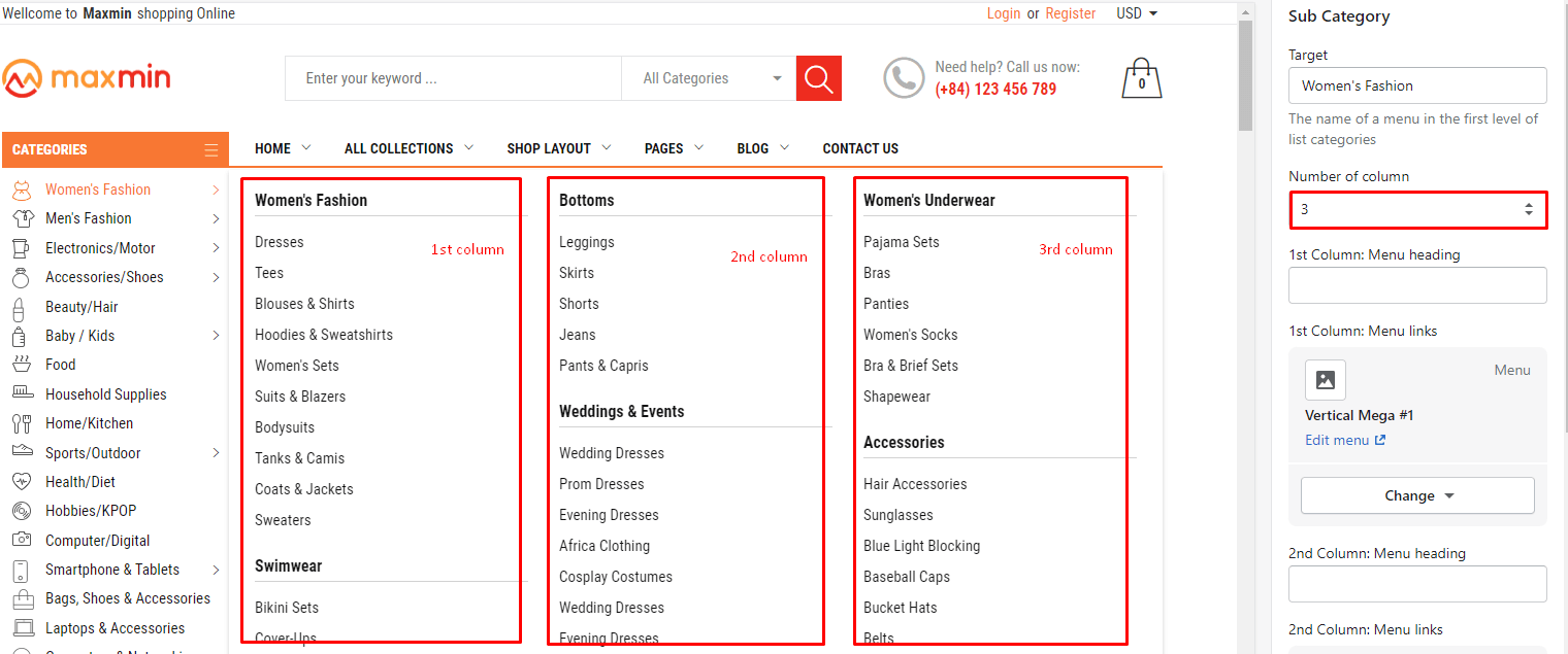
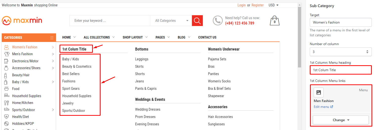
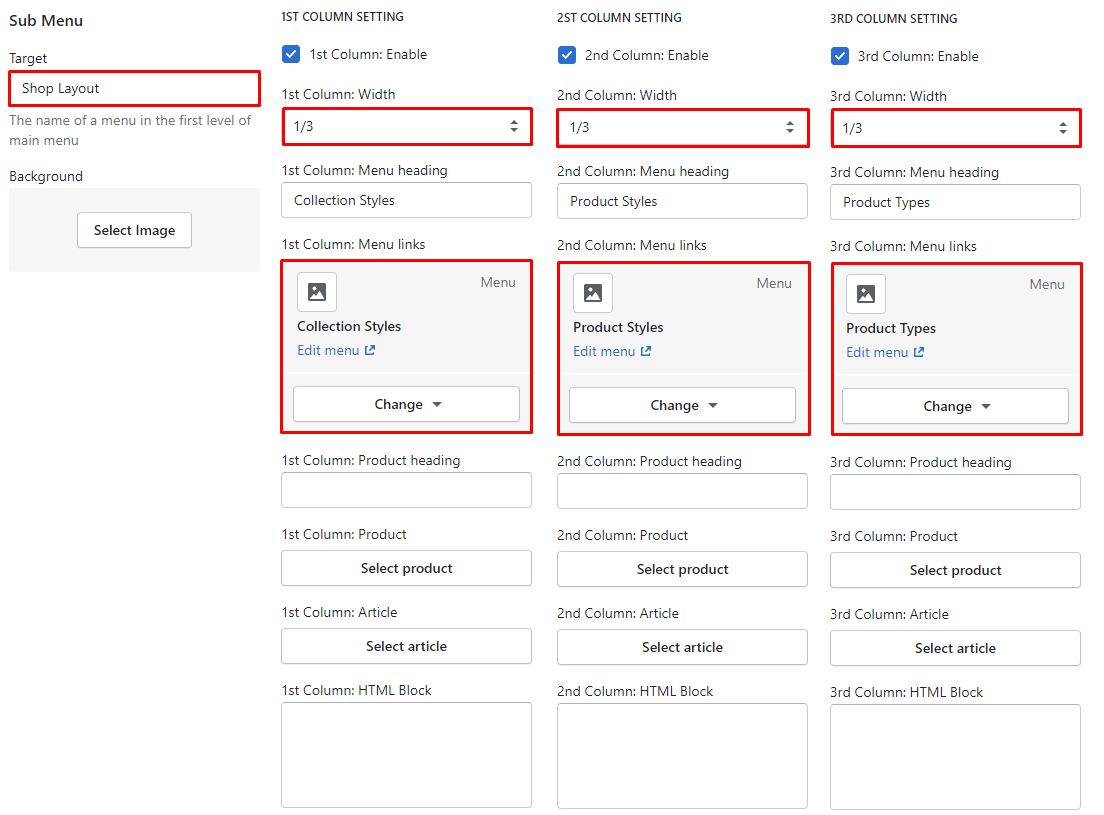
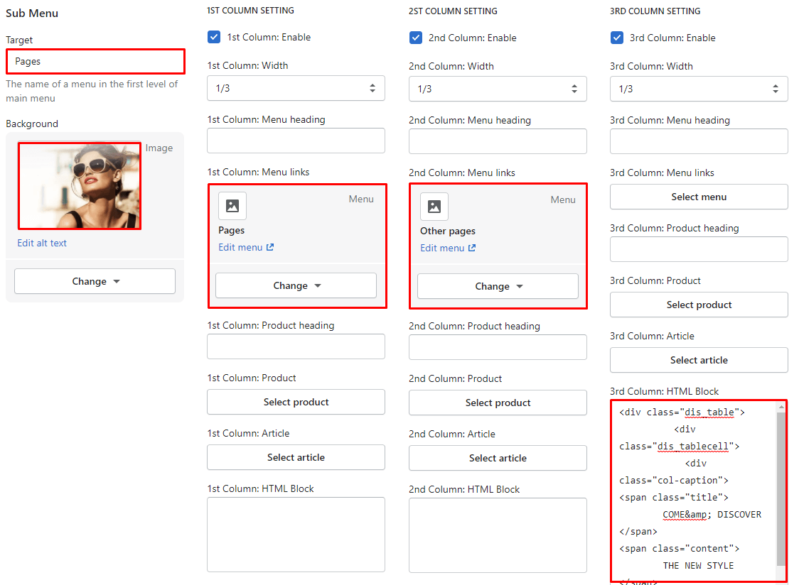
Maxmin 5.0.0 support all Categories Menu become Mega menu dorpdown with 1-6 columns.
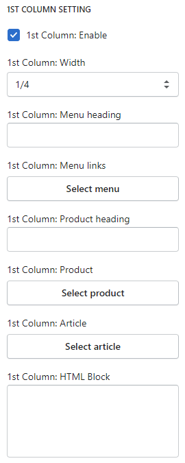
The same for 2nd, 3rd, 4th, 5th 6th column content (below settings).
Input the Column Title and the Width Grid for this column content.
Content of column include:
- Menu links
- Product heading
- Product
- Article
- HTML Block/content
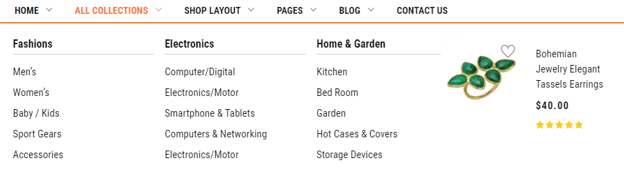
Screenshot:
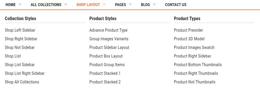
Screenshot:
Screenshot:
Screenshot:
Screenshot:
It's not Mega menu, so don't need setup Sub Menu. Only need create in the Navigation
Screenshot:
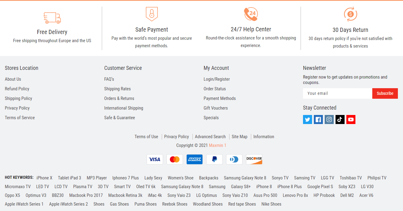
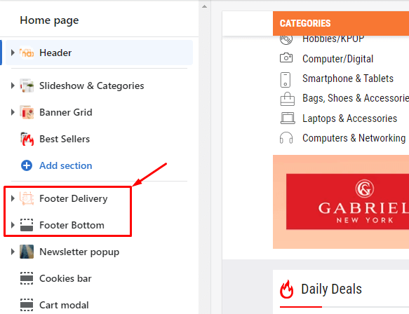
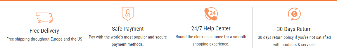
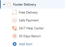
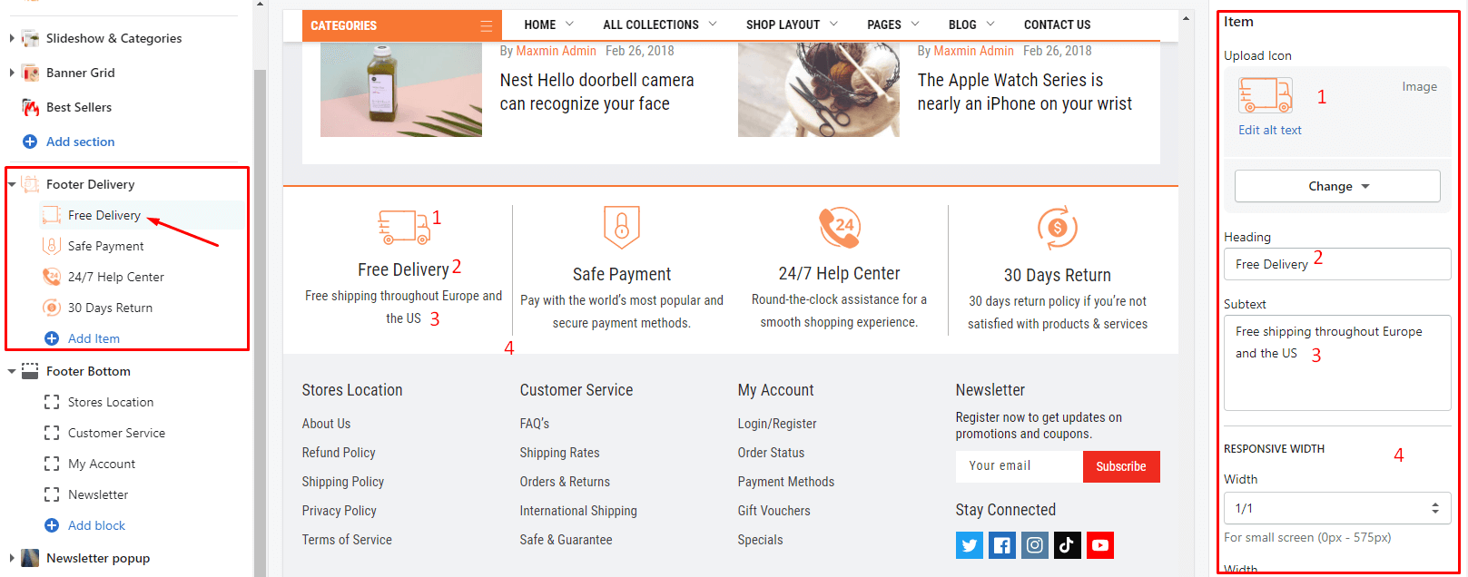
From Sections listing of Customize (Theme Editor)Footer Delivery section or Footer Bottom section
From Sections listing of Customize (Theme Editor)Footer Delivery section
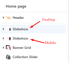
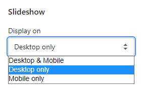
Section setting: select the Display mode (Desktop or Mobile or both).
Block Content: listing all blocks element. To add more, you can click to Add item.
Click to block element to edit. Include: upload icon, Heading text, Subtext and Responsive width.
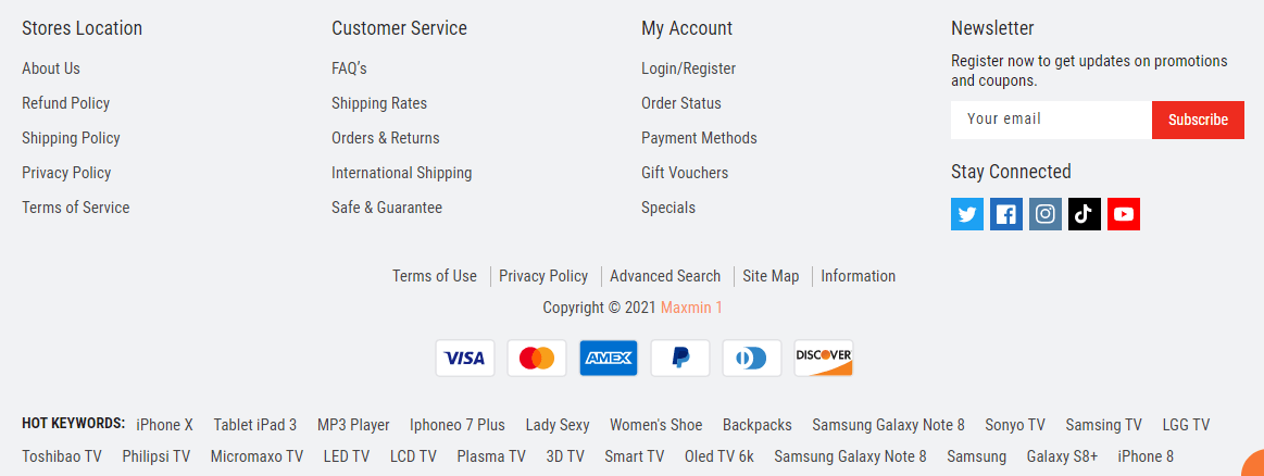
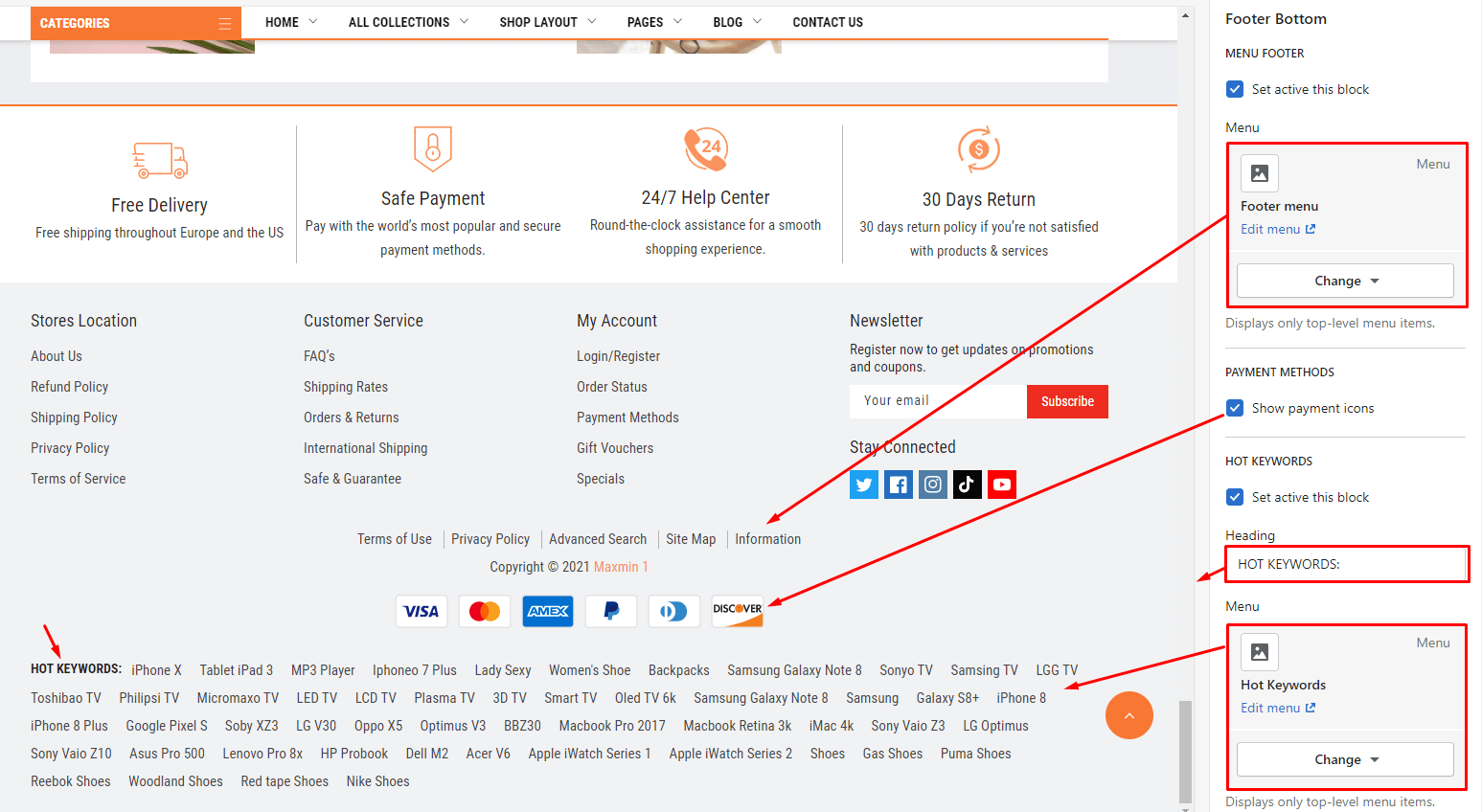
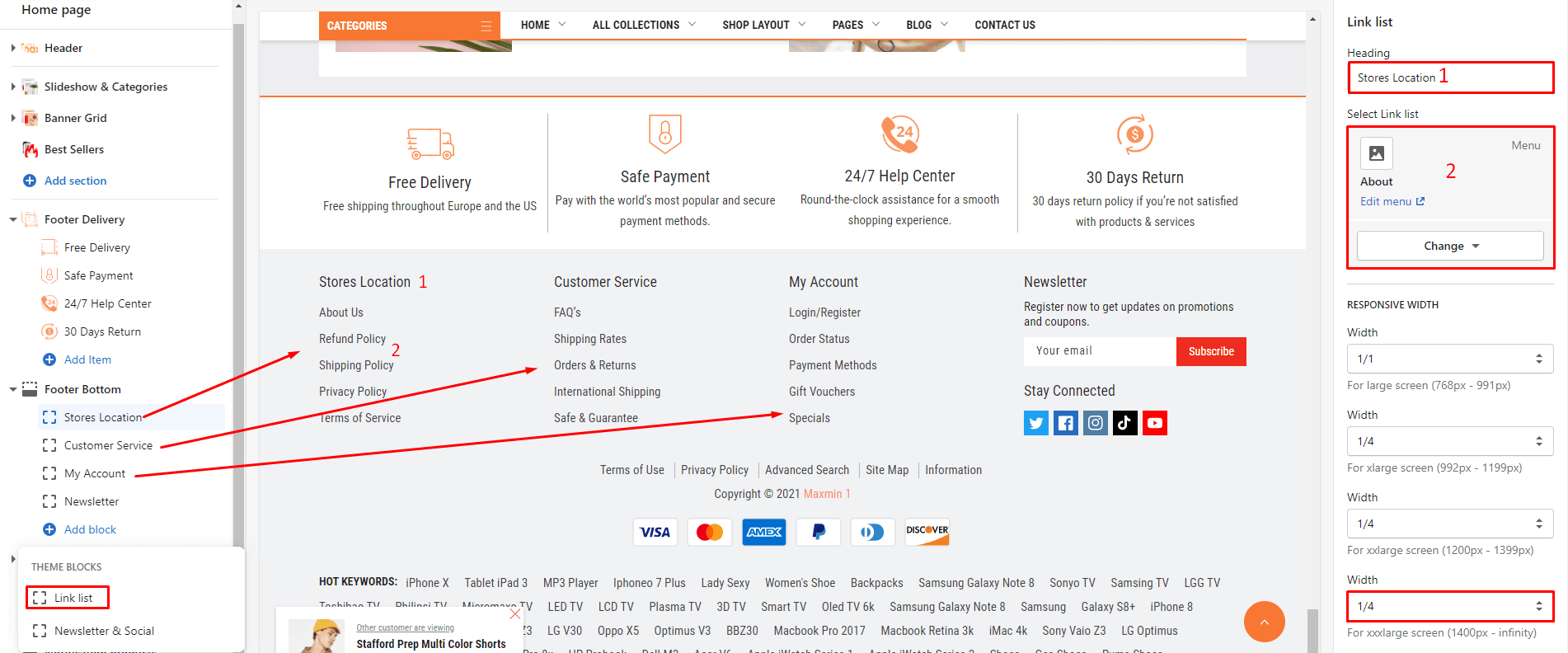
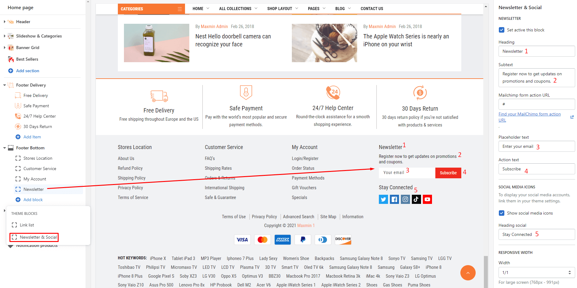
From Sections listing of Customize (Theme Editor)Footer Bottom section
Section setting:
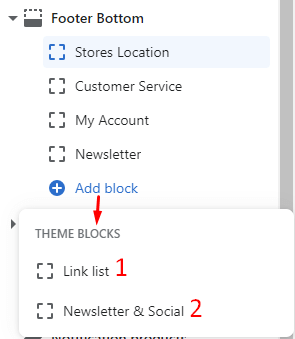
Block Content: listing all blocks element. To add more, you can click to Add block.
There are 2 block type: Link List and Newsletter & Social
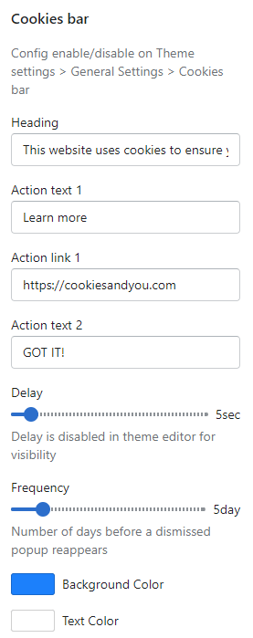
From Sections listing of Customize (Theme Editor)Cookies bar section
In Cookies Bar section, you can change the Text, Timer and Color settings.
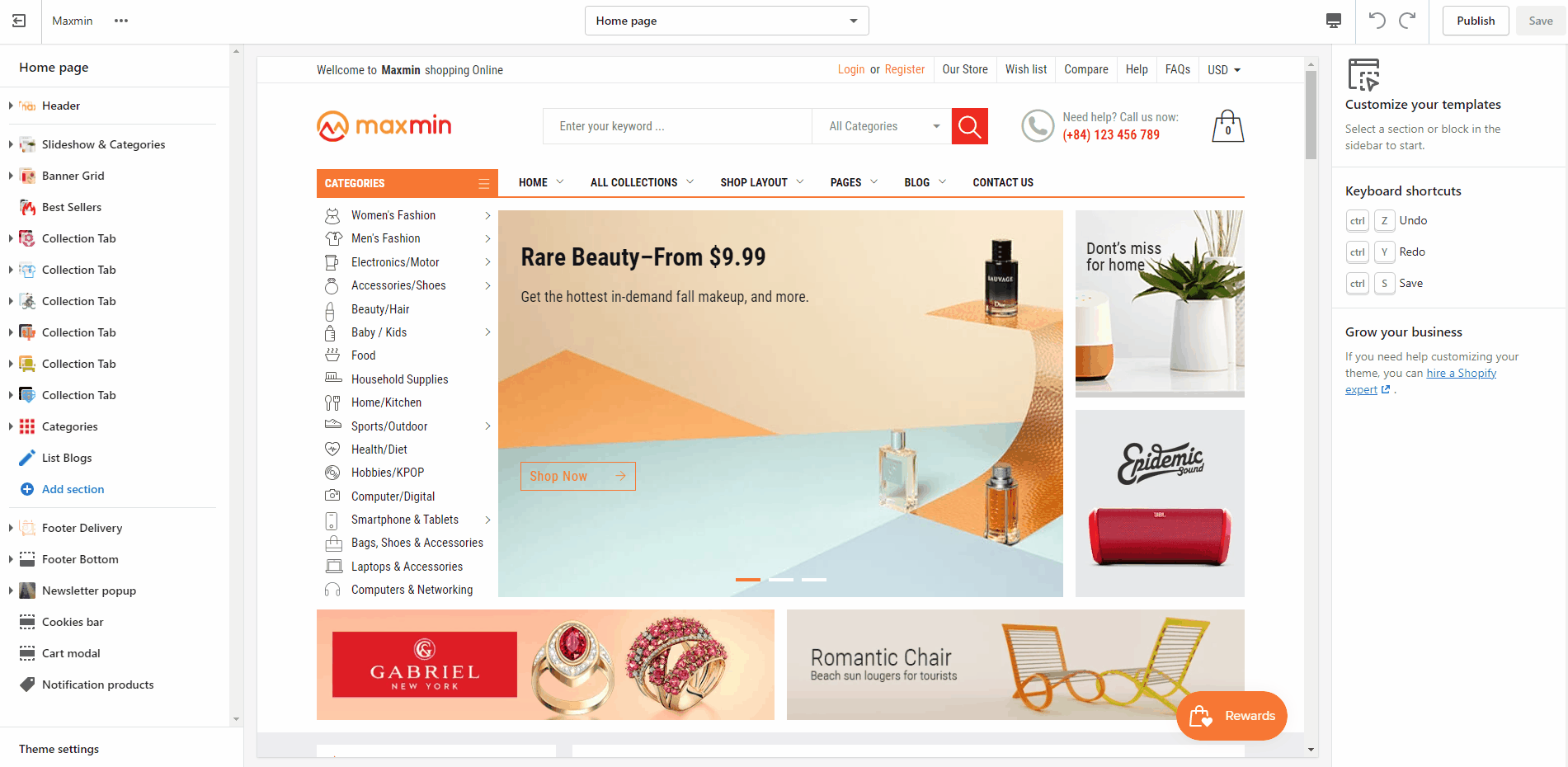
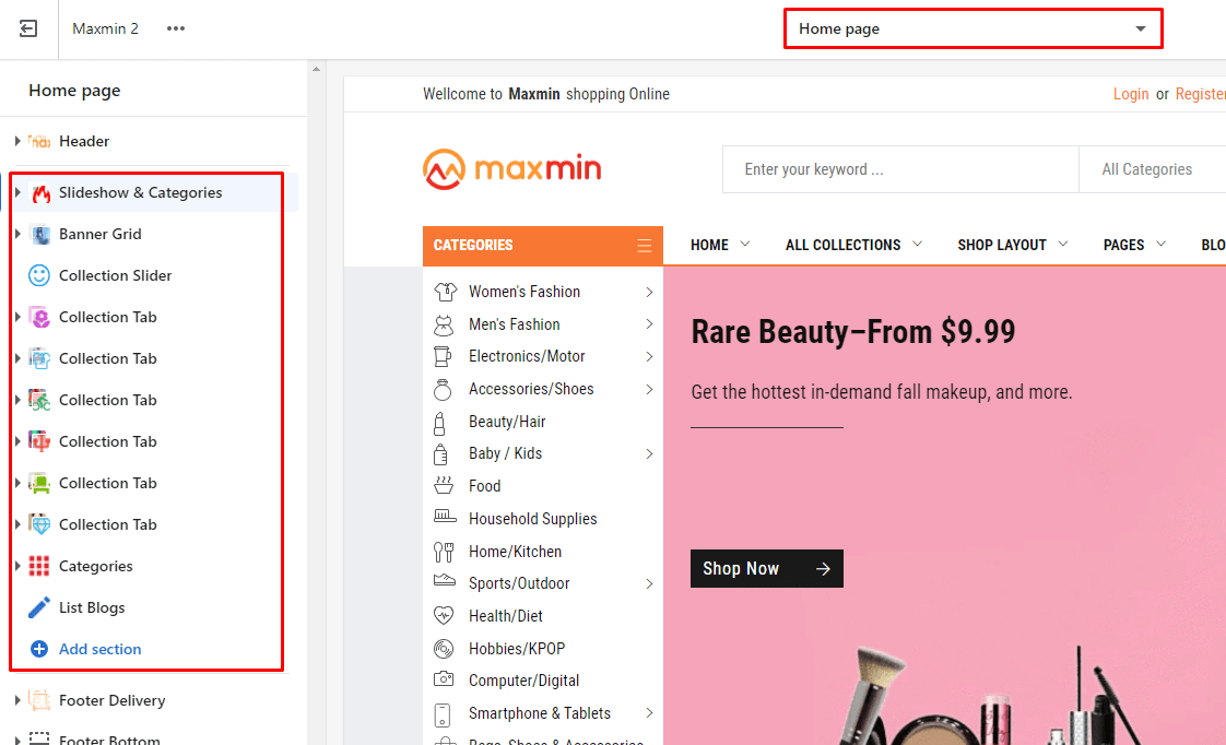
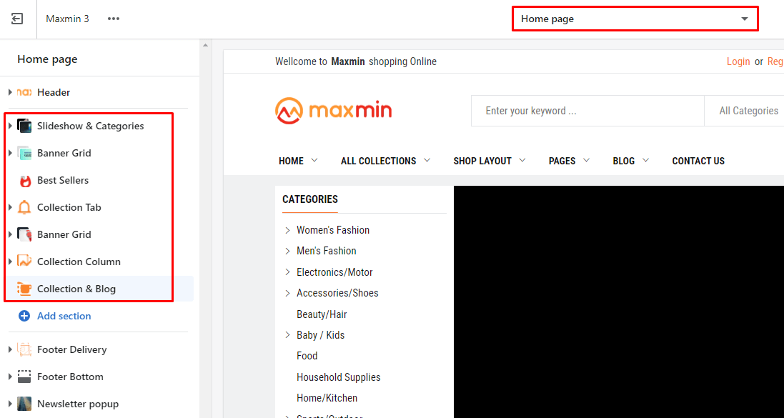
- Please make sure that the Customize view page is Home page. So that it will list all Home page sections (include in theme package) in the Left area.
- With the new Shopify Online Store 2.0 you can use these sections in the Inner pages.
- You also can click to Add section to add more sections. But you can not add/use the sections of Homepage #1 to another Homepage.
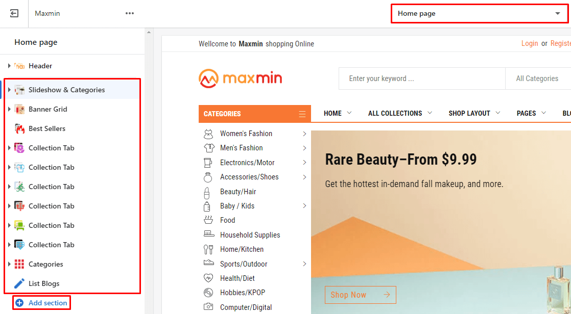
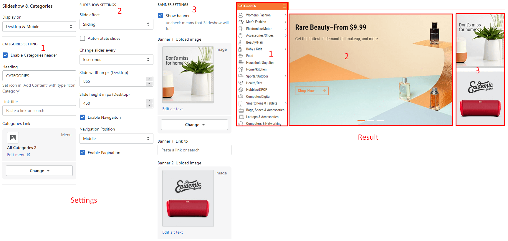
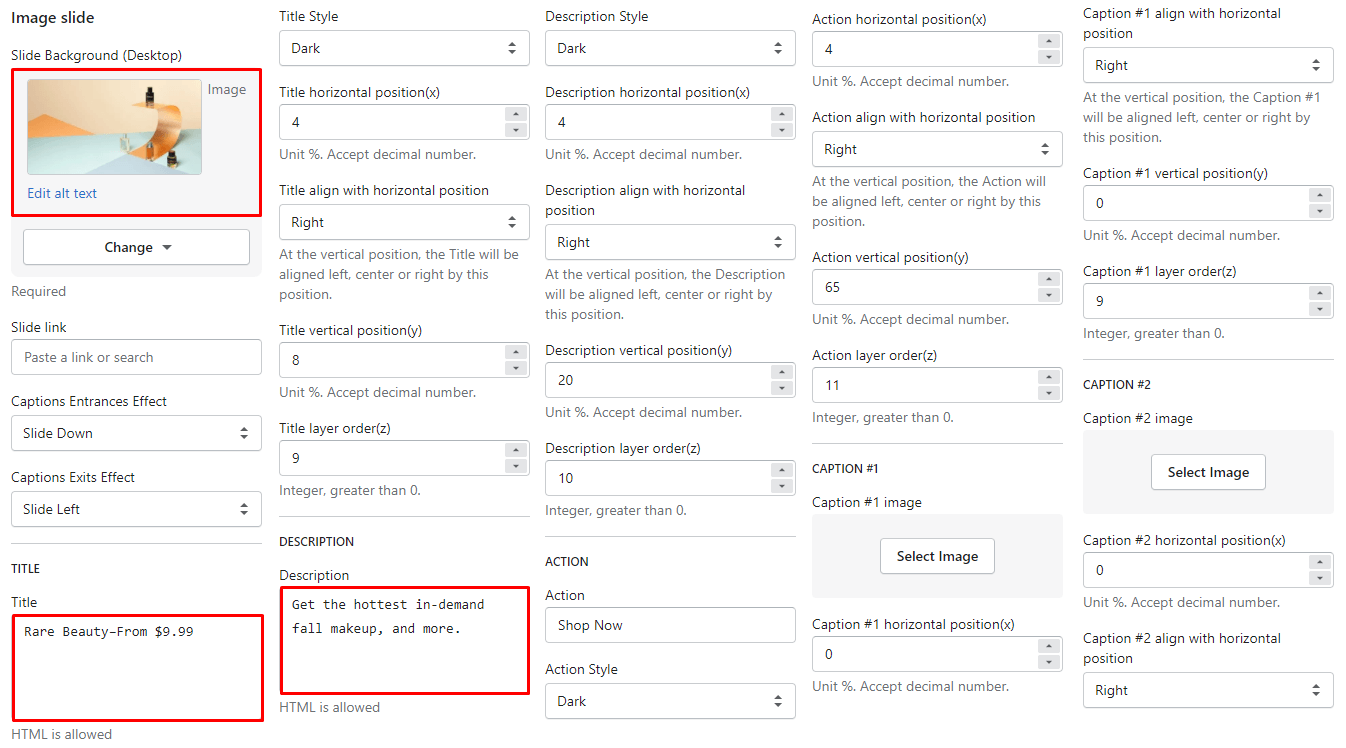
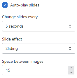
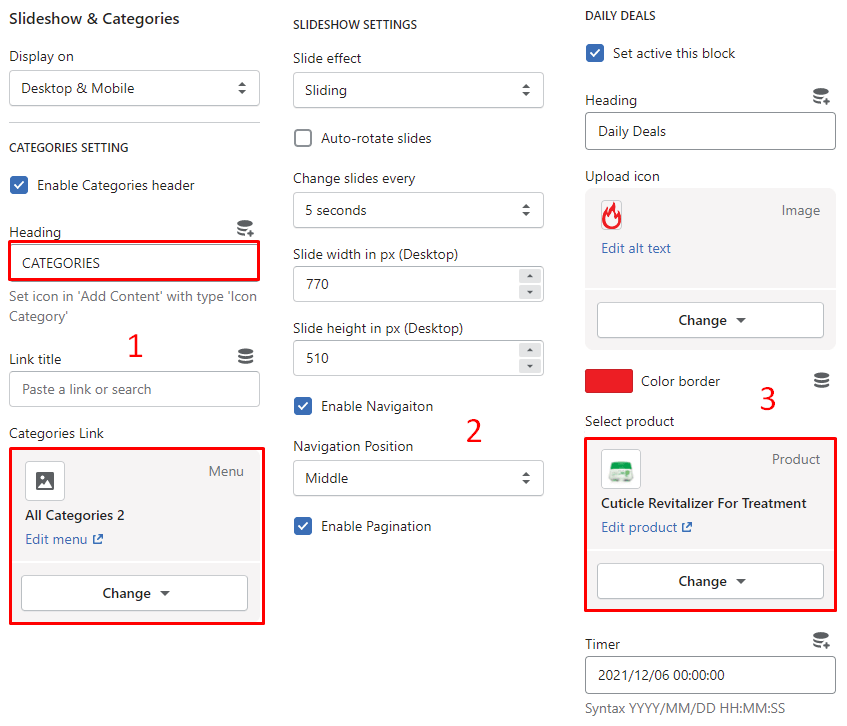
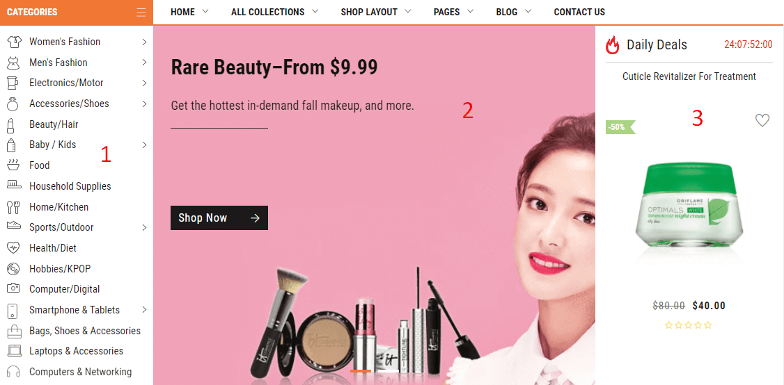
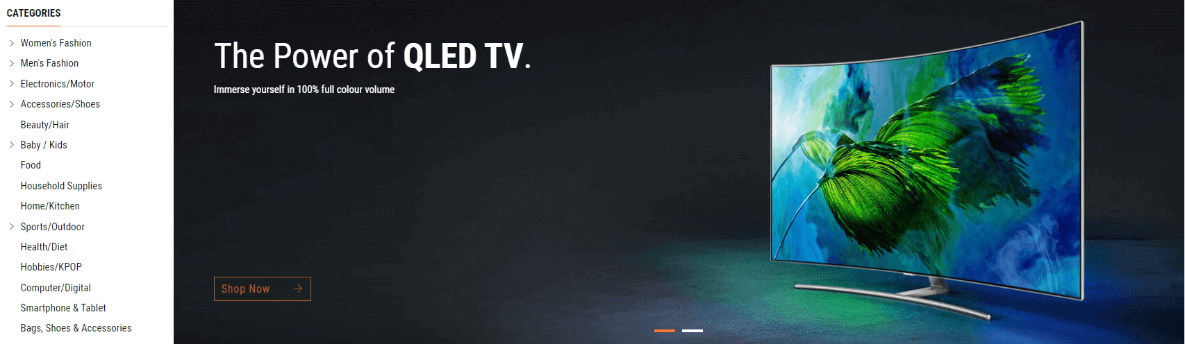
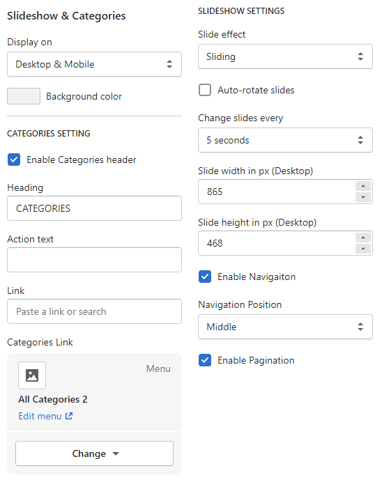
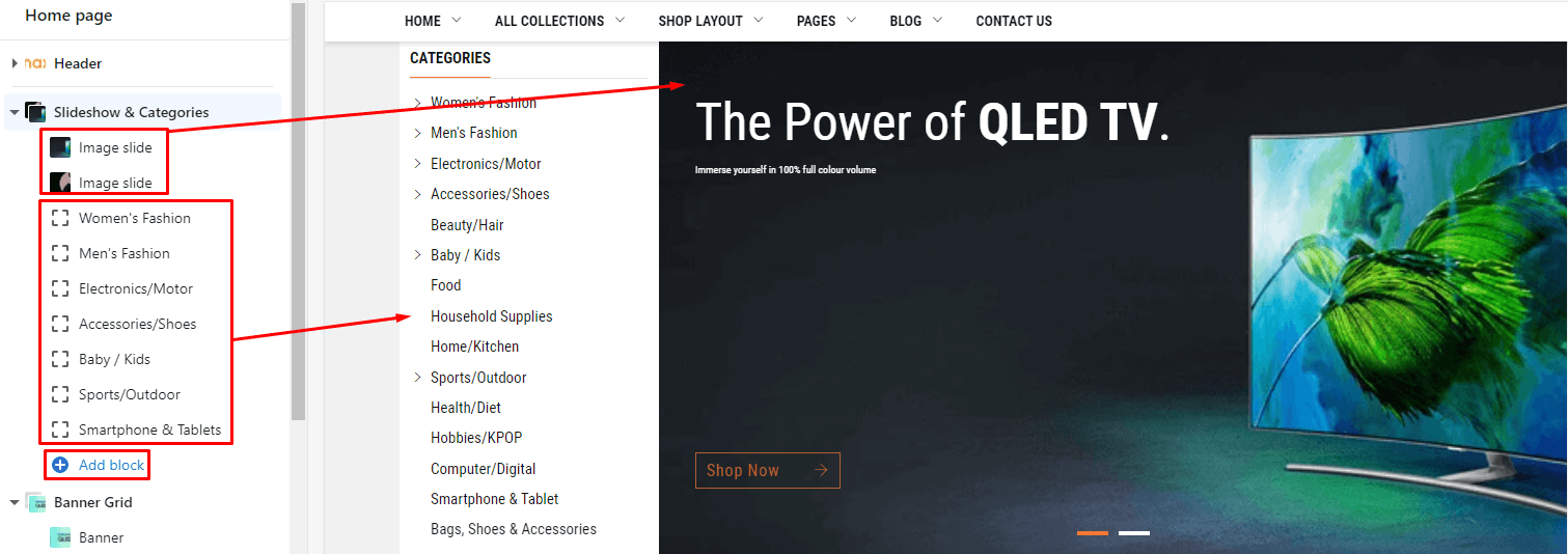
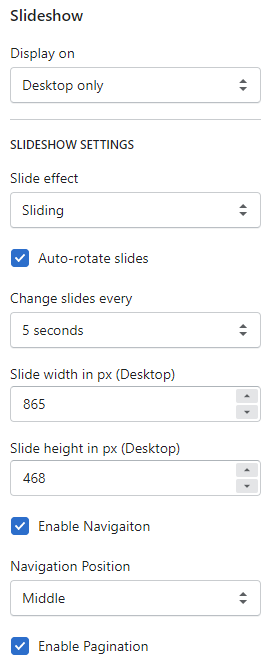
From Sections listing of Customize (Theme Editor)Slideshow & Categories section. The Right sidebar will list all settings use to setup the this section.
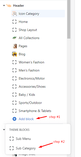
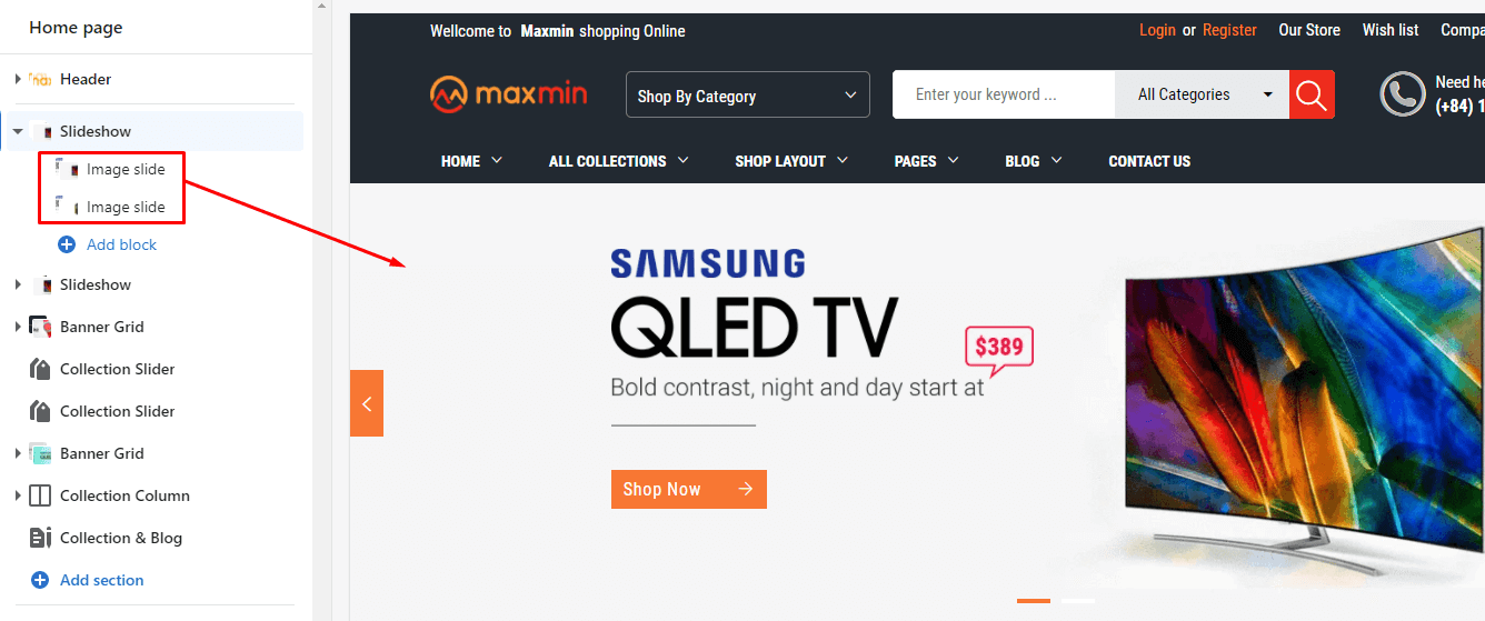
Under Slideshow & Categories will list all blocks content of Categories Icon & Mega menu and Slide images. You also can click to Add block to add more content.
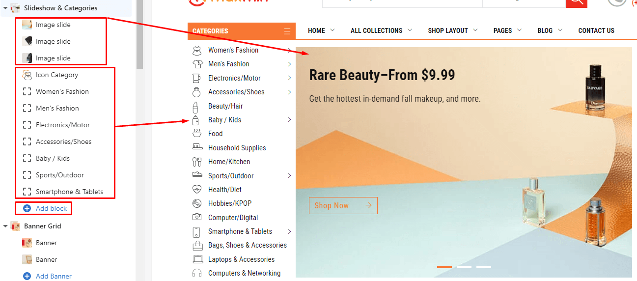
There are 1 block type use for Left Categories is Sub Category can add more and Icon Category can not add more.
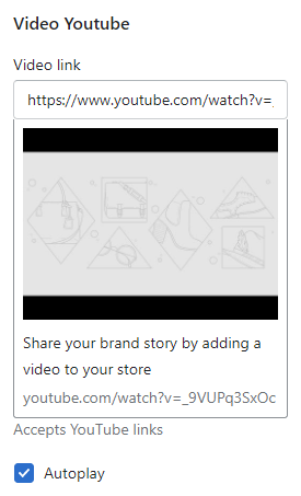
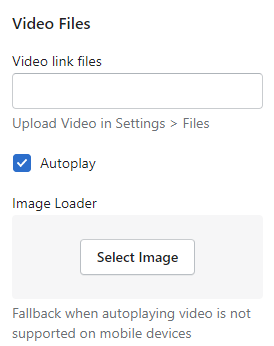
There are 3 block type use for Slideshow content
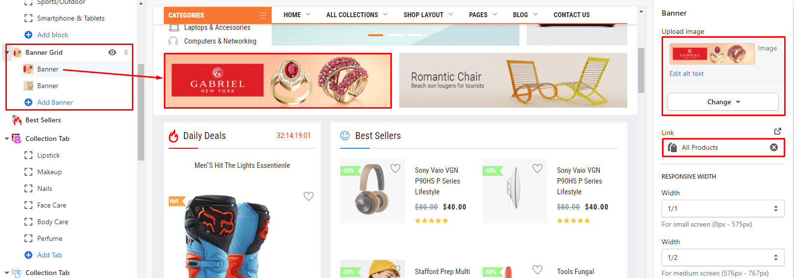
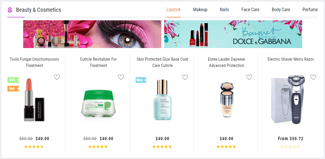
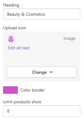
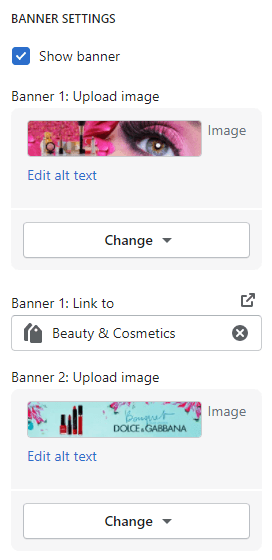
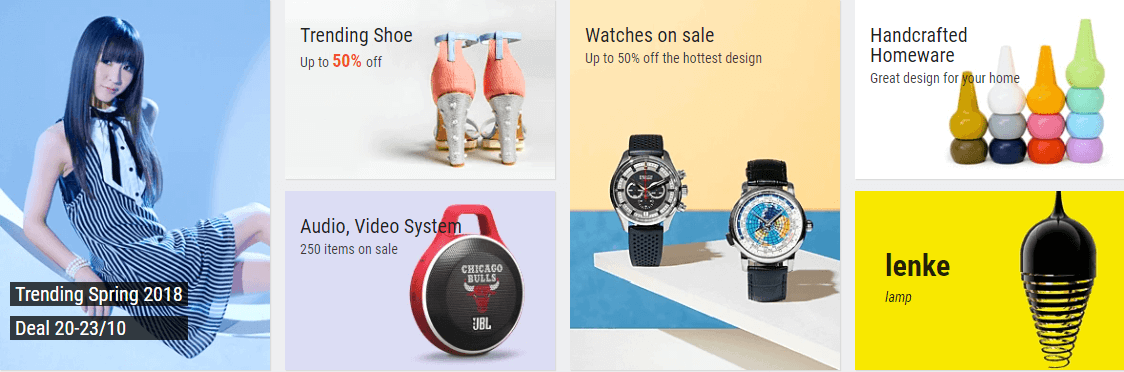
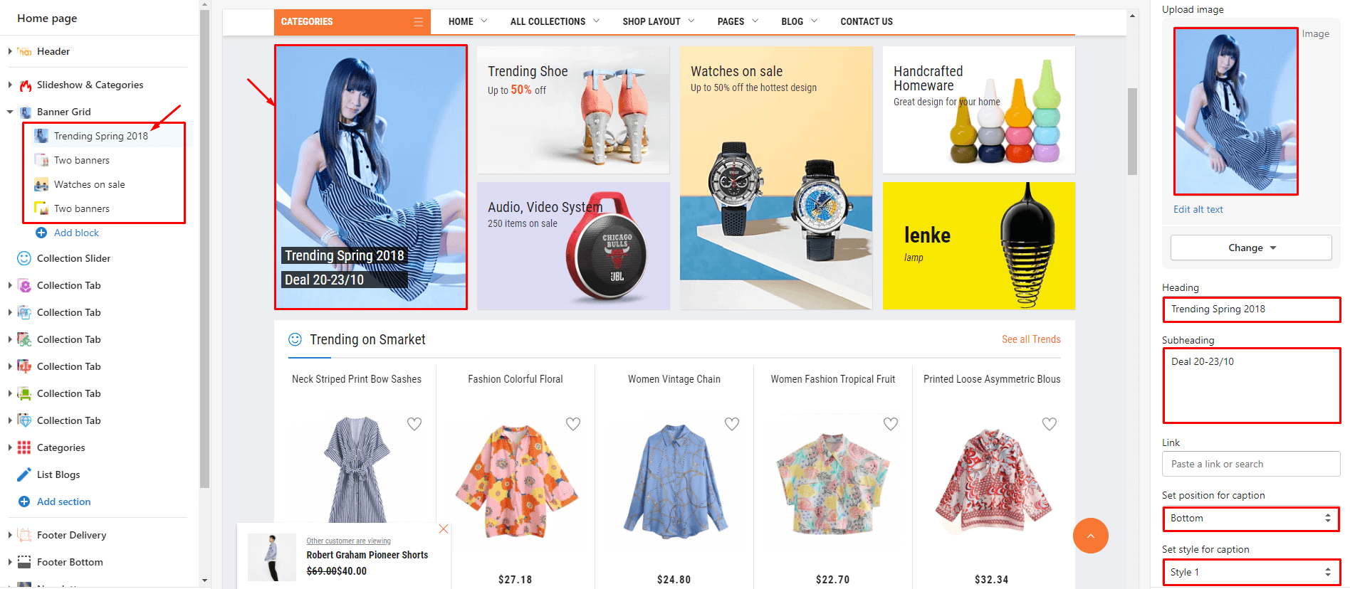
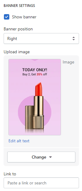
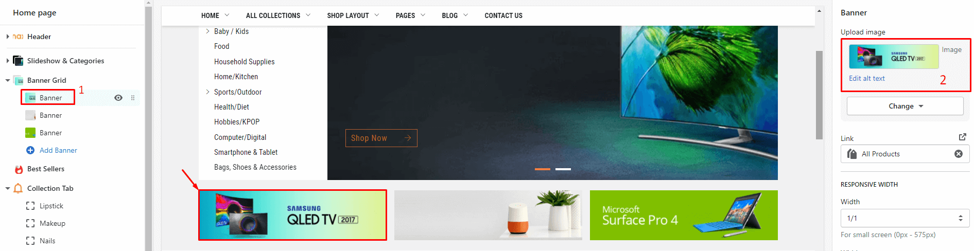
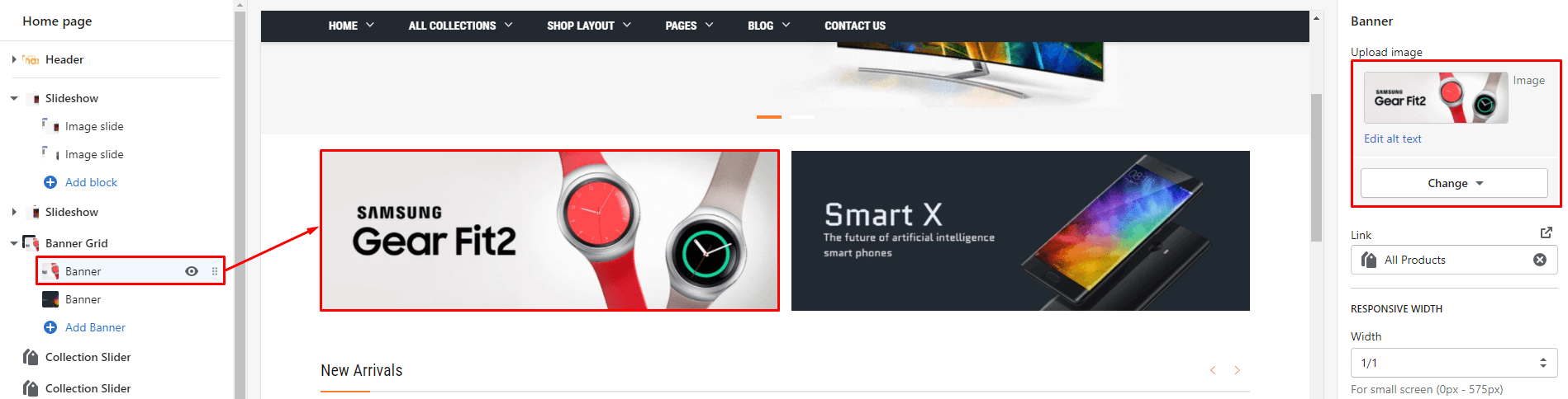
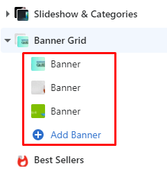
From Sections listing of Customize (Theme Editor)Banner Grid section. The Right sidebar will list all settings use to setup the this section.
Under Banner Grid will list all banners, click to edit. You also can click to Add Banner to add more.
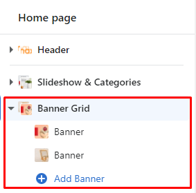
Settings for each banner element:
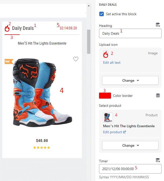
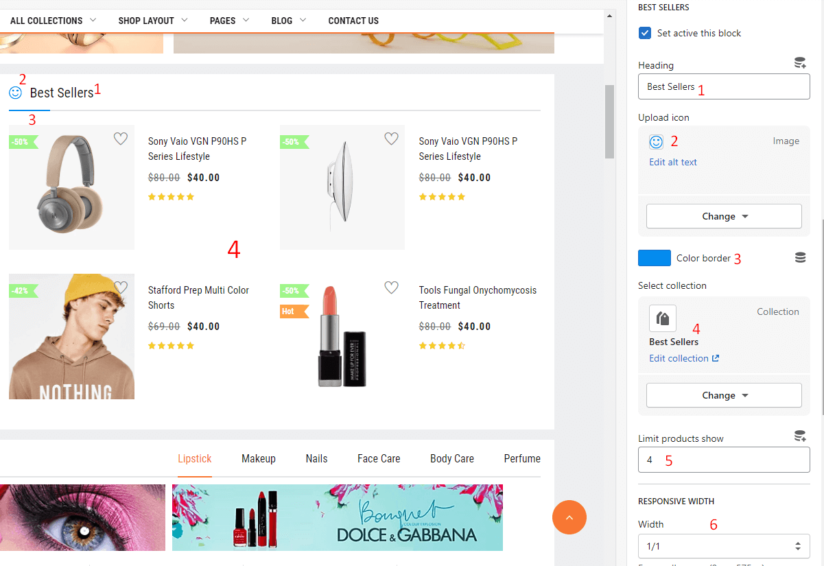
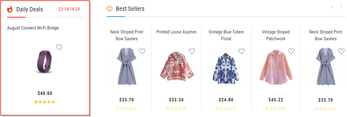
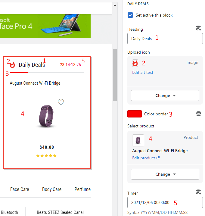
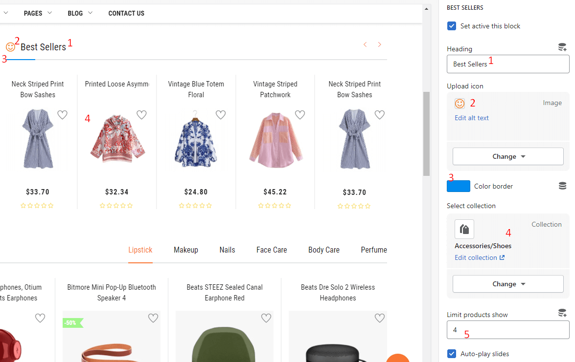
From Sections listing of Customize (Theme Editor)Best Sellers section. The Right sidebar will list all settings use to setup the this section.
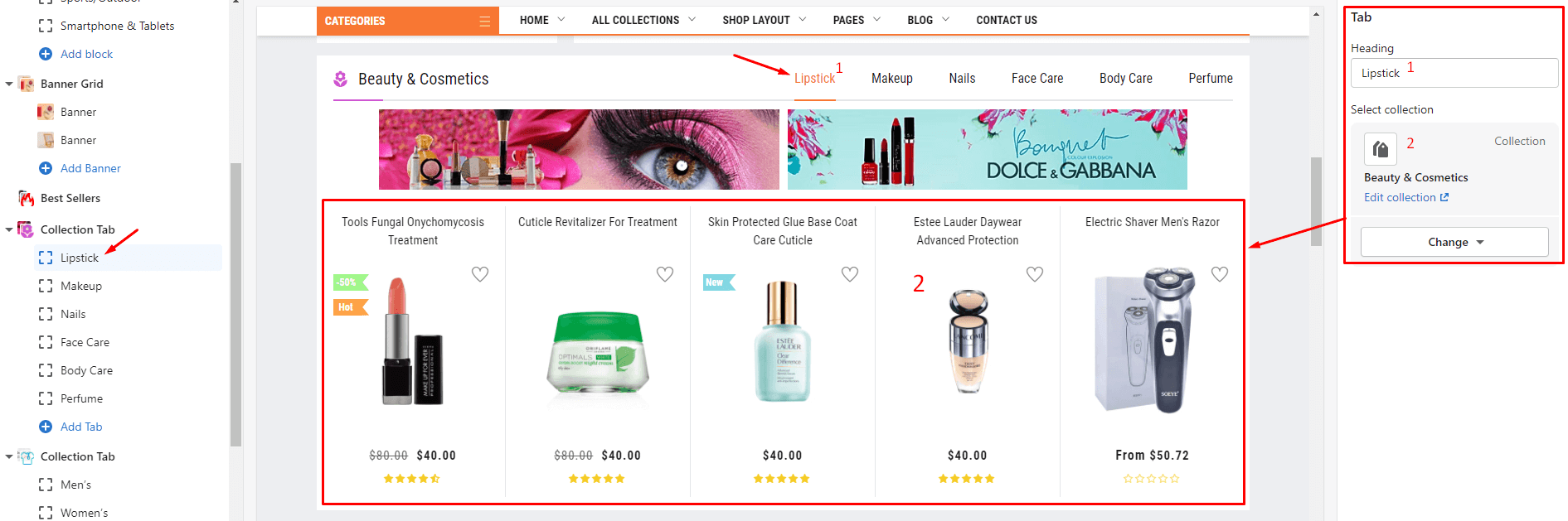
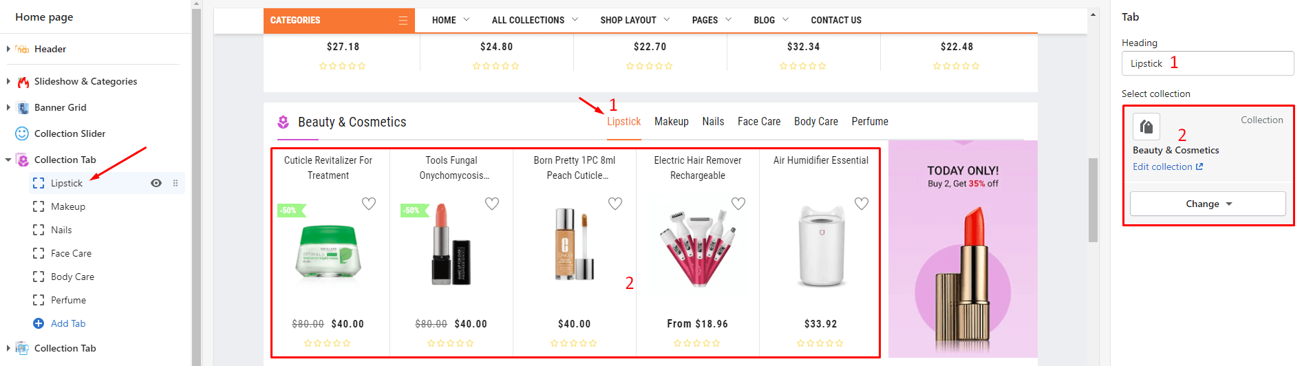
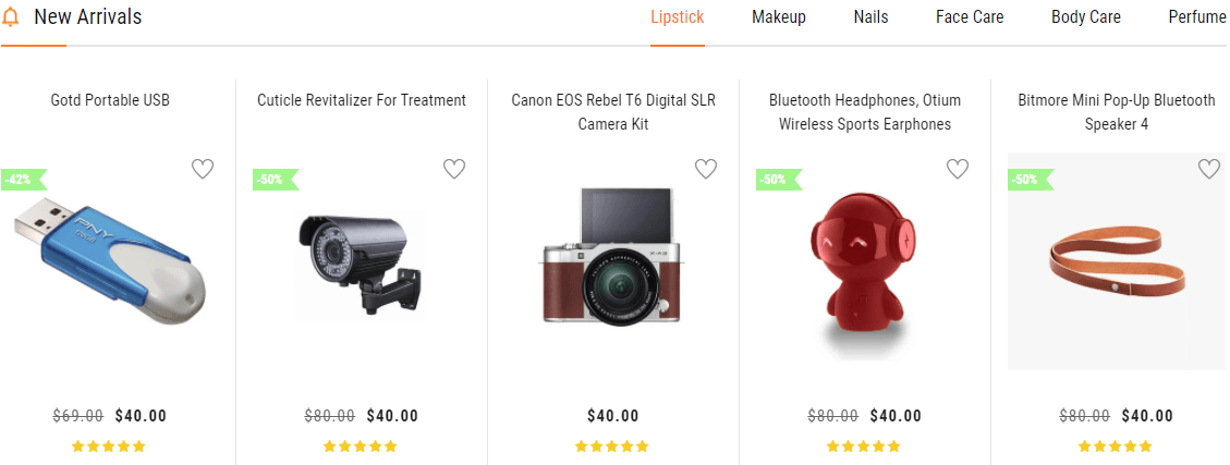
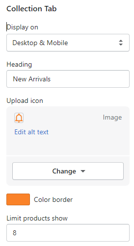
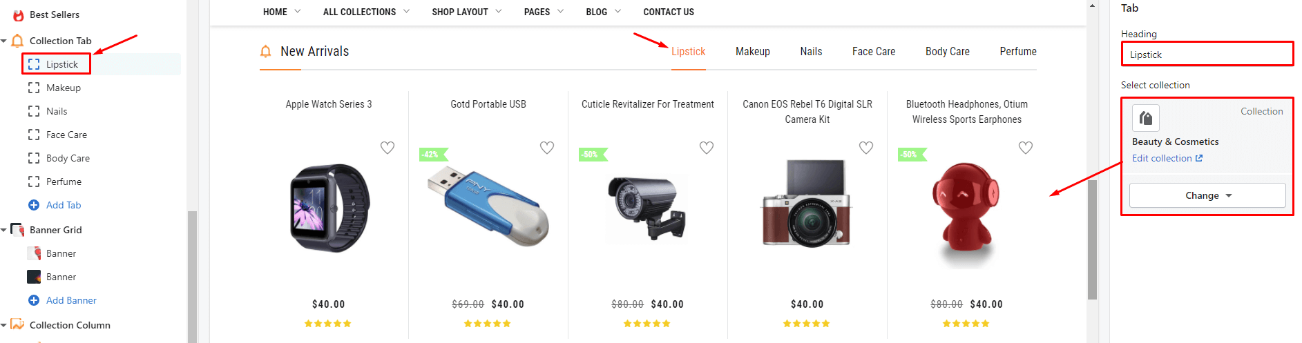
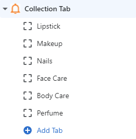
From Sections listing of Customize (Theme Editor)Collection Tab section. The Right sidebar will list all settings use to setup the this section.
Under Collection Tab will list all Tab, click to edit. You also can click to Add Tab to add more.
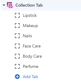
Settings for each Tab element:
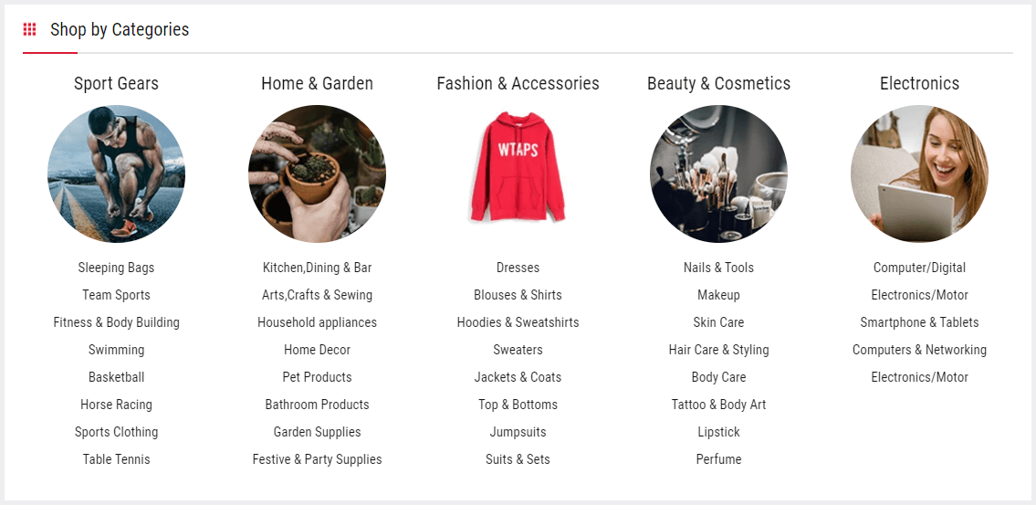
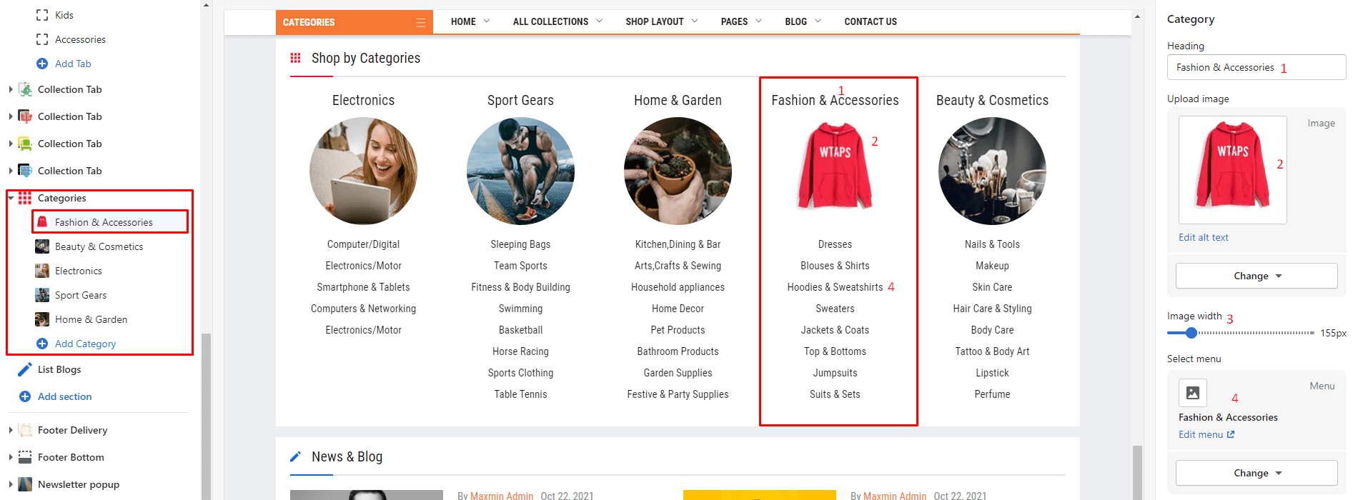
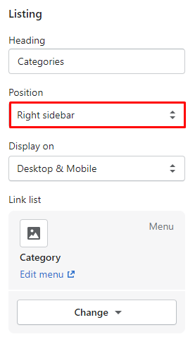
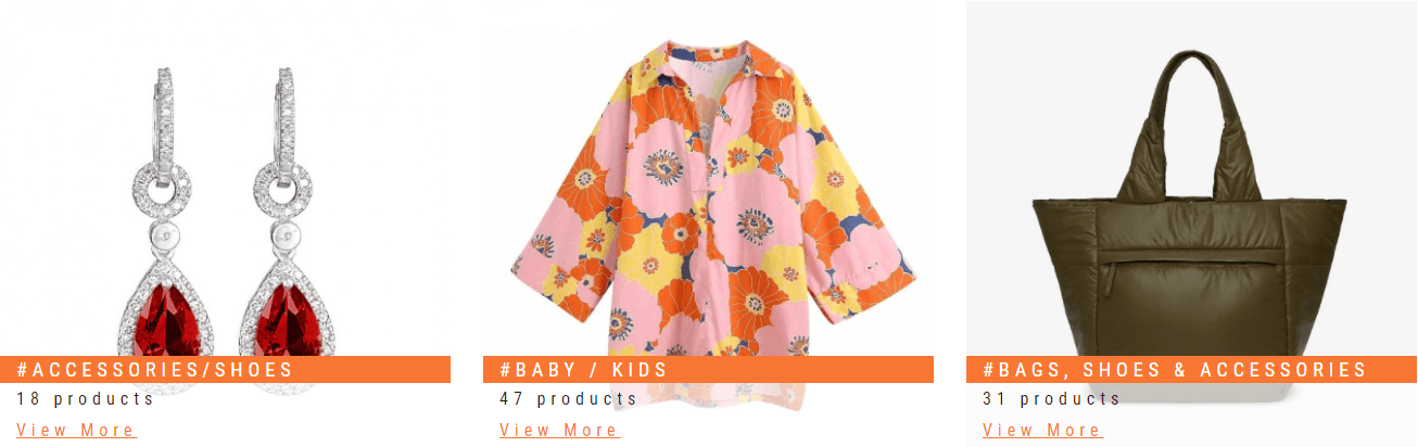
From Sections listing of Customize (Theme Editor)Categories section. The Right sidebar will list all settings use to setup the this section.
Under Categories will list all Categories, click to edit. You also can click to Add Category to add more.
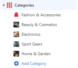
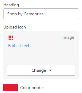
Settings for each Category element:
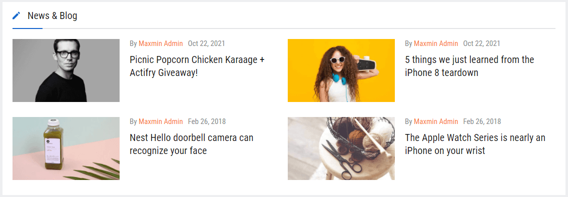
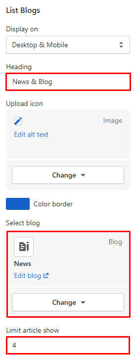
From Sections listing of Customize (Theme Editor)List Blogs section. The Right sidebar will list all settings use to setup the this section.
- Please make sure that the Customize view page is Home page. So that it will list all Home page sections (include in theme package) in the Left area.
- With the new Shopify Online Store 2.0 you can use these sections in the Inner pages.
- You also can click to Add section to add more sections. But you can not add/use the sections of Homepage #2 to another Homepage.
From Sections listing of Customize (Theme Editor)Slideshow & Categories section. The Right sidebar will list all settings use to setup the this section.
Under Slideshow & Categories will list all blocks content of Categories Icon & Mega menu and Slide images. You also can click to Add block to add more content.
There are 1 block type use for Left Categories is Sub Category can add more and Icon Category can not add more.
There are 3 block type use for Slideshow content
From Sections listing of Customize (Theme Editor)Banner Grid section. The Right sidebar will list all settings use to setup the this section.
Under Banner Grid will list all banners, click to edit. You also can click to Add block to add more.
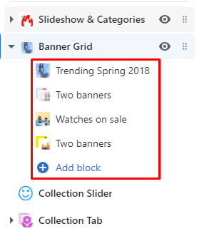
There are 2 Banner type: One banner and Two banners. Settings for each banner element:
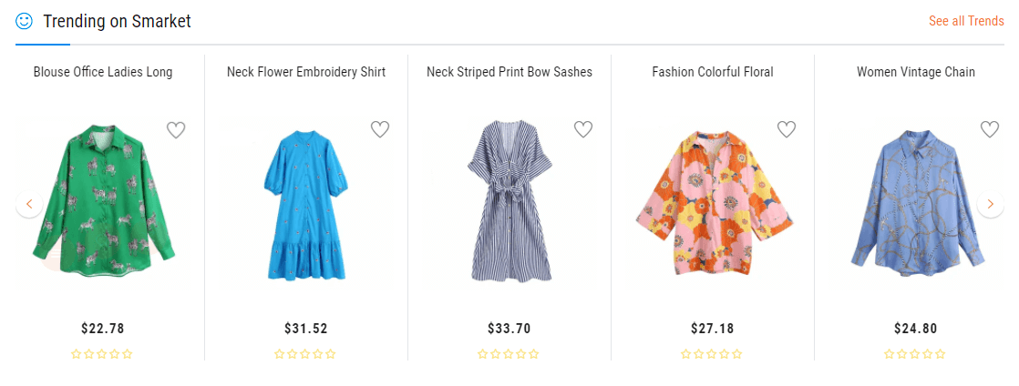
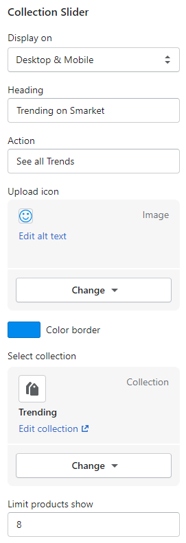
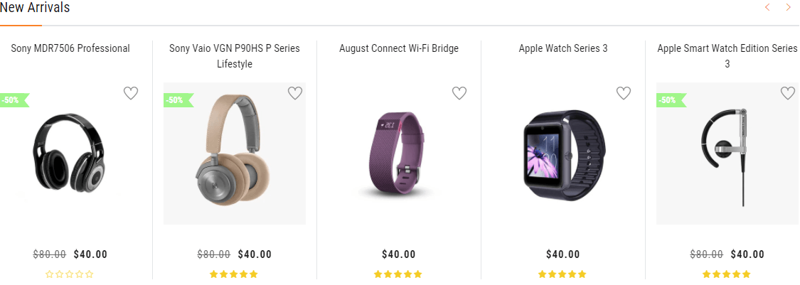
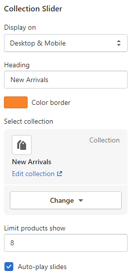
From Sections listing of Customize (Theme Editor)Collection Slider section. The Right sidebar will list all settings use to setup the this section.
From Sections listing of Customize (Theme Editor)Collection Tab section. The Right sidebar will list all settings use to setup the this section.
Under Collection Tab will list all Tab, click to edit. You also can click to Add Tab to add more.
Settings for each Tab element:
From Sections listing of Customize (Theme Editor)Categories section. The Right sidebar will list all settings use to setup the this section.
Under Categories will list all Categories, click to edit. You also can click to Add Category to add more.
Settings for each Category element:
From Sections listing of Customize (Theme Editor)List Blogs section. The Right sidebar will list all settings use to setup the this section.
- Please make sure that the Customize view page is Home page. So that it will list all Home page sections (include in theme package) in the Left area.
- With the new Shopify Online Store 2.0 you can use these sections in the Inner pages.
- You also can click to Add section to add more sections. But you can not add/use the sections of Homepage #3 to another Homepage.
From Sections listing of Customize (Theme Editor)Slideshow & Categories section. The Right sidebar will list all settings use to setup the this section.
Under Slideshow & Categories will list all blocks content of Categories Icon & Mega menu and Slide images. You also can click to Add block to add more content.
There are 1 block type use for Left Categories is Sub Category can add more and Icon Category can not add more.
There are 3 block type use for Slideshow content
From Sections listing of Customize (Theme Editor)Banner Grid section. The Right sidebar will list all settings use to setup the this section.
Under Banner Grid will list all banners, click to edit. You also can click to Add block to add more.
There are 2 Banner type: One banner and Two banners. Settings for each banner element:
From Sections listing of Customize (Theme Editor)Best Sellers section. The Right sidebar will list all settings use to setup the this section.
From Sections listing of Customize (Theme Editor)Collection Tab section. The Right sidebar will list all settings use to setup the this section.
Under Collection Tab will list all Tab, click to edit. You also can click to Add Tab to add more.
Settings for each Tab element:
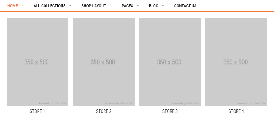
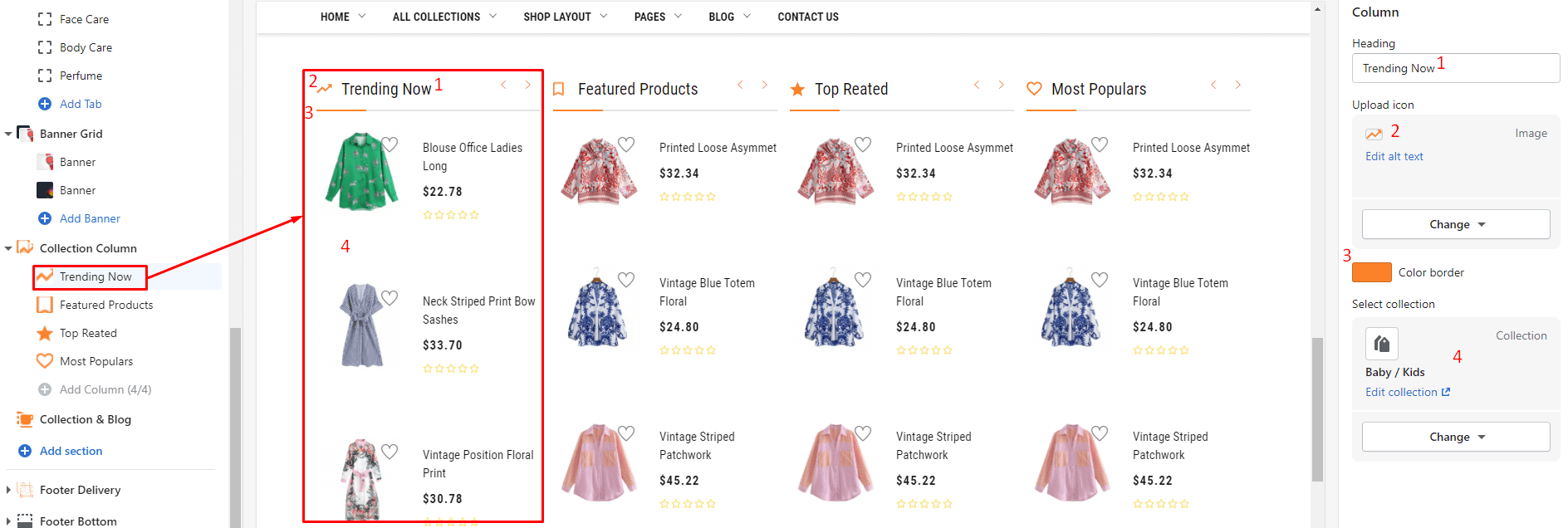
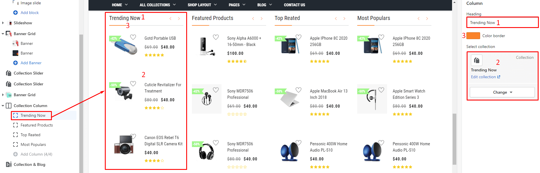
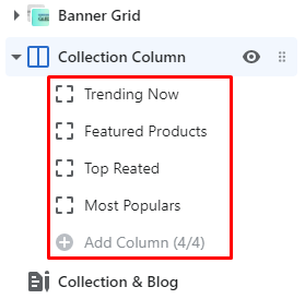
From Sections listing of Customize (Theme Editor)Collection Column section. The Right sidebar will list all settings use to setup the this section.
Under Collection Column will list all Category columns, click to edit. You also can click to Add Column (limit 4 columns) to add more.
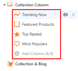
Settings for each Category column:
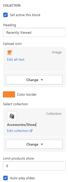
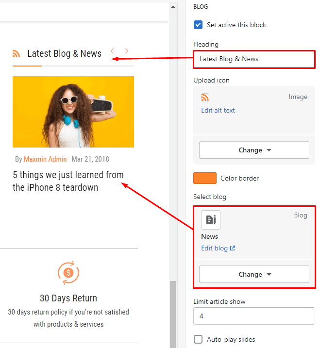
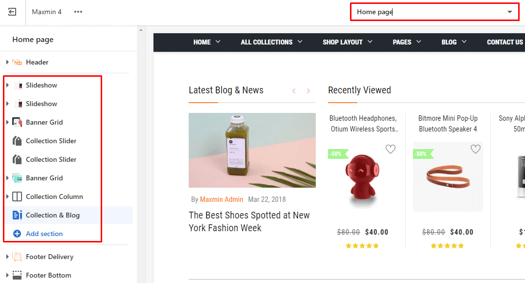
From Sections listing of Customize (Theme Editor)Collection & Blog section. The Right sidebar will list all settings use to setup the this section.
- Please make sure that the Customize view page is Home page. So that it will list all Home page sections (include in theme package) in the Left area.
- With the new Shopify Online Store 2.0 you can use these sections in the Inner pages.
- You also can click to Add section to add more sections. But you can not add/use the sections of Homepage #4 to another Homepage.
From Sections listing of Customize (Theme Editor)Slideshow & Categories section. The Right sidebar will list all settings use to setup the this section.
Under Slideshow will list all blocks content of Slide images. You also can click to Add block to add more content.
There are 3 block type use for Slideshow content
From Sections listing of Customize (Theme Editor)Banner Grid section. The Right sidebar will list all settings use to setup the this section.
Under Banner Grid will list all banners, click to edit. You also can click to Add block to add more.
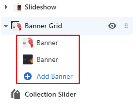
There are 2 Banner type: One banner and Two banners. Settings for each banner element:
From Sections listing of Customize (Theme Editor)Collection Slider section. The Right sidebar will list all settings use to setup the this section.
From Sections listing of Customize (Theme Editor)Collection Column section. The Right sidebar will list all settings use to setup the this section.
Under Collection Column will list all Category columns, click to edit. You also can click to Add Column (limit 4 columns) to add more.
Settings for each Category column:
From Sections listing of Customize (Theme Editor)Collection & Blog section. The Right sidebar will list all settings use to setup the this section.
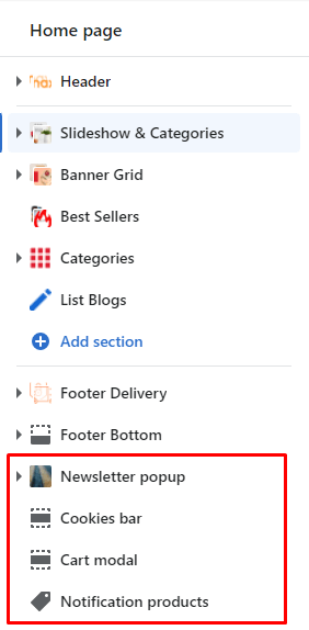
The section that appears at the bottom of section listing (after Footer sections) and can not delete or add more, will be called Static Sections
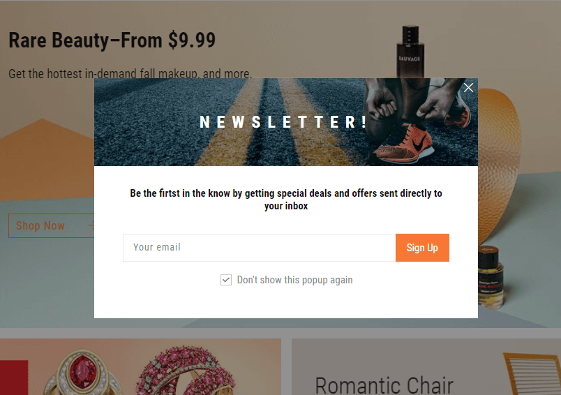
When you access the site for the first time, you will see the popup with Mail input, it's Newsletter popup
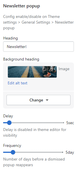
From Sections listing of Customize (Theme Editor)Newsletter popup section. The Right sidebar will list all settings use to setup the this section.
This bar appear at the bottom of the page.
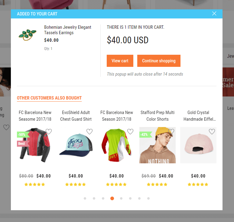
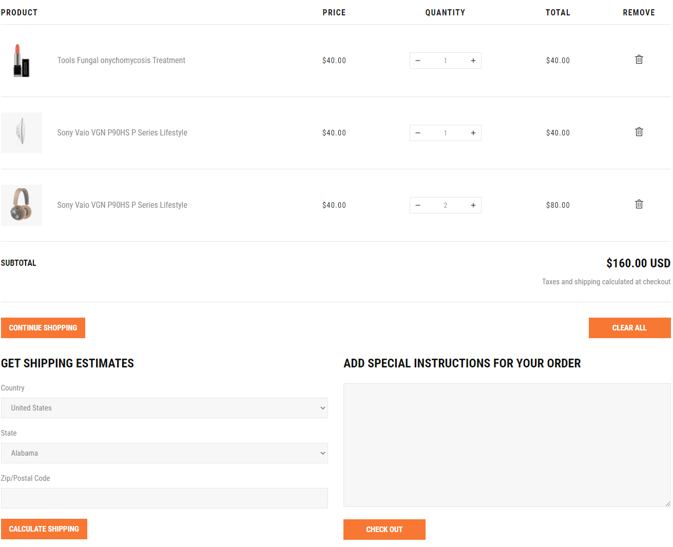
The popup appears when you click Add to Cart button, it's Cart modal
From Sections listing of Customize (Theme Editor)Cart modal section. The Right sidebar will list all settings use to setup the this section.
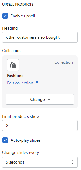
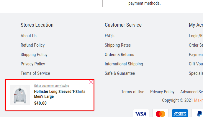
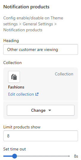
The toggle Product panel appear in the bottom right, it's Notification products
From Sections listing of Customize (Theme Editor)Notification products section. The Right sidebar will list all settings use to setup the this section.
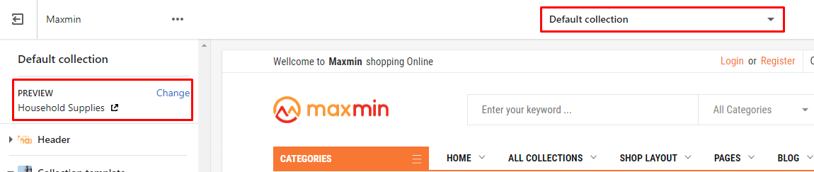
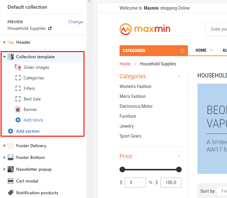
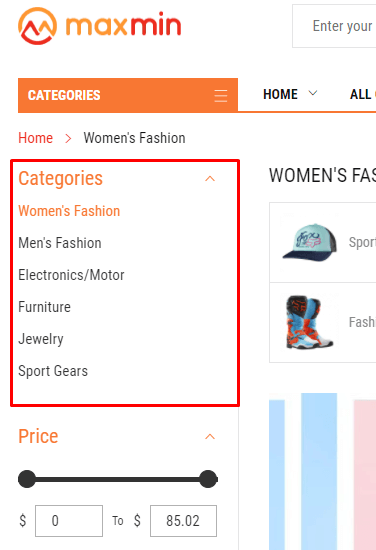
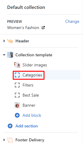
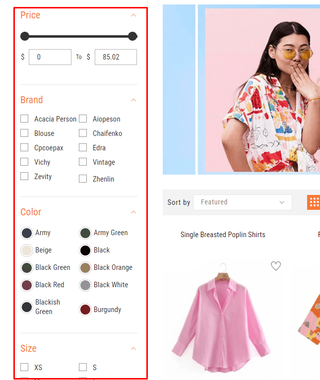
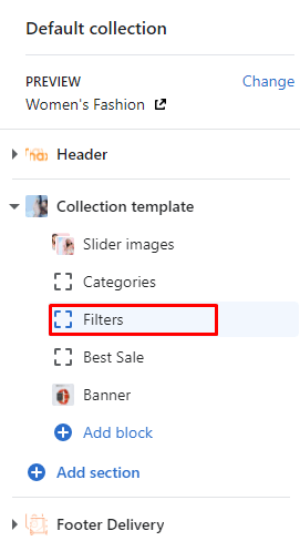
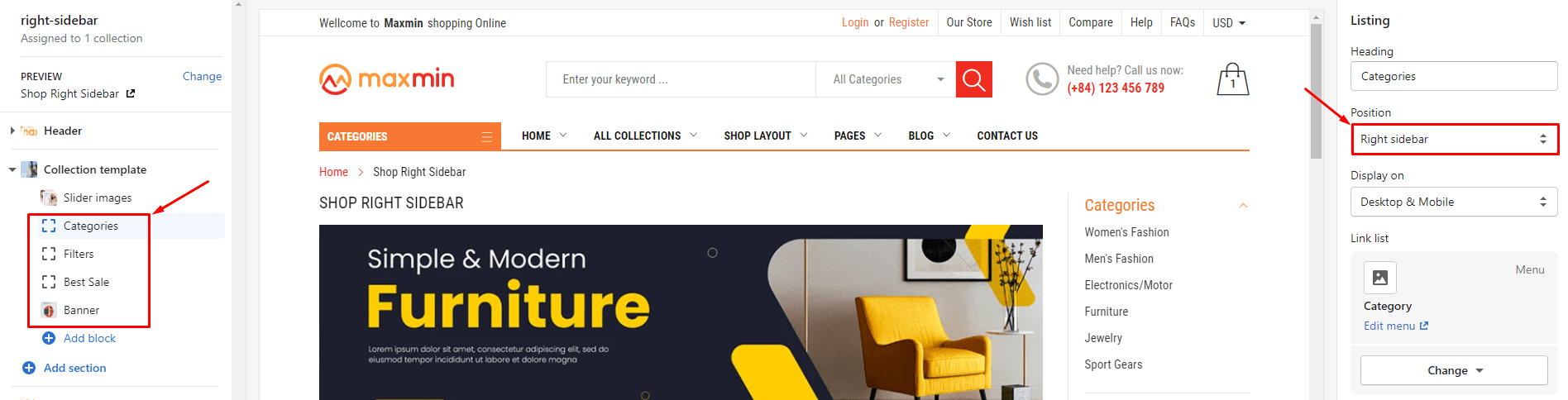
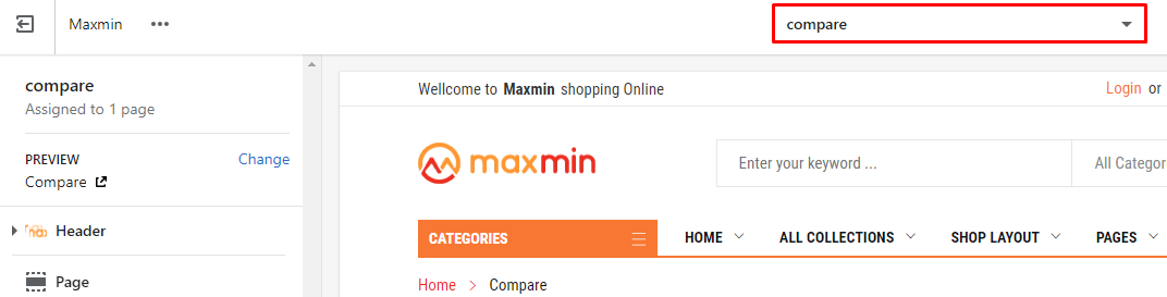
From Customize (Theme Editor) Select View page or Preview is CollectionsDefault Collection
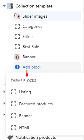
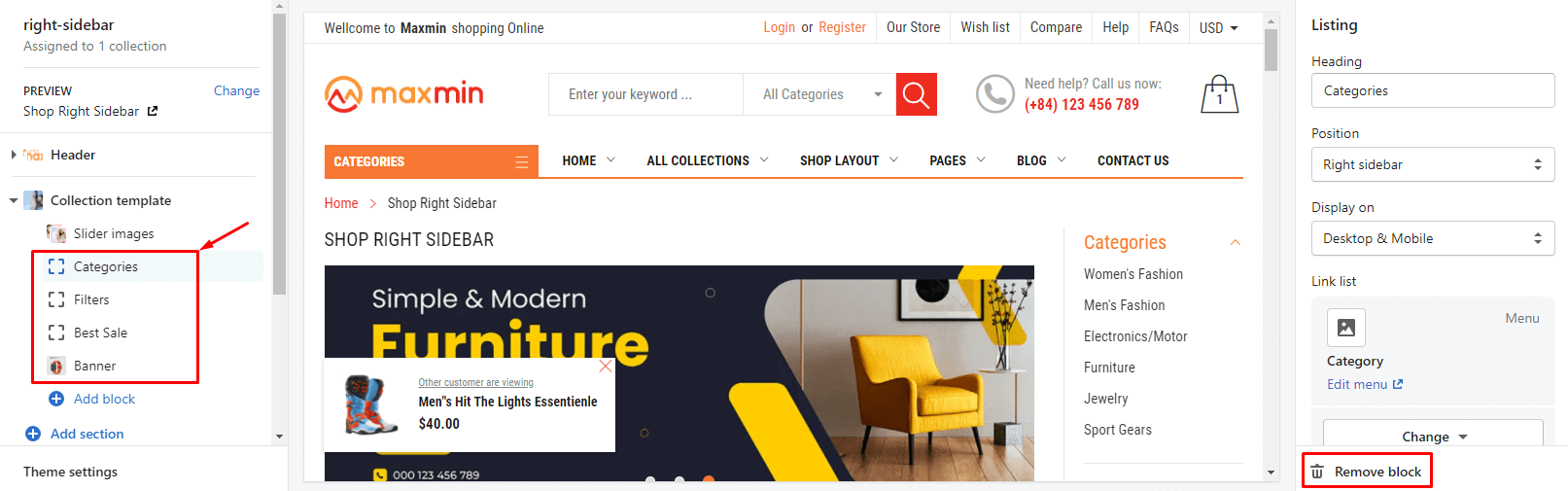
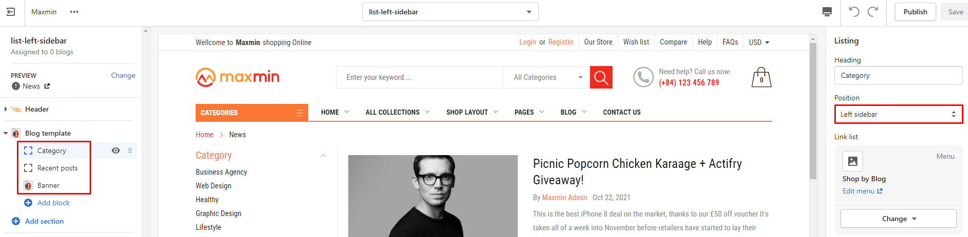
The Collection template section will appear in the Left sidebar.
Click to Collection template section , the Right sidebar will list all settings use to setup the Collection page.
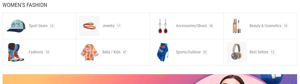
To showing the sub-collections, you need to create the Menu with the handle syntax is navigation-[handle collection]
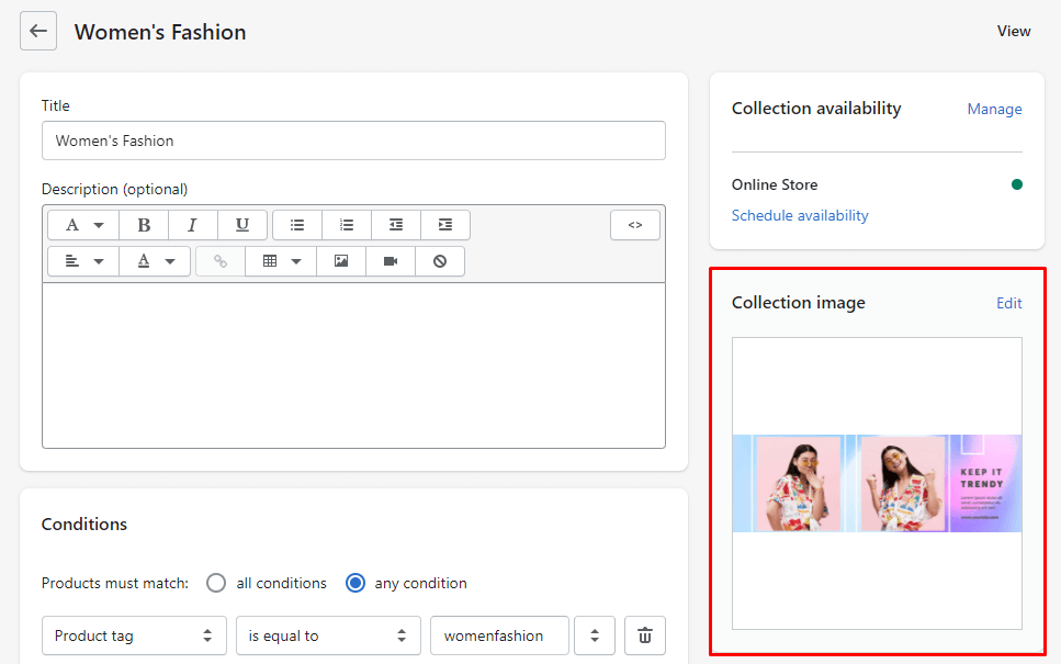
Example: If you want create the sub collection for WOMEN'S FASHION
- Step #1: Get the Collection handle. Go to the collection and you will know the handle at the url.
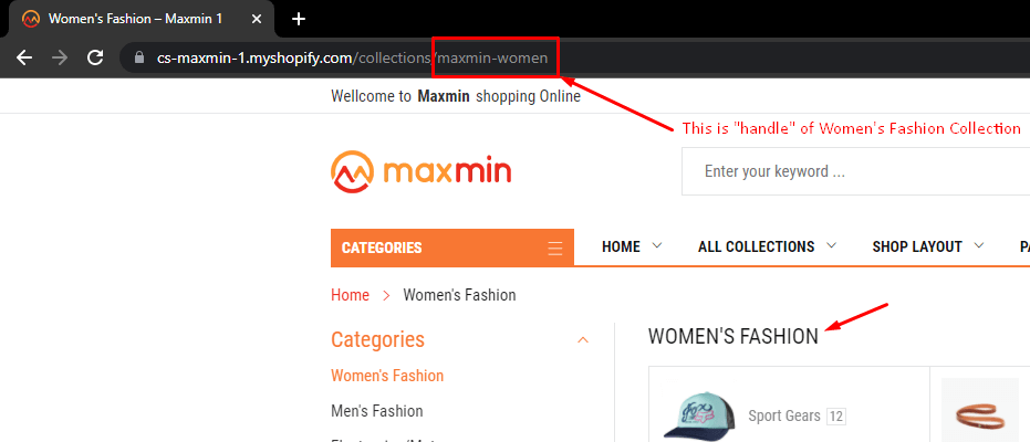
Now we have the handle collection is maxmin-women
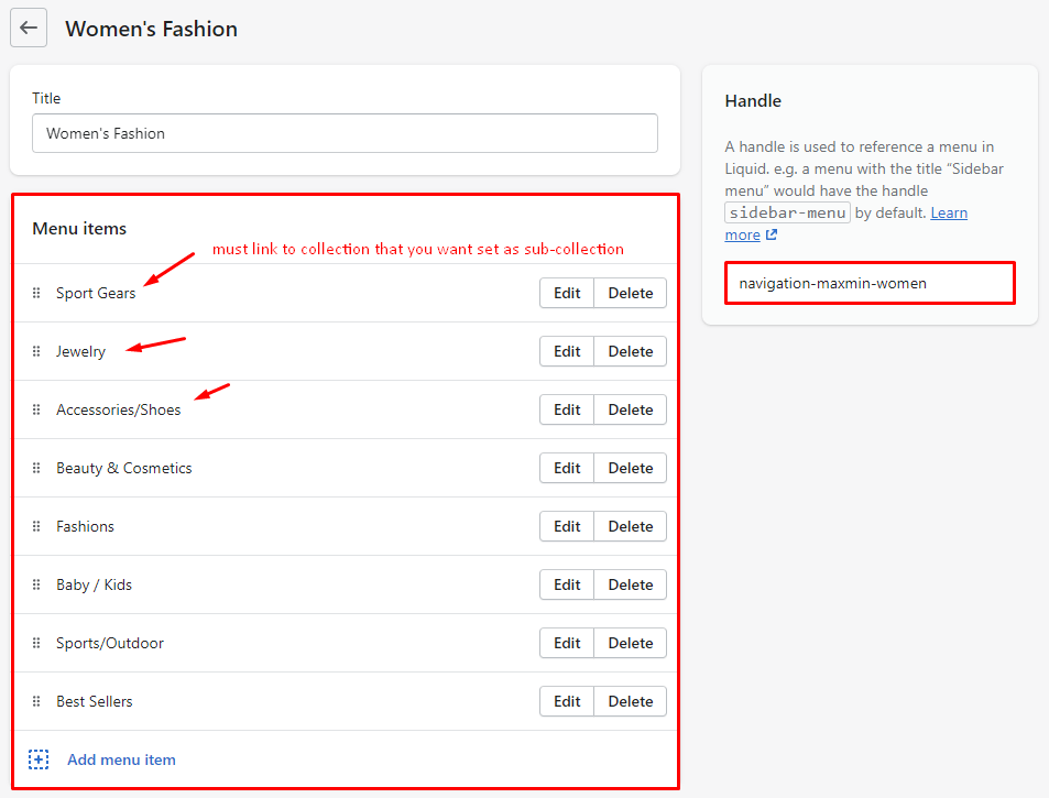
- Step #2: Go to Online StoreNavigationAdd menu
+ In the right Handle need input syntax navigation-maxmin-women
+ In the Left Bottom Menu items add Menu with target link to Collection that you want set as sub-collection.
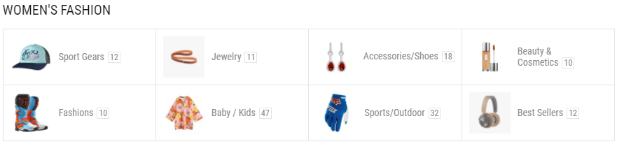
- Result: https://cs-maxmin-1.myshopify.com/collections/maxmin-women
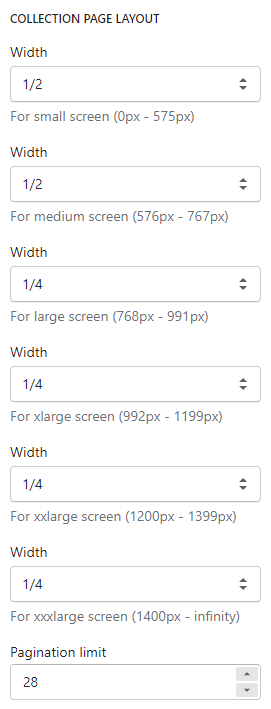
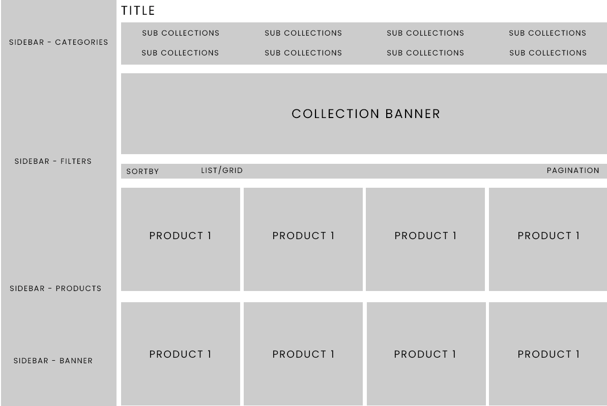
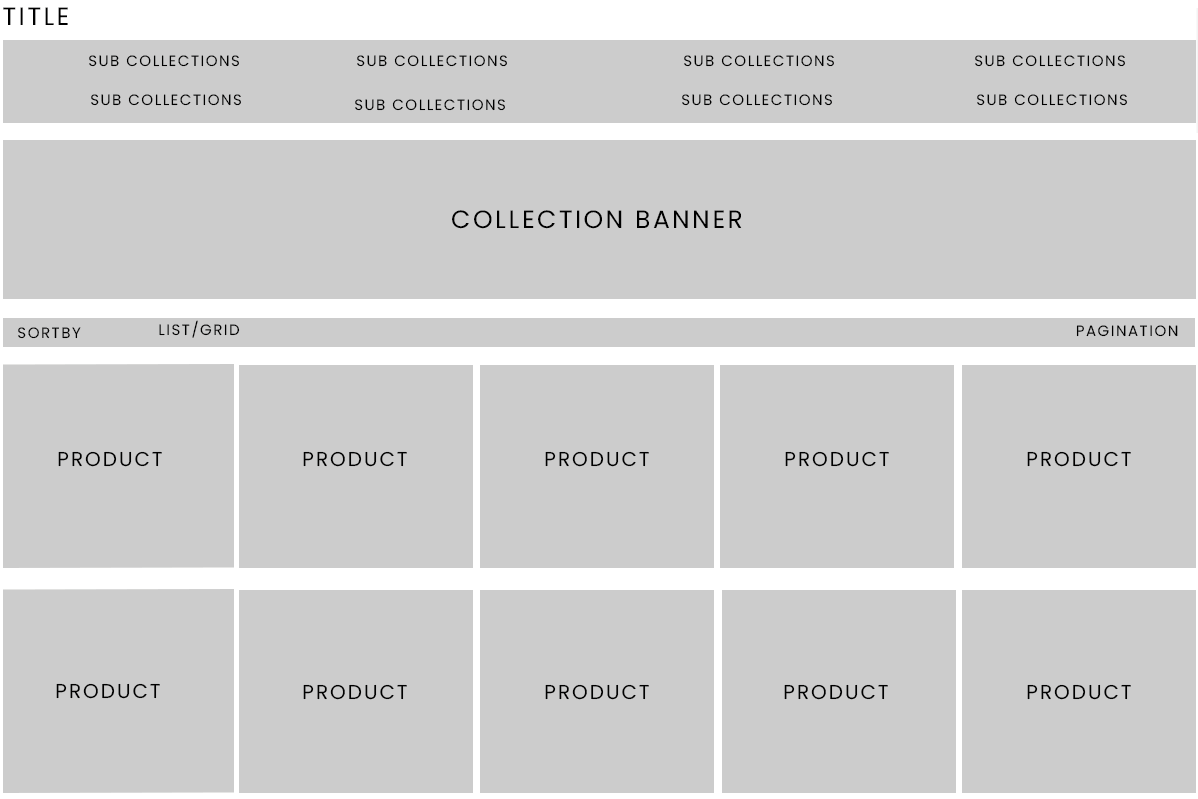
Continue with the Collection template section settings in the Right sidebar, scroll down to Collection Page Layout. Then pick the option to show products per line for 6 break responsive point.
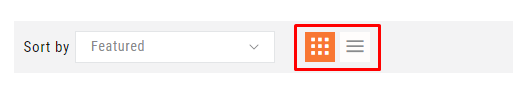
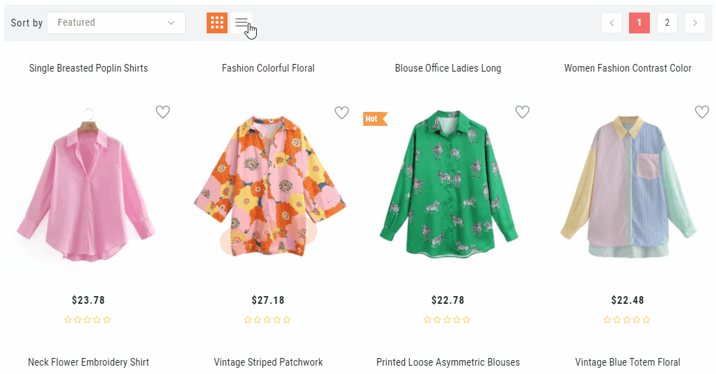
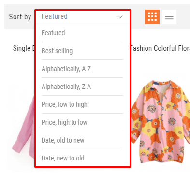
Continue with the Collection template section settings in the Right sidebar, scroll down to Sorting. Then check to enable/disable the sorting
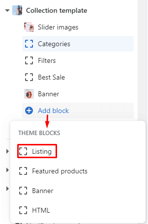
Under the Collection Template will list all blocks content. There are 4 block type that you can add more by click to Add block and 1 fixed block type.
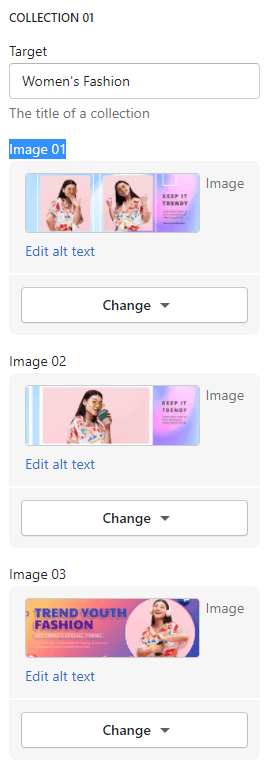
This block will use to control the Collection Banners Slider.
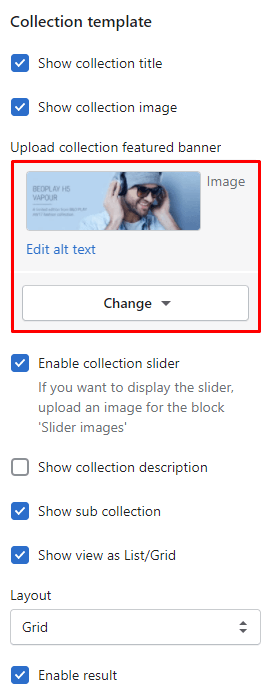
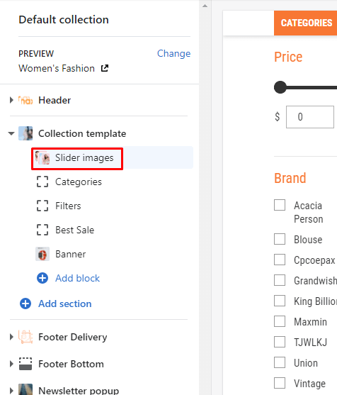
Under the Collection Template select Slider images. The Right sidebar will list all settings use to setup the this section.
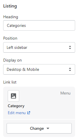
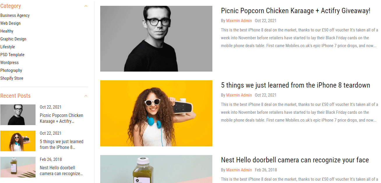
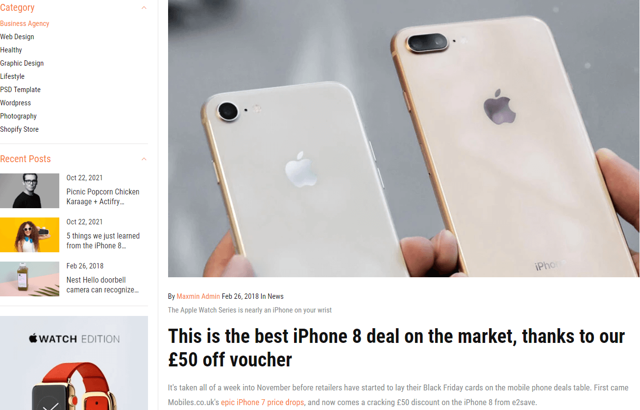
This block will use to control the Categories listing in the top of sidebar.
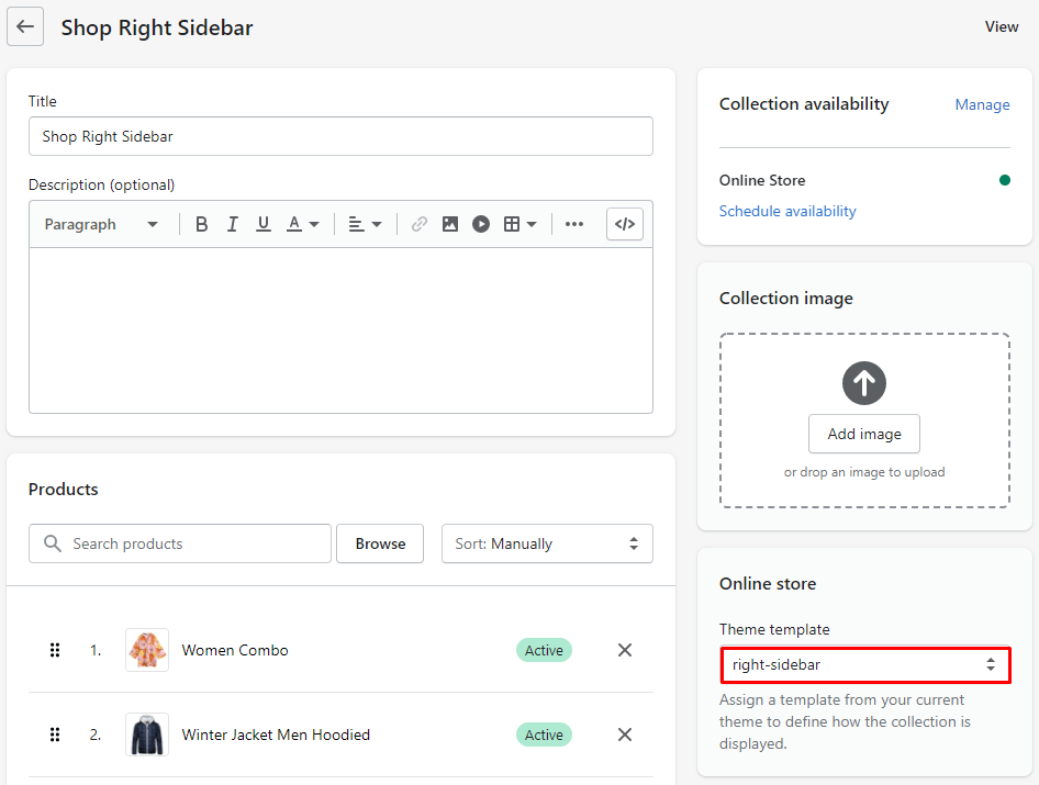
Under the Collection Template select Categories (the exactly name depend on Heading field). The Right sidebar will list all settings use to setup the this section.
Settings include:
You also can add new more Categories by click to Add block and select type is Listing
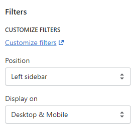
This block will use to control the Filter in the sidebar.
Under the Collection Template select Filters. The Right sidebar will list all settings use to setup the this section.
Settings include:
You also can add new more Filters by click to Add block and select type is Filters
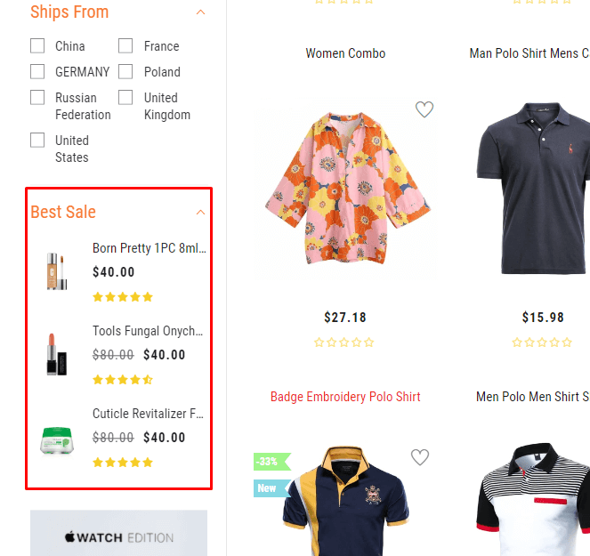
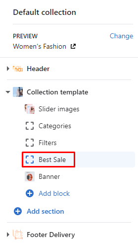
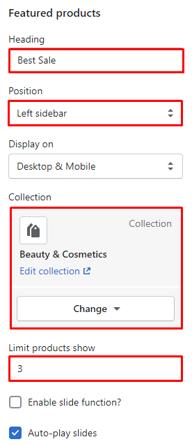
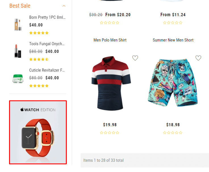
This block will use to control the Products listing in the sidebar.
Under the Collection Template select Best Sale (the exactly name depend on Heading field). The Right sidebar will list all settings use to setup the this section.
Settings include:
You also can add new more Featured products by click to Add block and select type is Featured products
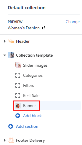
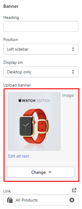
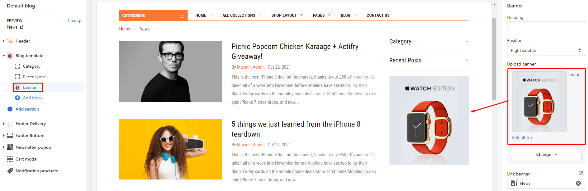
This block will use to control the Banner in the sidebar.
Under the Collection Template select Banner. The Right sidebar will list all settings use to setup the this section.
Settings include:
You also can add new more Banner by click to Add block and select type is Banner
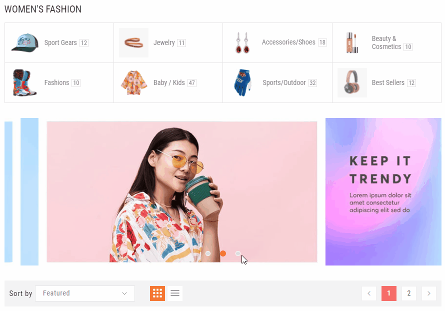
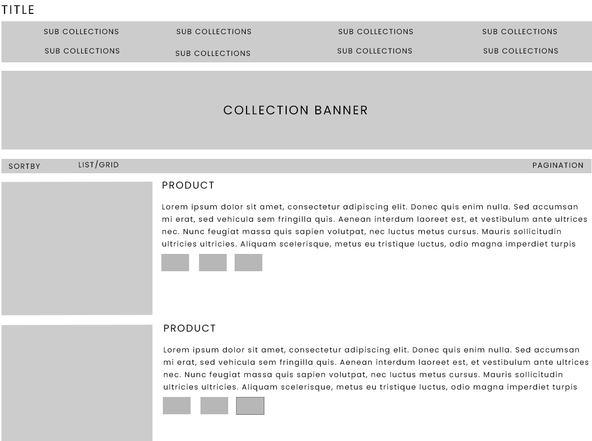
With these above settings of the Collection Template section, you can change the layout into different 6 layouts:
This is default of Collection page layout. All settings above.
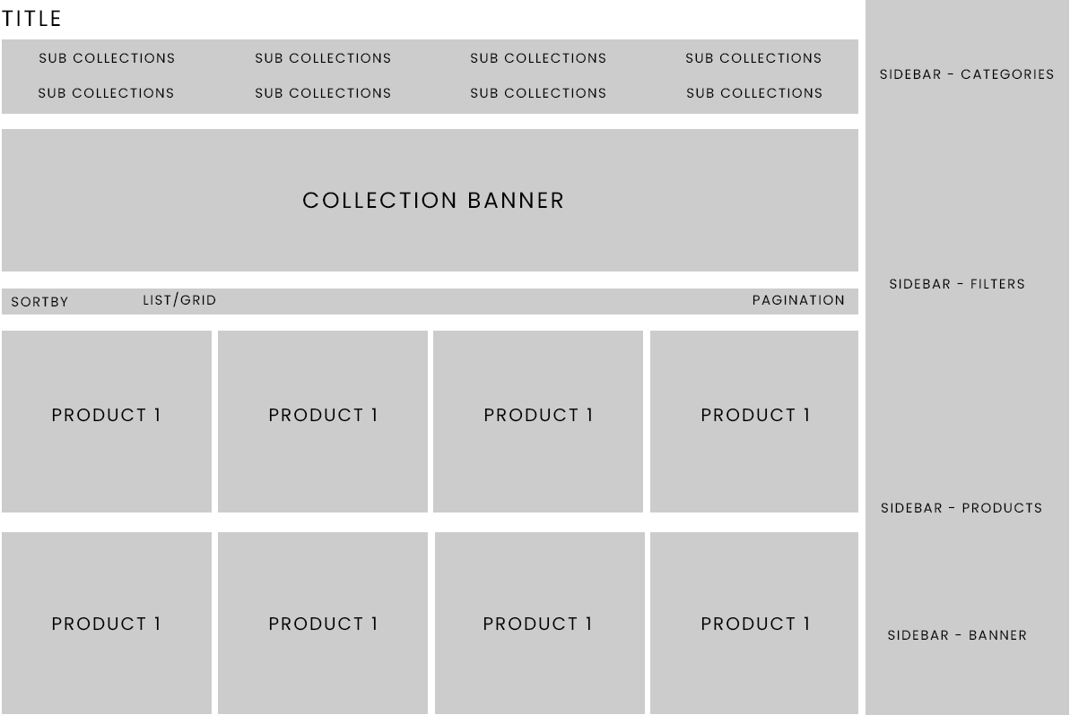
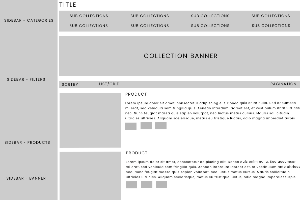
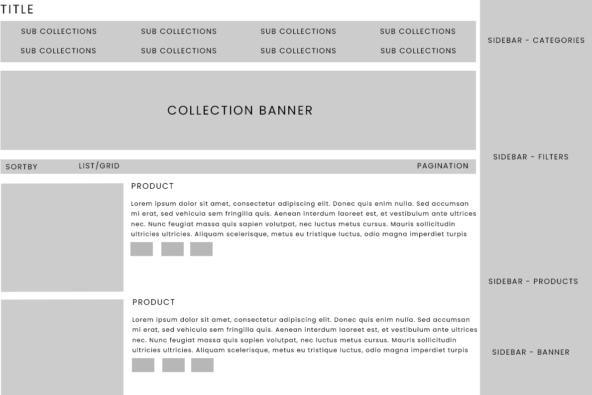
Set the Position of all 4 Sidebar blocks: Sidebar - Categories listing, Sidebar - Filters, Sidebar - Featured products ,and Sidebar - Banner to Right sidebar.
Remove all 4 Sidebar blocks: Sidebar - Categories listing, Sidebar - Filters, Sidebar - Featured products ,and Sidebar - Banner.
You also can increase the number of product per line from 4 to 5 in the Collection Page Layout
Result:
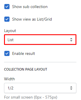
From Collection template area, set the Layout option to List
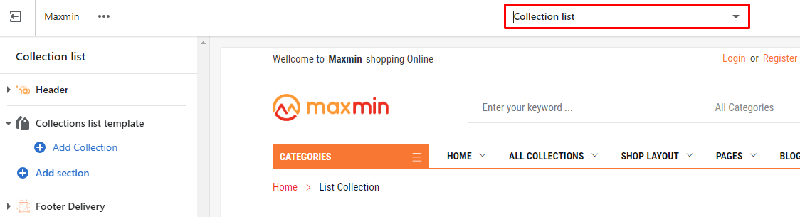
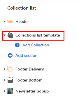
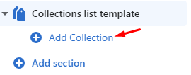
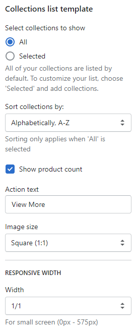
From Customize (Theme Editor) Select View page or Preview is Collection list
The Collections list template section will appear in the Left sidebar.
Click to Collections list template section , the Right sidebar will list all settings use to setup the Collections listing page.
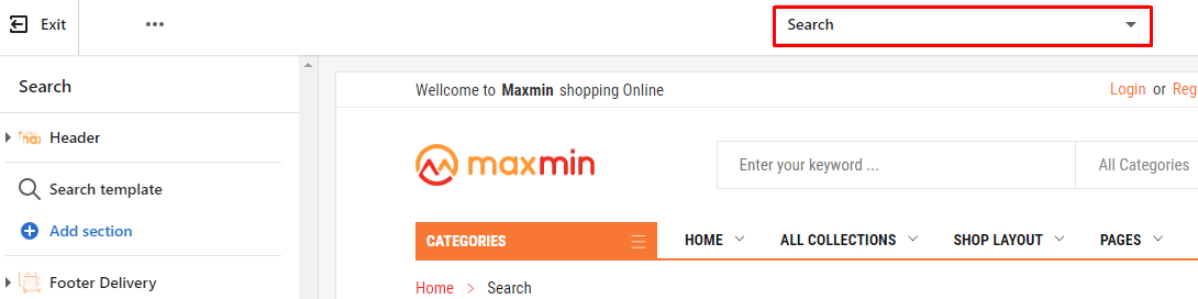
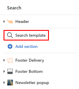
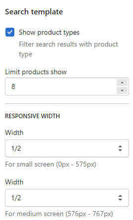
From Customize (Theme Editor) Select View page or Preview is OthersSearch
The Search template section will appear in the Left sidebar.
Click to Search template section , the Right sidebar will list all settings use to setup the Search page.
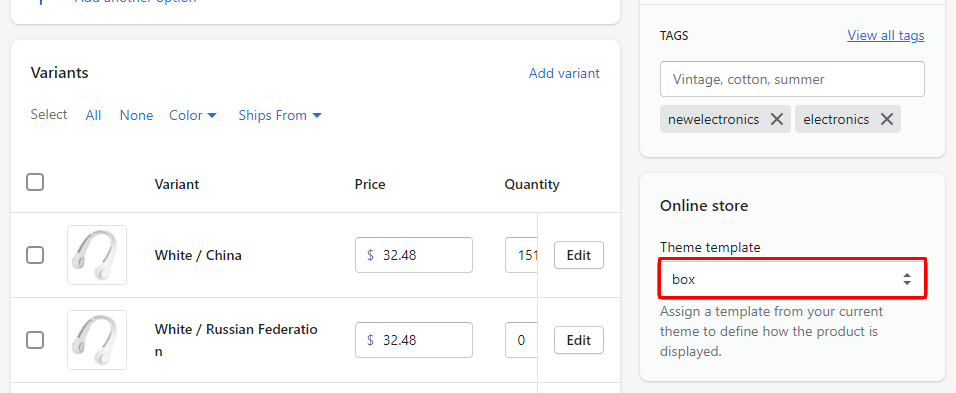
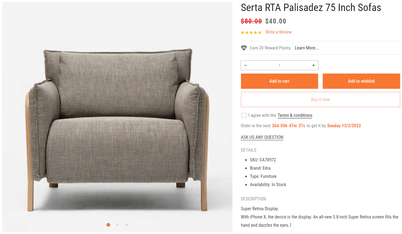
Maxmin 5.x.x version included different 7 Product Detail layouts, and each layout can be changed to 7 different layout Style.
This layout is the default Product detail layout of Maxmin 5.x.x version
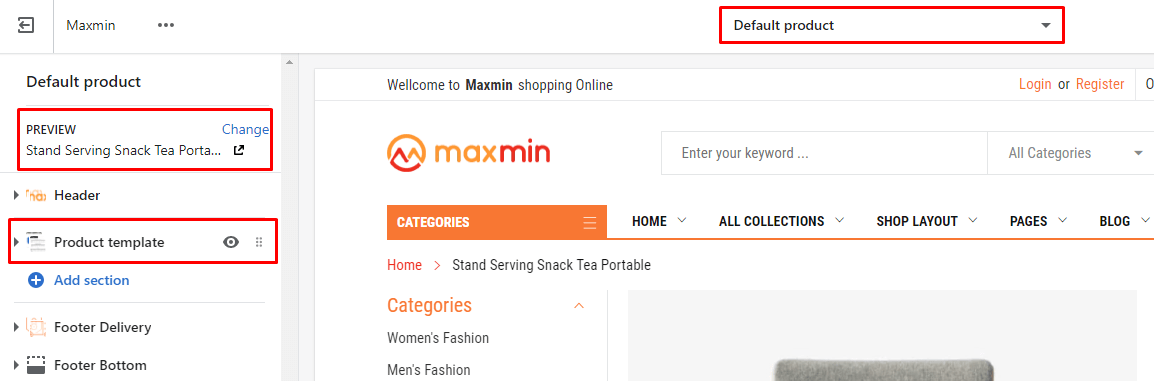
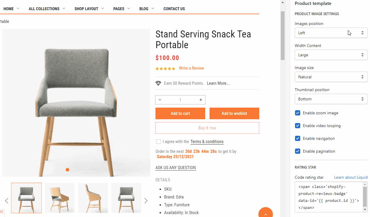
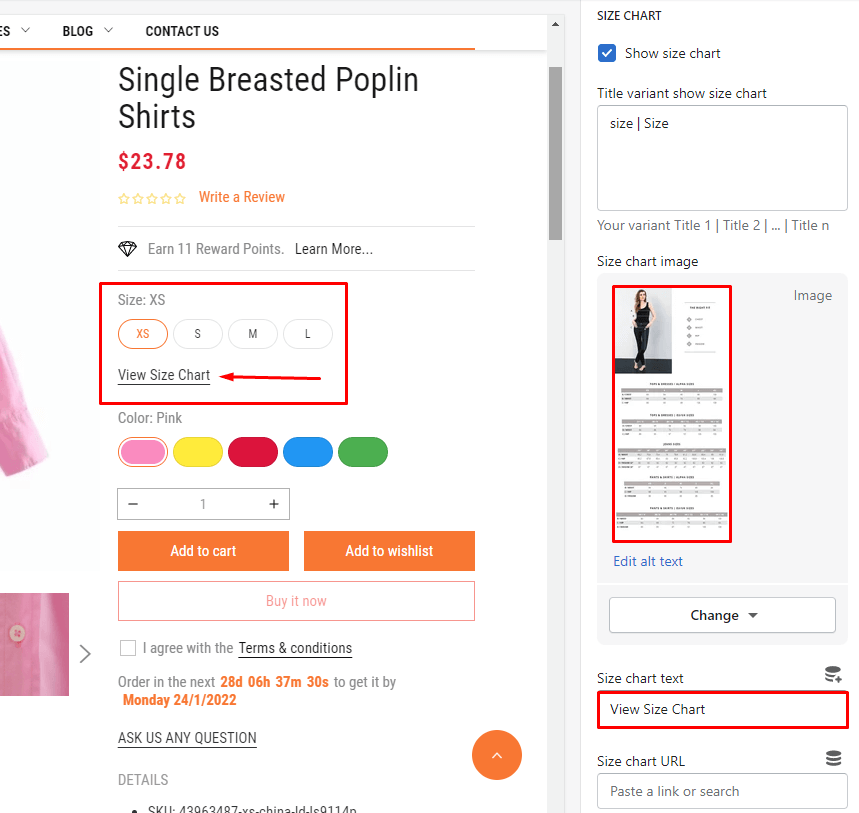
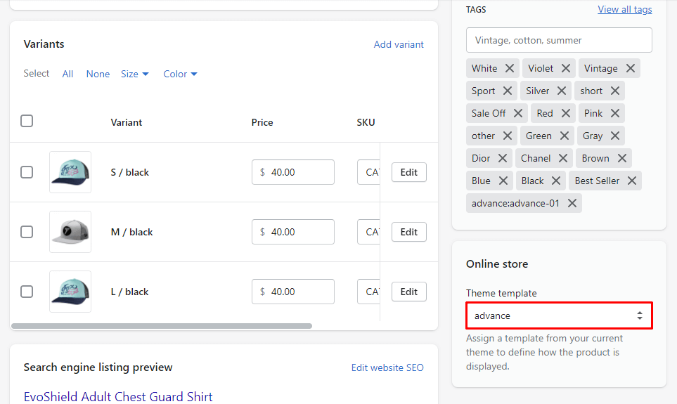
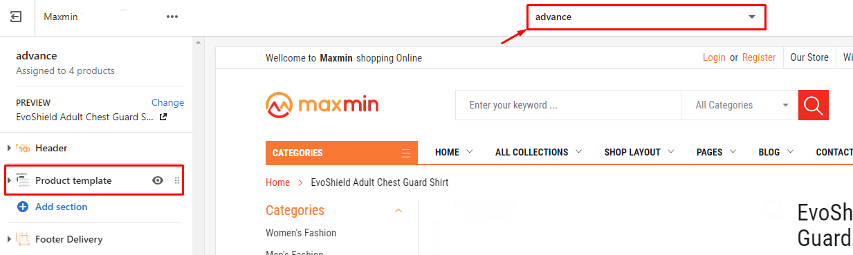
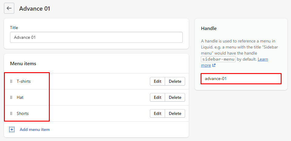
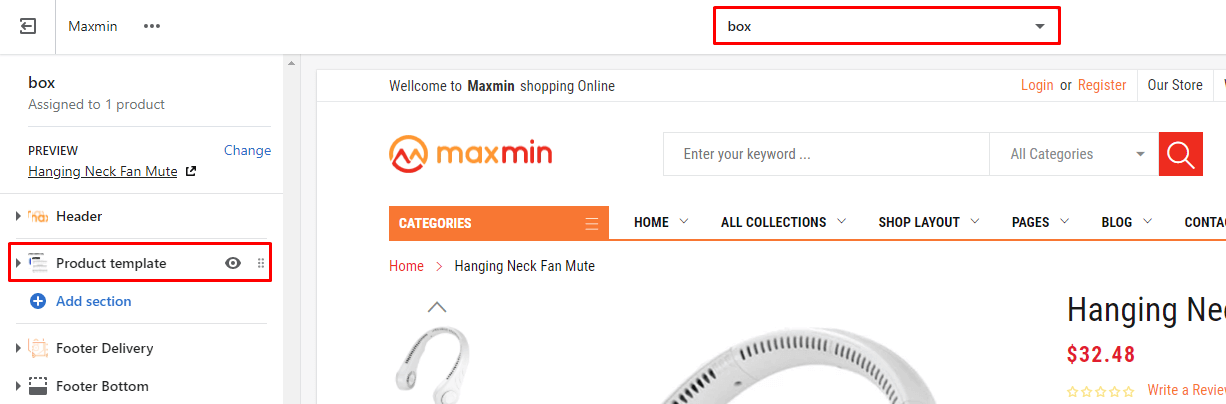
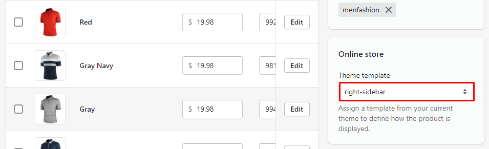
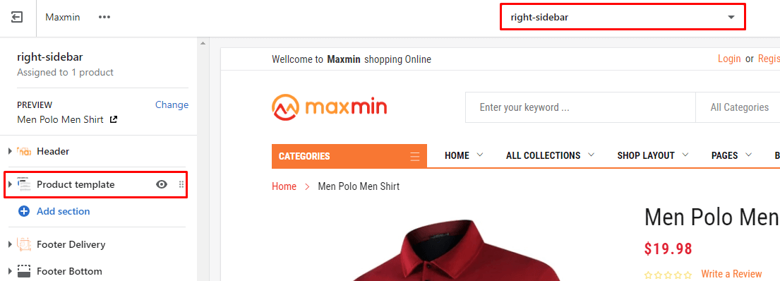
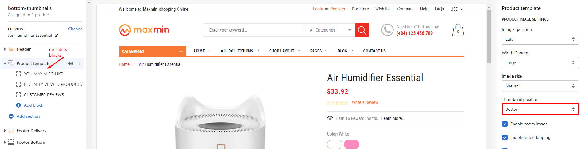
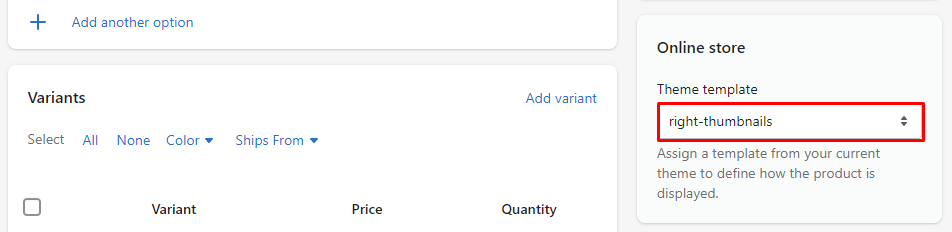
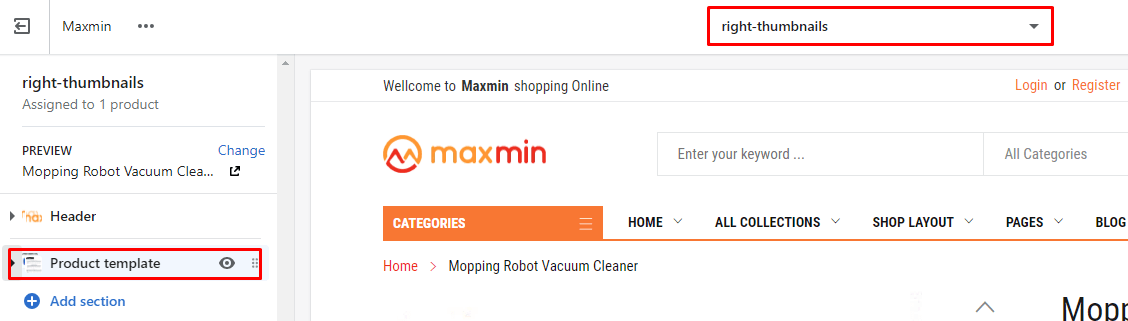
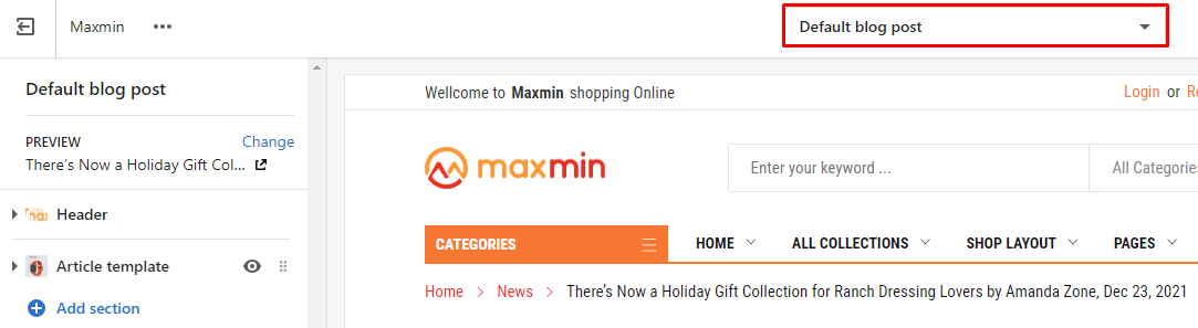
From Customize (Theme Editor) Select View page is ProductsDefault Product, or in Preview, select any product in the Customize. The Product template section will appear in the Left sidebar.
Click to this section , the Right sidebar will list all settings use to setup the Product Sidebar Layout.
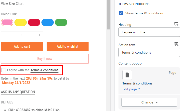
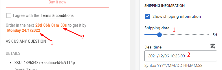
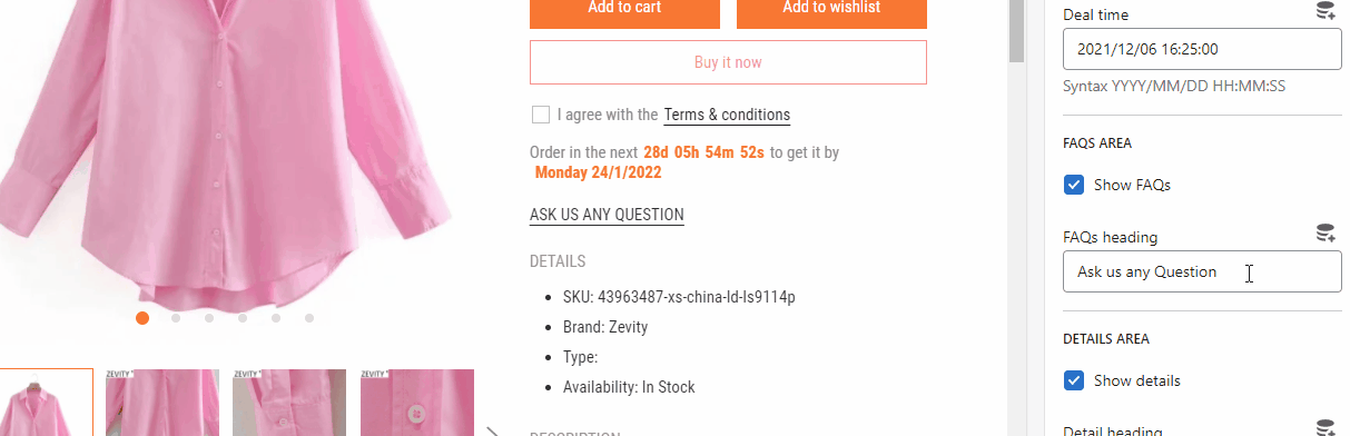
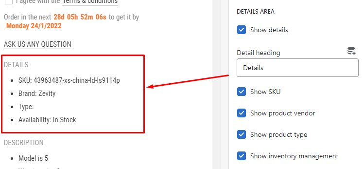
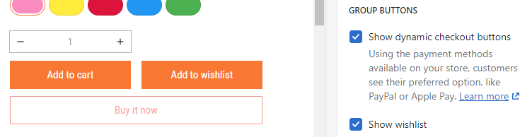
Settings to control the Dynamic checkout buttons (Buy Now) and Wishlist button.
Settings to config the Terms & Conditions.
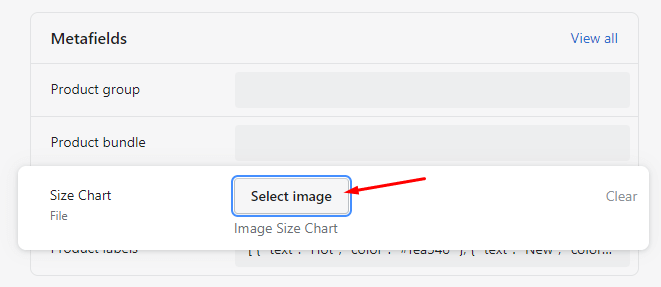
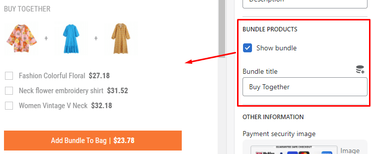
To showing other products in bundle, you need follow these steps:
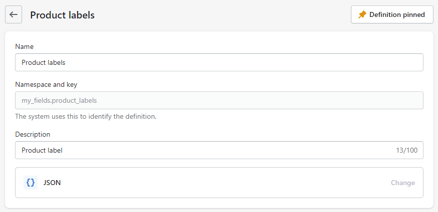
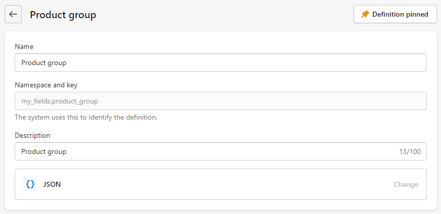
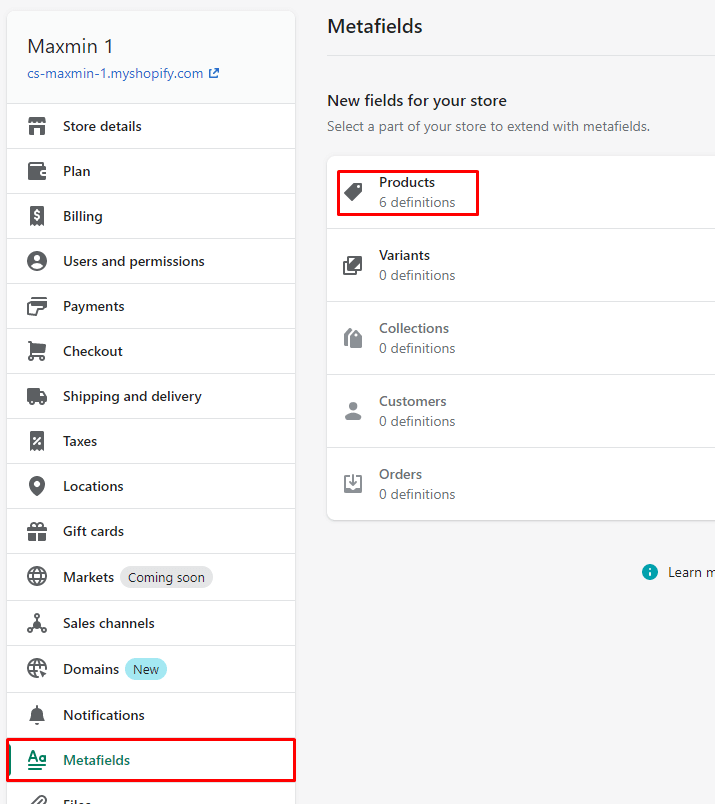
- Step #1: From Your Shopify AdminSettingsMetafieldsProducts
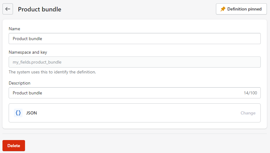
- Step #2: click to top/right Add Definition button, then input new field value:
Name:Product bundle
Description:Product bundle
Select content type:JSON
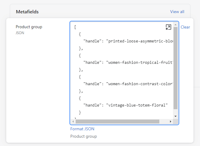
- Step #3: get products handle of these products that appear in the bundle. You can find the handle at the url/address of product.
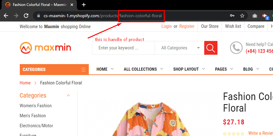
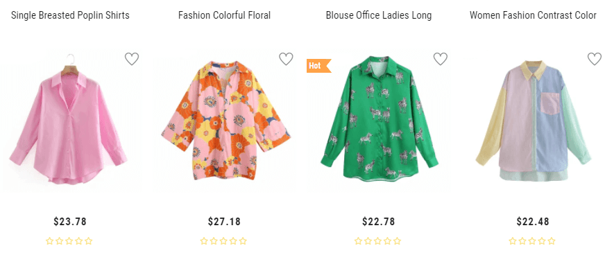
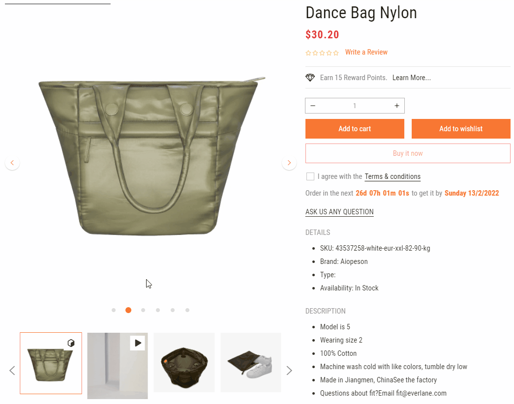
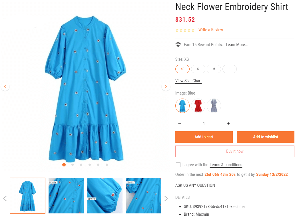
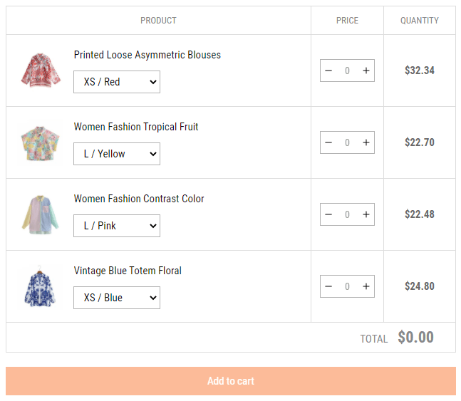
For example, we want 3 products have hanle fashion-colorful-floral,neck-flower-embroidery-shirt, and women-vintage-v-neck into Bundle
- Step #4: From Your Shopify AdminProductsAll Products
- Step #5: select the product that you want show above bundle, then scroll down to Metafields area.
- Step #6: In Product bundle row,input the JSON bundle syntax value:
                                                        [

                                                            {

                                                                    "handle": "fashion-colorful-floral"

                                                                    },

                                                                    {

                                                                    "handle": "neck-flower-embroidery-shirt"

                                                                    },

                                                                    {

                                                                    "handle": "women-vintage-v-neck"

                                                                    }

                                                            ]
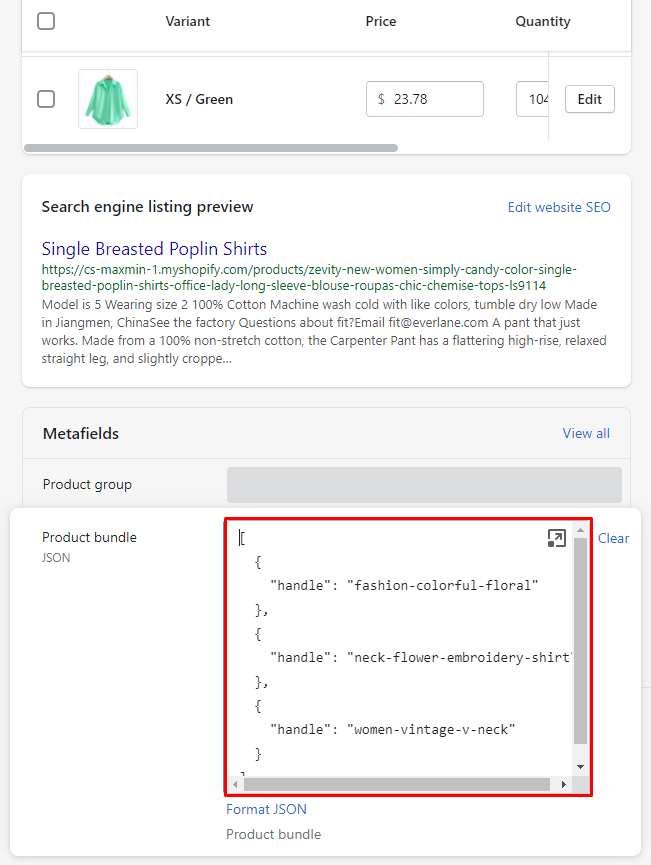
Replace the example products handle by your products handle value.
- That's all!
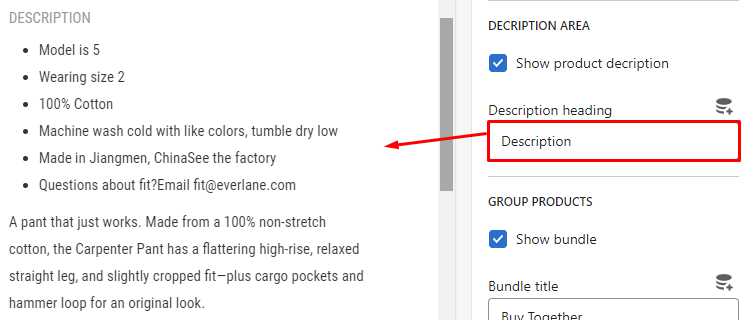
Product detail page also include 4 blocks content in Sidebar as Collection page (not include Sidebar - Slider images):
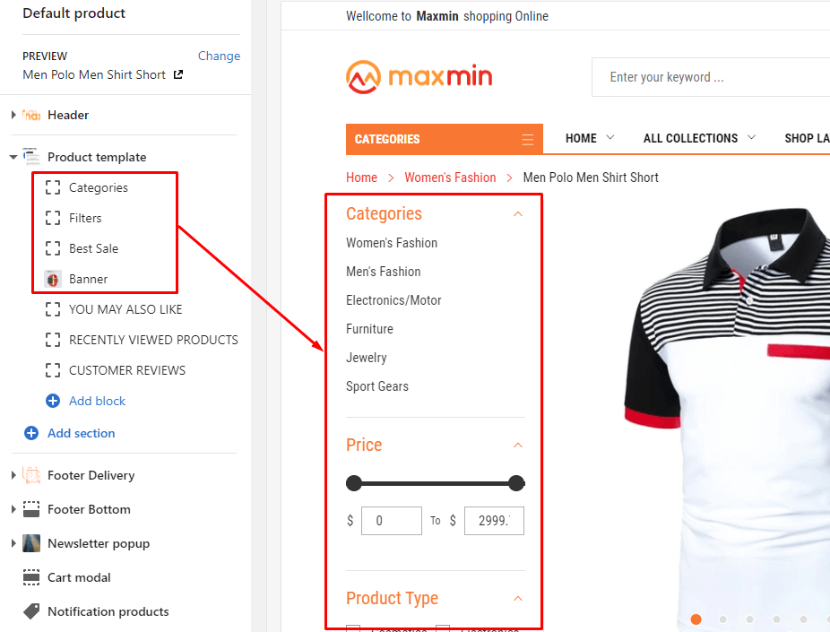
You can read again here.
3 bottom blocks: Product recommendations, Recently viewed, Review (Custom HTML block), and Related Product
These blocks are also a part of blocks content.
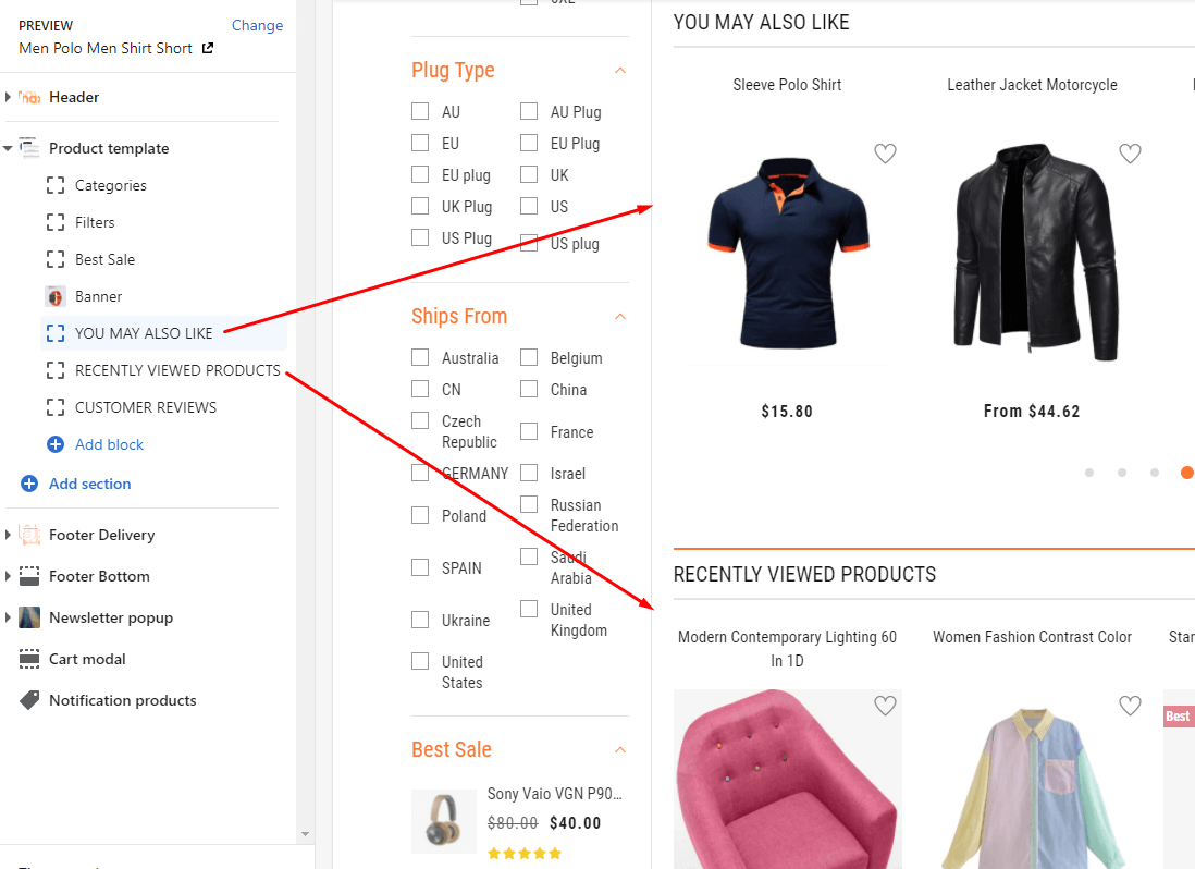
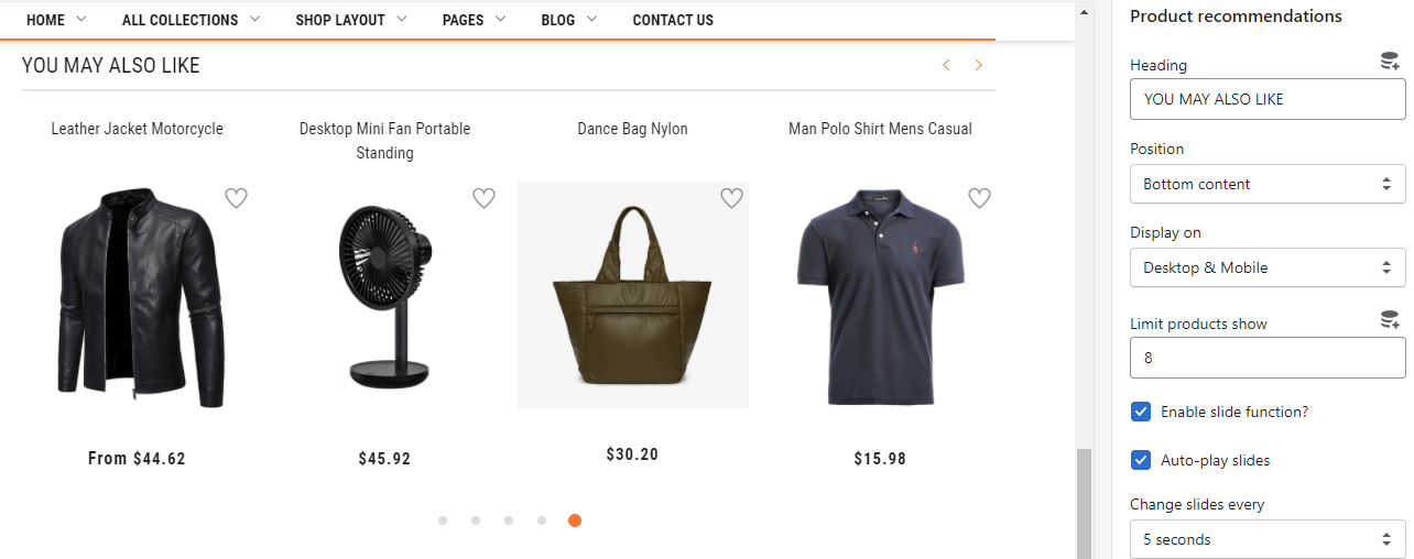
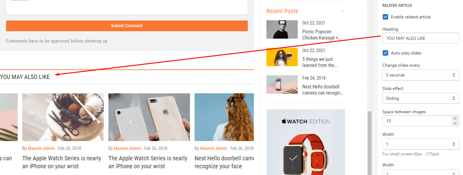
Under the Product template select YOU MAY ALSO LIKE(the exactly name depend on Heading field). The Right sidebar will list all settings use to setup the this section.
- Heading
- Position
- Display on
- Limit products show
- Slider group settings
- Responsive group settings
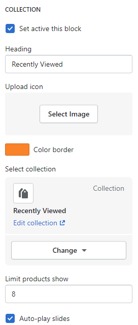
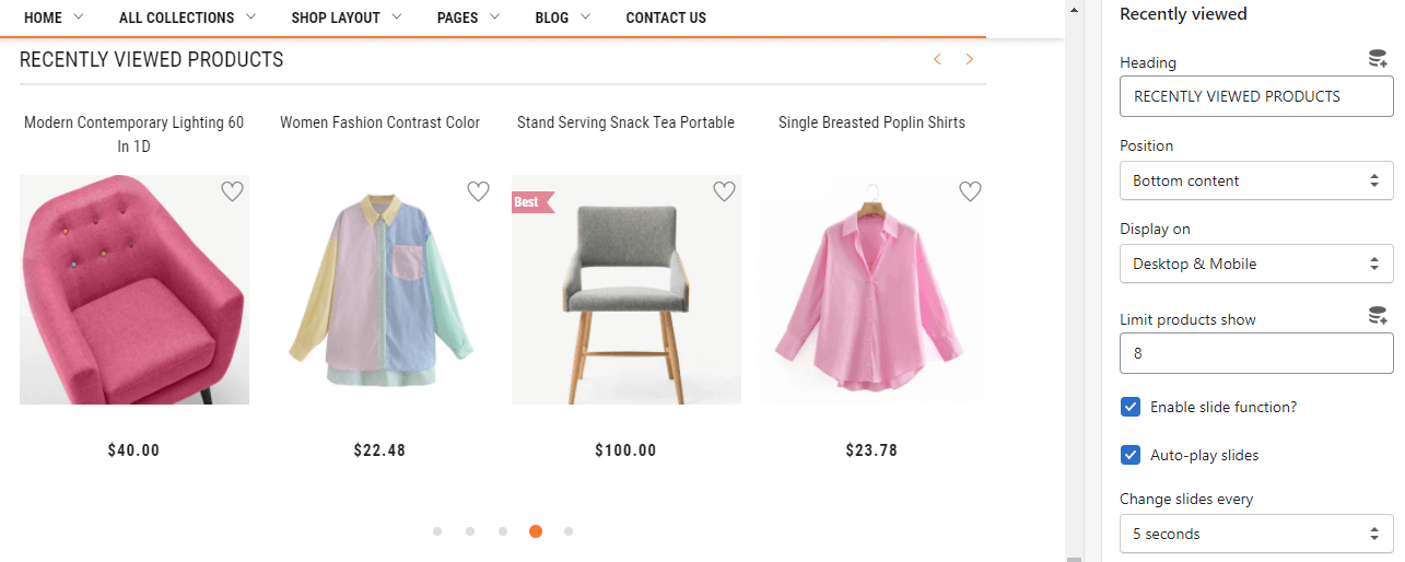
Under the Product template select RECENTLY VIEWED PRODUCTS(the exactly name depend on Heading field). The Right sidebar will list all settings use to setup the this section.
- Heading
- Position
- Display on
- Limit products show
- Slider group settings
- Responsive group settings
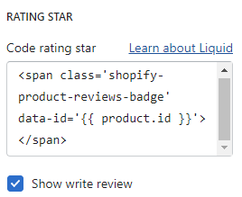
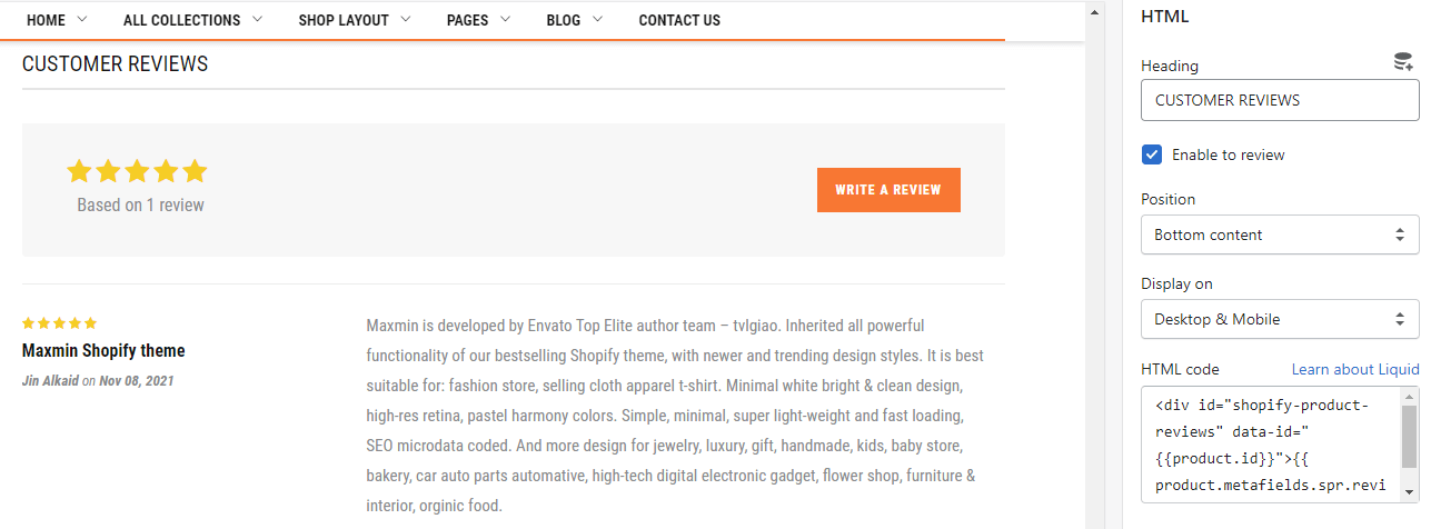
Under the Product template select CUSTOMER REVIEWS(the exactly name depend on Heading field). The Right sidebar will list all settings use to setup the this section.
- Enable to review
- Position
- Display on
- HTML code: input the review of 3rd party code.
Under the Product templateAdd blockRelated Products. The Right sidebar will list all settings use to setup the this section.
- Heading
- Position
- Display on
- Limit products show
- Slider group settings
- Responsive group settings
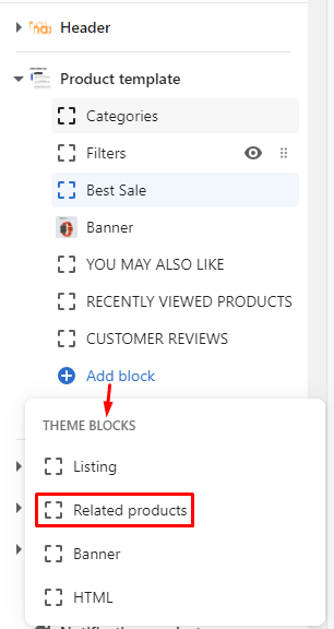
The config and result the same Product recommendations. Currently in our live demo, it appear in the Sidebar as Best Sale block.
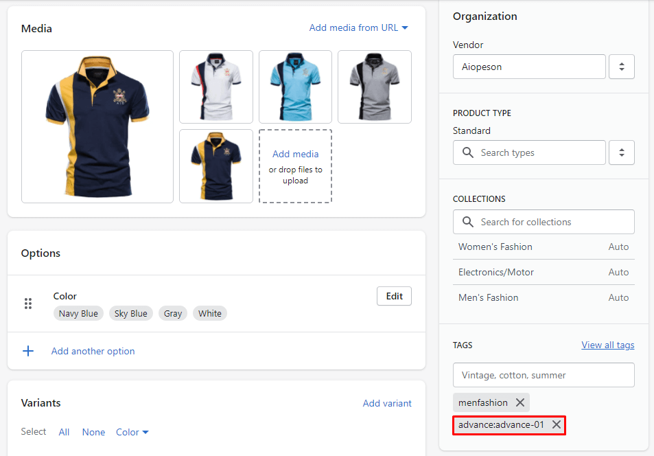
This layout is not active as default for all products. So, You need set products using this layout manually.
After setup the product using the Advance Product Type layout, you can go to Customize to control the layout settings.
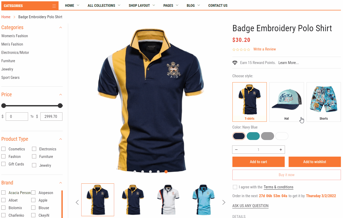
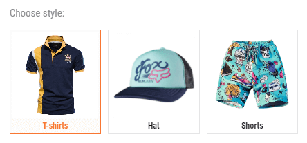
The Advance Product Type layout is the same Product Sidebar Layout, the only difference is the new Choose style: feature. It will display other product's styles with the viewing product.
In this case, we will guide how to active the Choose style: feature. Other settings area (Product image settings, Group functions, Group buttons, Sidebar, Bottom content,... ) please help us read again the guide.
This layout is not active as default for all products. So, You need set products using this layout manually.
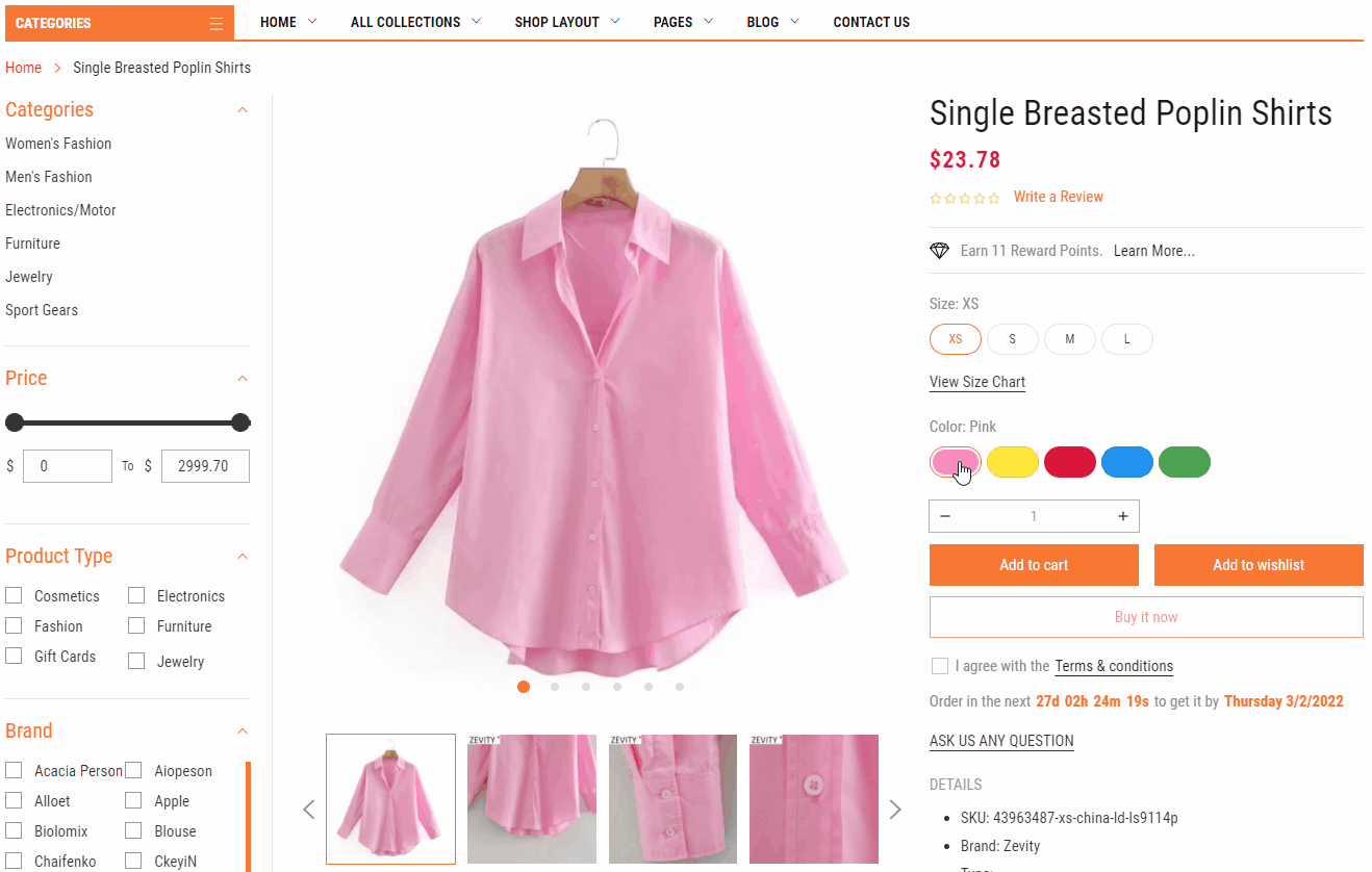
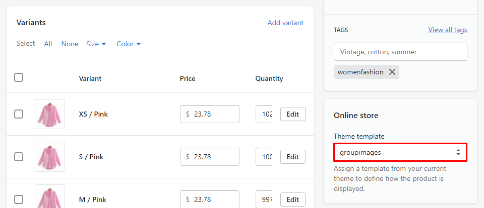
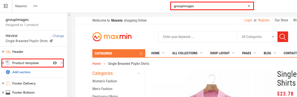
After setup the product using the Group Images Variants layout, you can go to Customize to control the layout settings.
The Group Images Variants layout is the same Product Sidebar Layout, the only difference is only showing images of the selected variant. For example, only show Pink images in the gallery when the Pink variant is selected.
In this case, we will guide how to active the Group Images Variants feature. Other settings area (Product image settings, Group functions, Group buttons, Sidebar, Bottom content,... ) please help us read again the guide.
This layout is not active as default for all products. So, You need set products using this layout manually.
After setup the product using the Product Box layout, you can go to Customize to control the layout settings.
The Product Box layout is the same Product Sidebar Layout, the only difference is the layout (no sidebar)
Please help us read again the guide for all layout settings.
This layout is not active as default for all products. So, You need set products using this layout manually.
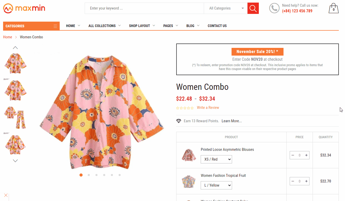
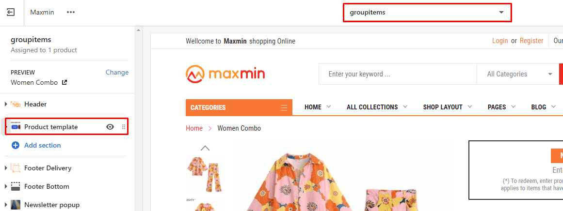
After setup the product using the Product Group Items layout, you can go to Customize to control the layout settings.
The Product Group Items layout is the same Product Sidebar Layout, the only difference is
In this case, we will guide how to active the Discount Information and Group Items listing feature. Other settings area (Product image settings, Group functions, Group buttons, Sidebar, Bottom content,... ) please help us read again the guide.
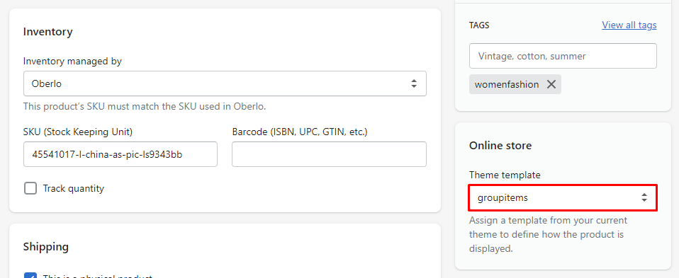
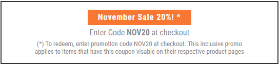
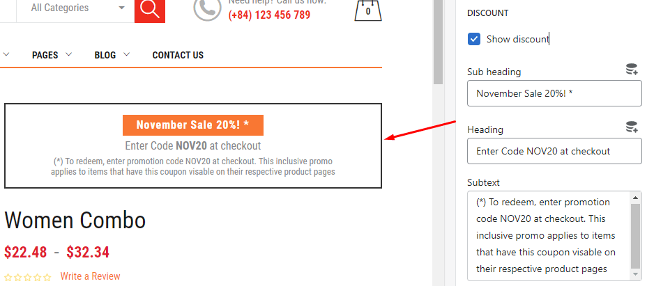
From settings of Product template appear in the Right sidebar, select DISCOUNT.
Input content of Sub heading, Heading, and Subtext field
[
{
"handle": "printed-loose-asymmetric-blouses"
},
{
"handle": "women-fashion-tropical-fruit"
},
{
"handle": "women-vintage-v-neck"
},
{
"handle": "women-fashion-contrast-color",
}
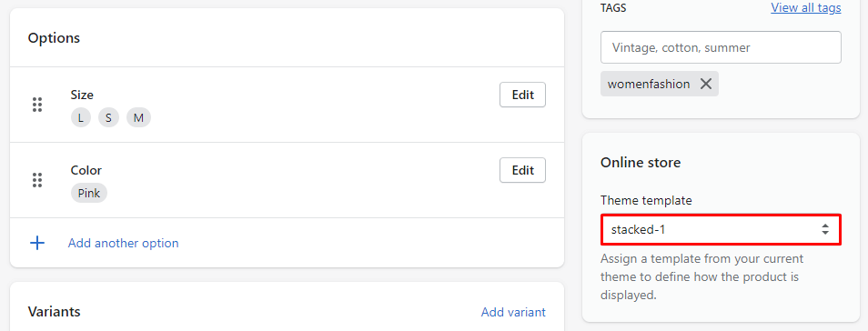
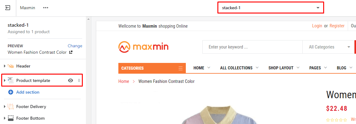
]This layout is not active as default for all products. So, You need set products using this layout manually.
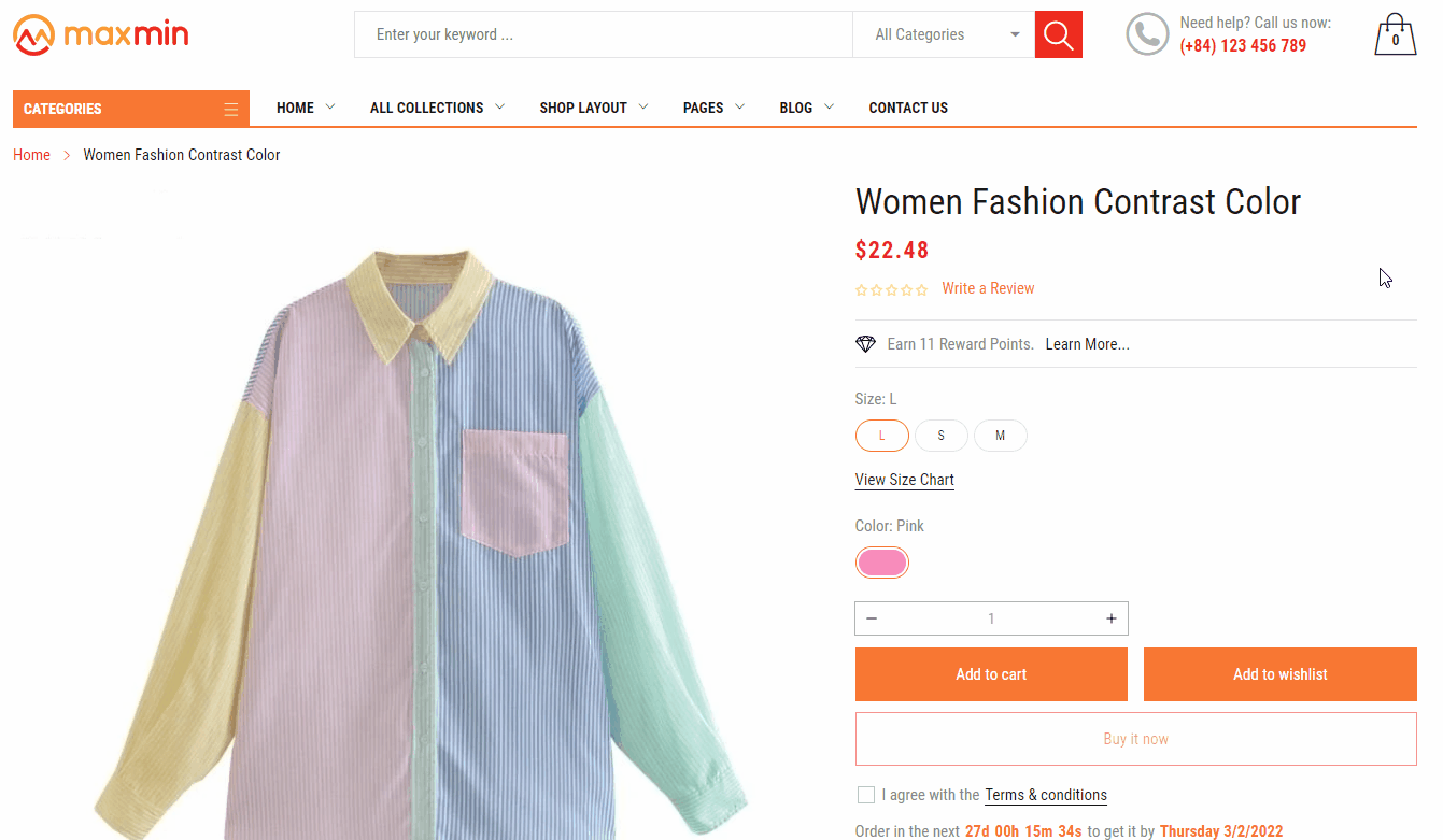
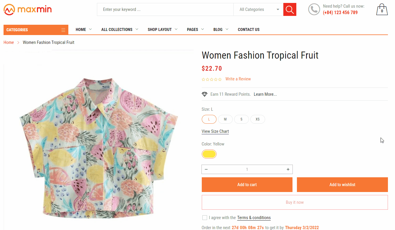
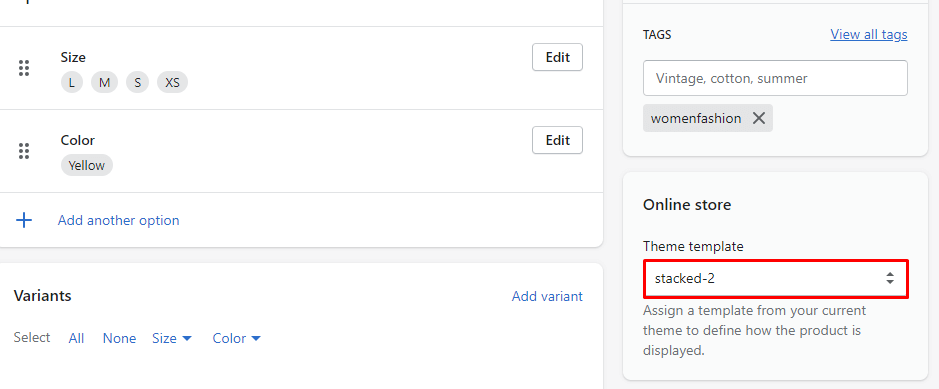
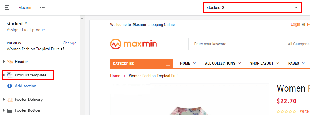
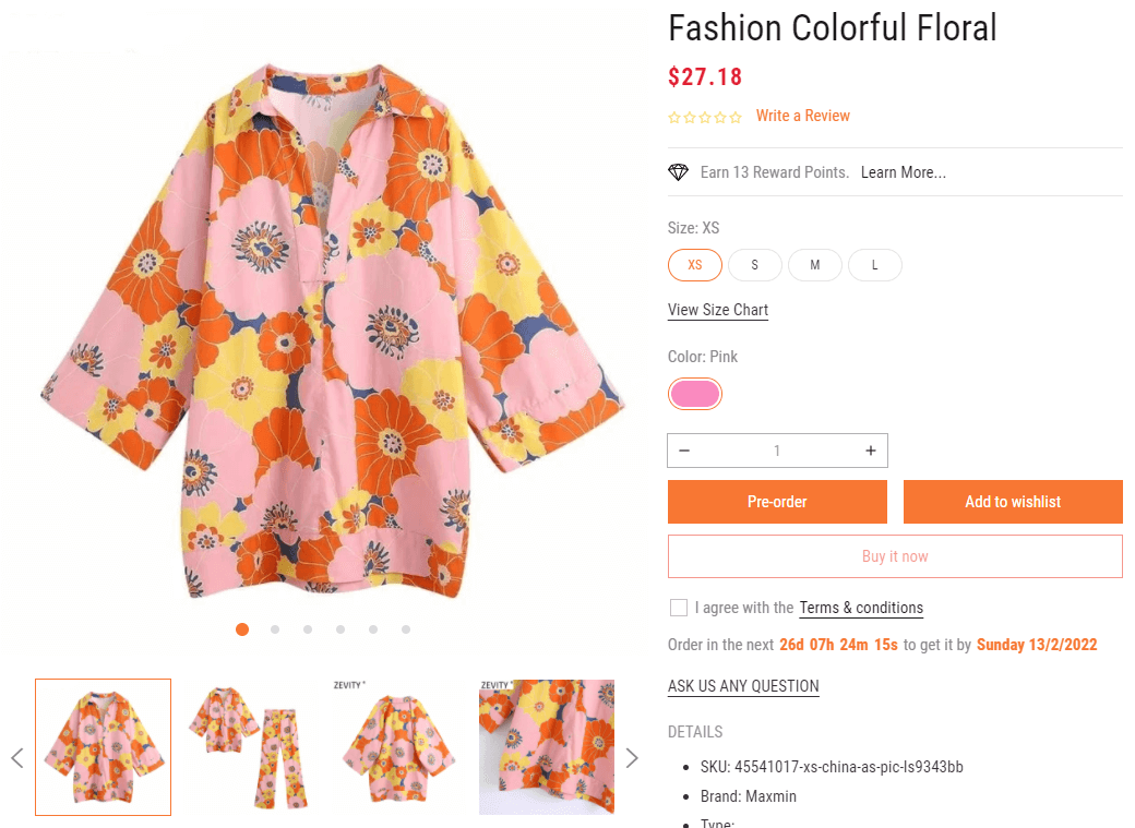
After setup the product using the Product Stacked 1 layout, you can go to Customize to control the layout settings.
The Product Stacked 1 layout is the same Product Sidebar Layout, the only difference is the layout (no sidebar and stacked style 1 gallery)
Please help us read again the guide for all layout settings.
This layout is not active as default for all products. So, You need set products using this layout manually.
After setup the product using the Product Stacked 2 layout, you can go to Customize to control the layout settings.
The Product Stacked 2 layout is the same Product Sidebar Layout, the only difference is the layout (no sidebar and stacked style 2 gallery)
Please help us read again the guide for all layout settings.
This layout will replace the Add to cart button with the Pre-order button 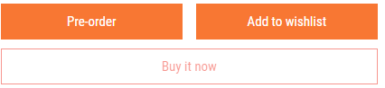
Conditional of product have this button:
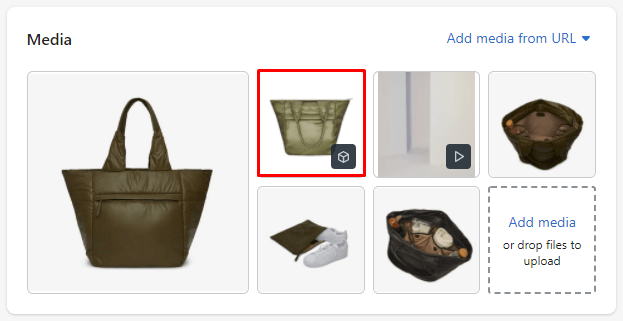
Maxmin 5.x.x version support 3D Model in Gallery.
You can upload 3D Model image with *.GLB format into Media area.
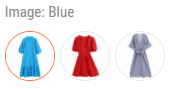
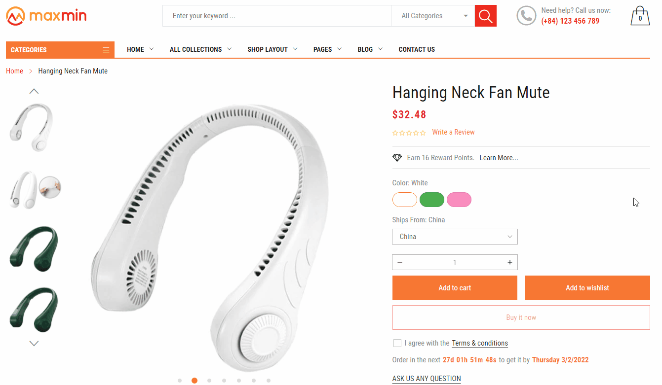
This layout will show the Color/Image option as an Image variant.
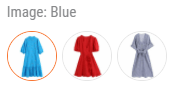
You need set Options Mapping of Color/Image into Color:image/Image:image
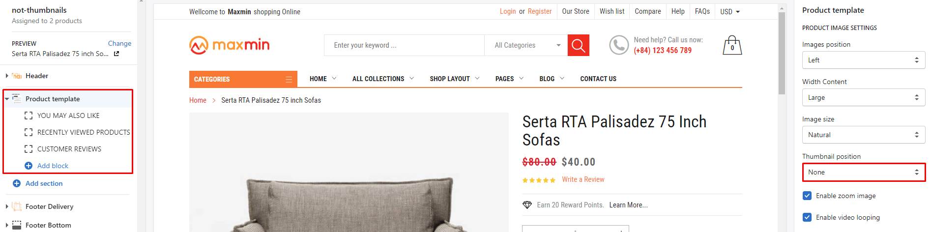
This layout is different from the Default layout in the Sidebar from Left to Right.
From Default Sidebar layout, You need to set the Position of 4 Sidebar blocks from Left sidebar to Right sidebar.
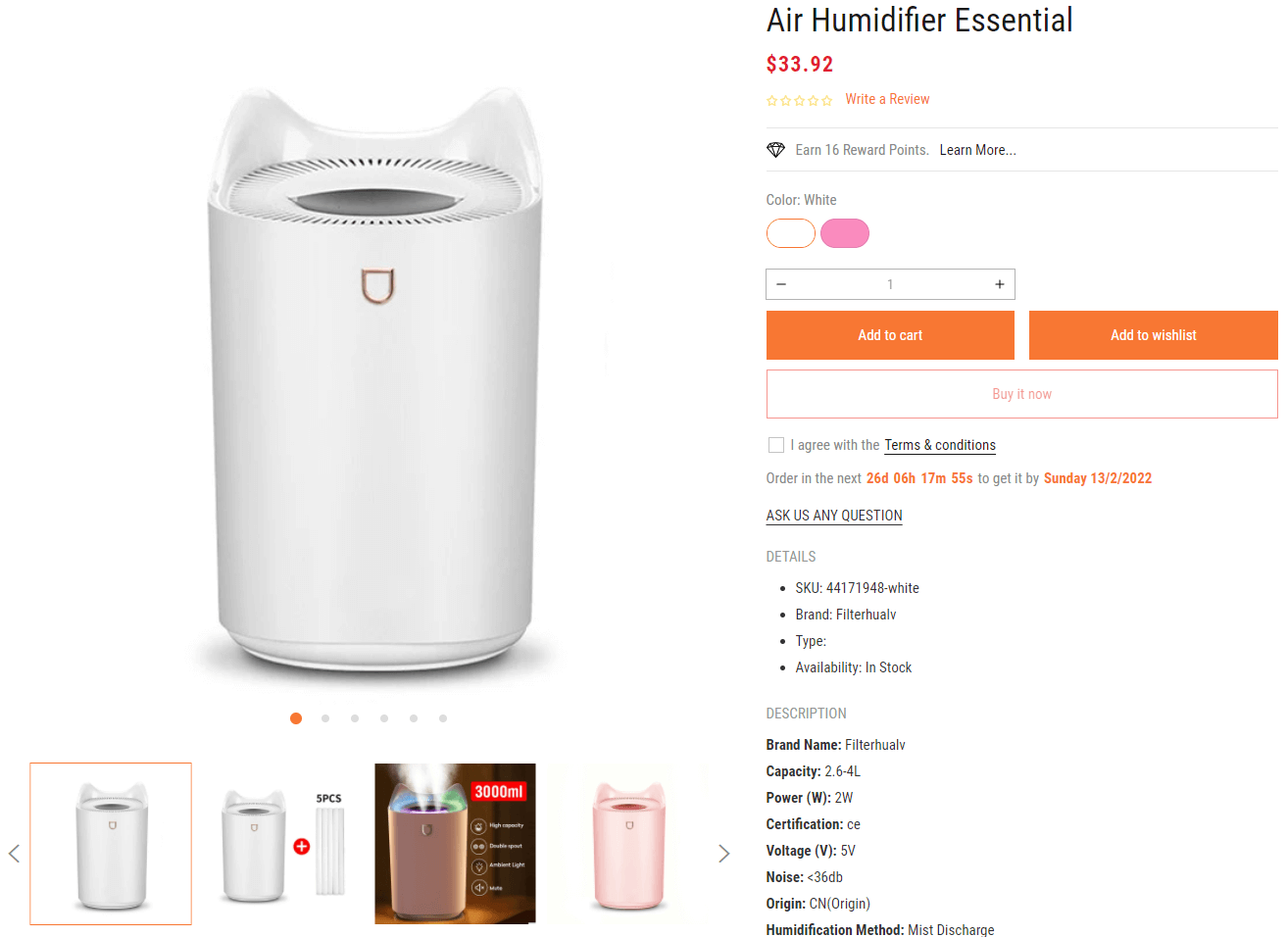
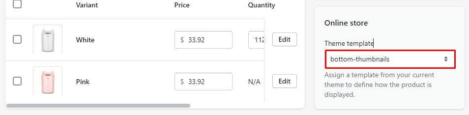
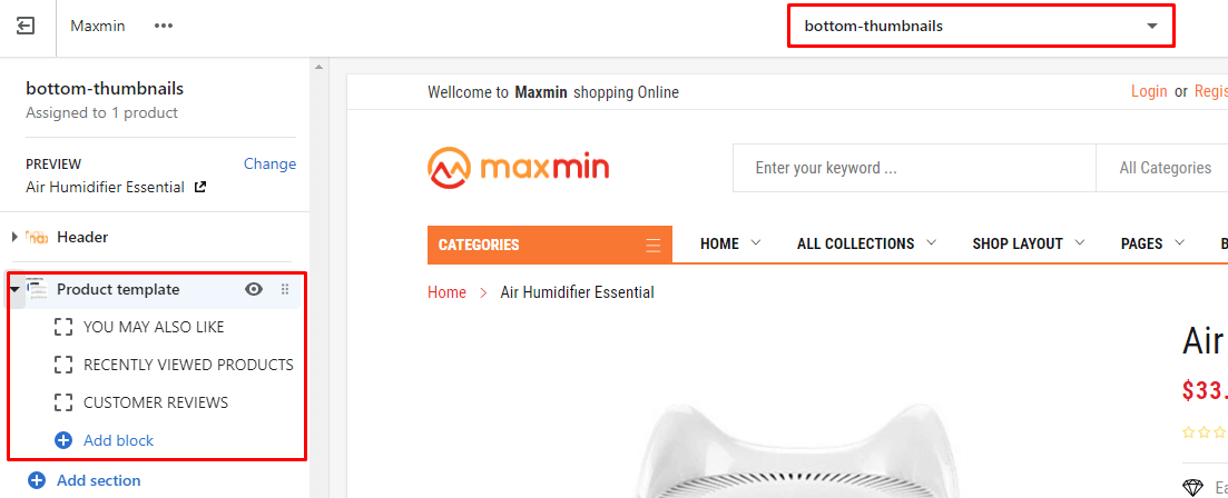
From Default Sidebar layout, You need remove 4 Sidebar blocks and set Thumbnail position to Bottom.
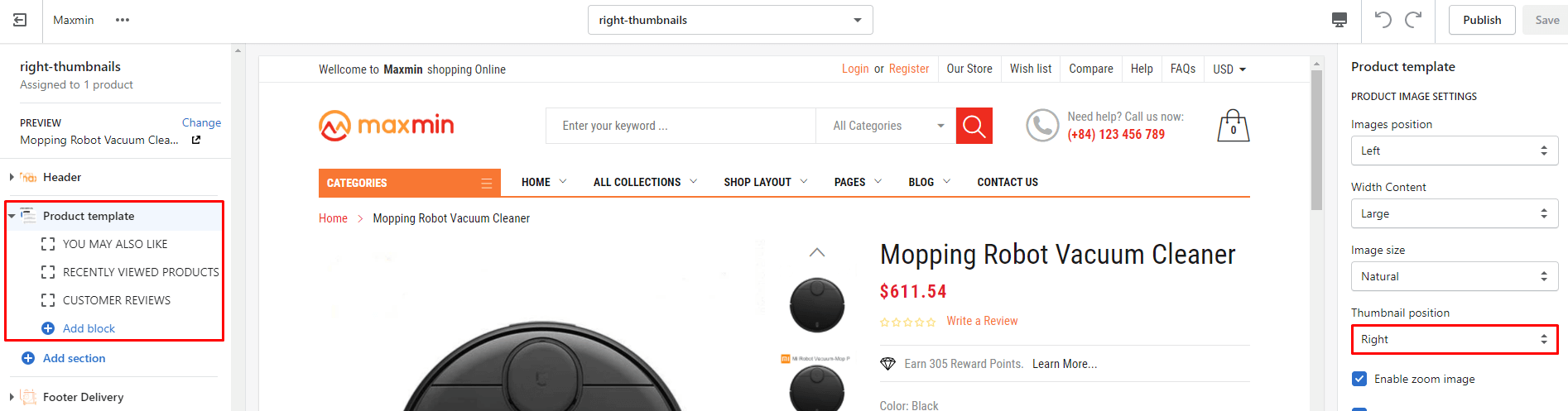
From Default Sidebar layout, You need remove 4 Sidebar blocks and set Thumbnail position to Right.
From Default Sidebar layout, You need remove 4 Sidebar blocks and set Thumbnail position to None.
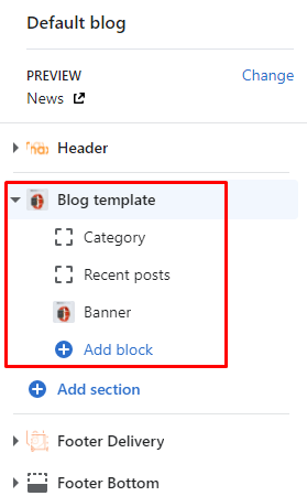
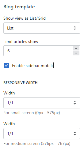
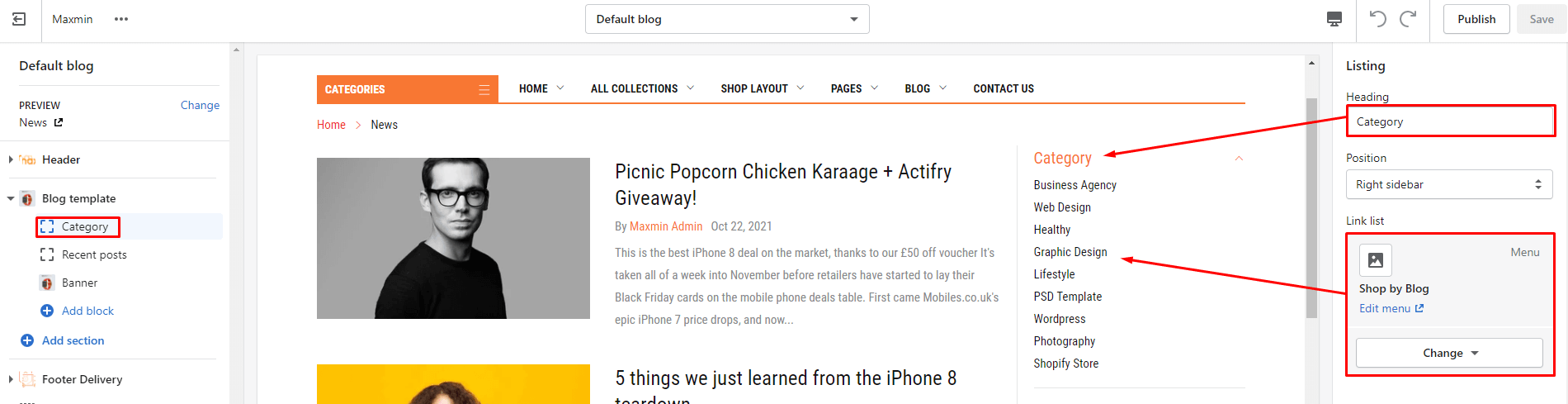
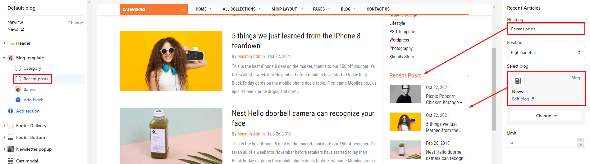
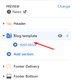
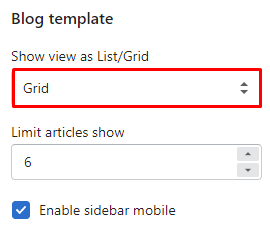
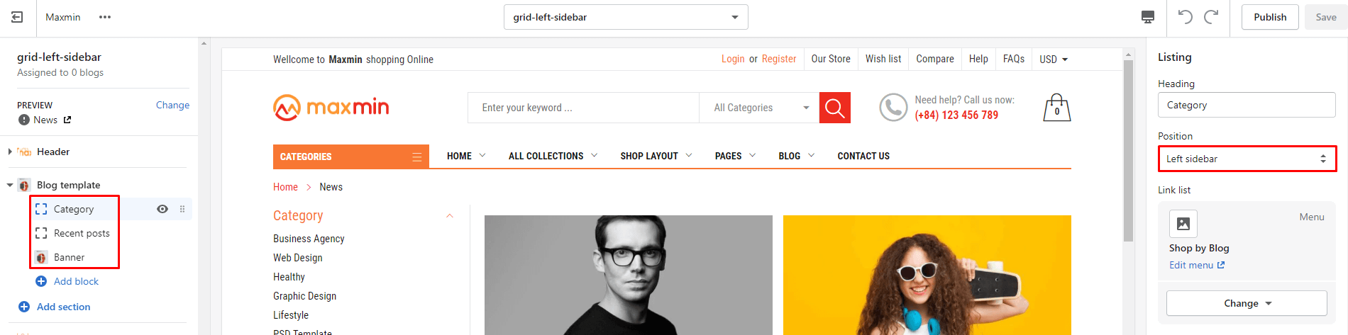
Blog template section include settings:
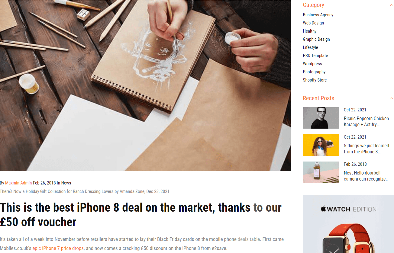
This layout is different from the Default layout in the Sidebar from Right to Left.
From Default layout, You need to set the Position of 4 Sidebar blocks from Right sidebar to Left sidebar.
This layout is different from the Default layout in No Sidebar.
From Default layout, You need to set remove 4 Sidebar blocks.
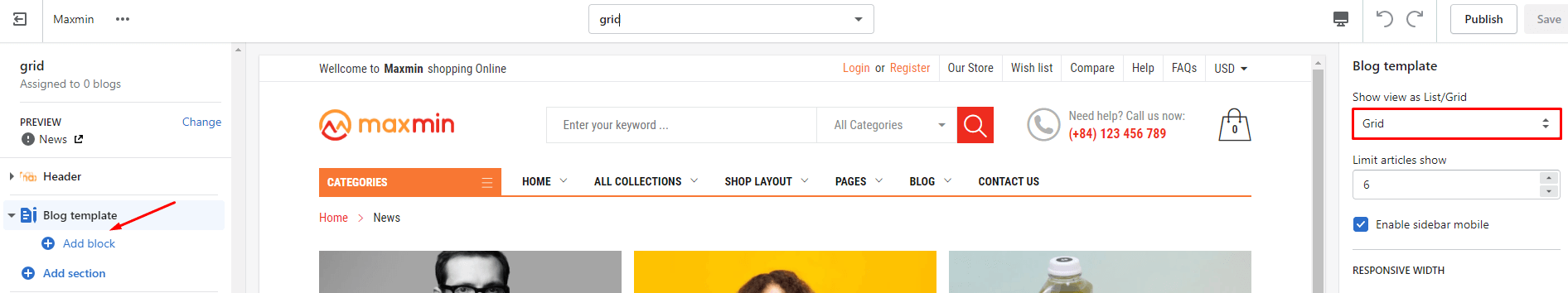
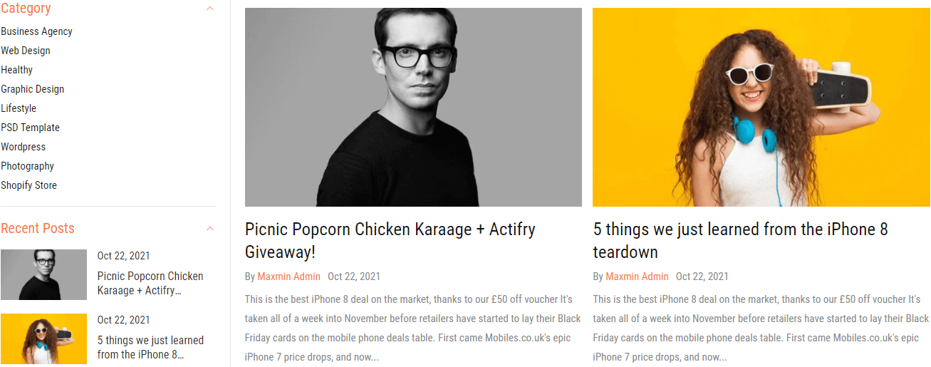
This layout is different from the Default layout in the listing in Grid.
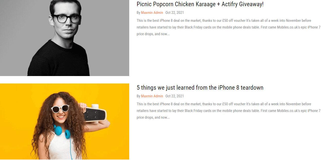
From Default layout, You need to set remove 4 Sidebar blocks. Then, set Show view as List/Grid to Grid
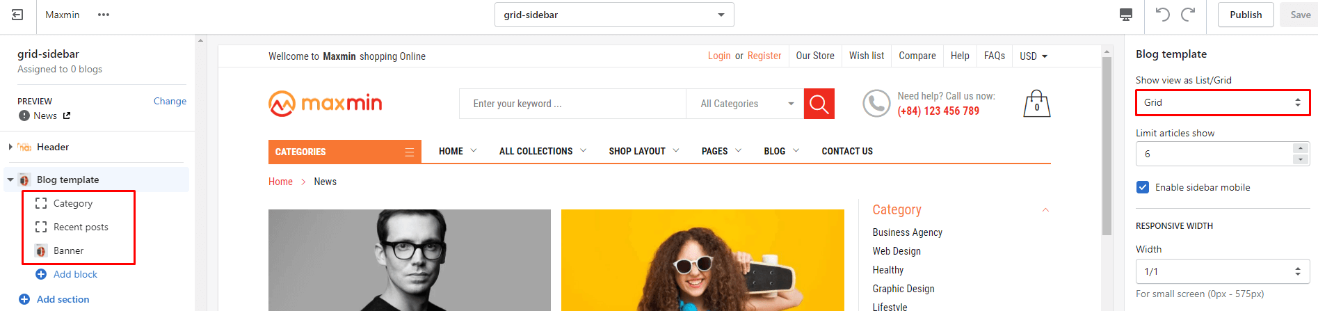
This layout is different from the Default layout in the listing in Grid with Right Sidebar.
From Default layout, You need to set Show view as List/Grid to Grid
This layout is different from the Default layout in the listing in Grid with Left Sidebar.
From Default layout, You need to set Show view as List/Grid to Grid. Then, set the Position of 4 Sidebar blocks from Right sidebar to Left sidebar
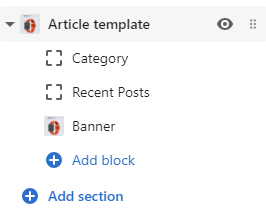
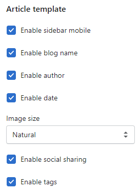
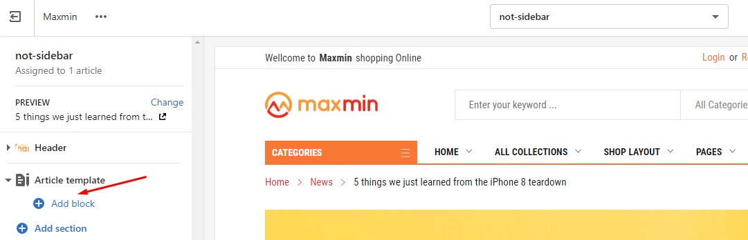
Artile template section include settings:
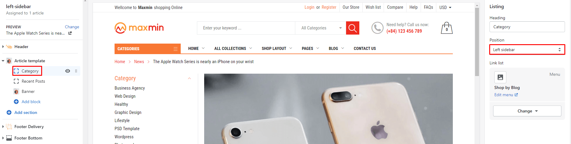
Under Article template section, will list all Blog sidebar blocks. You also can click to Add block button to add a new or more sidebar block. These sidebar blocks the same in Blogs page, you can read at again here.
This layout is different from the Default layout in the Sidebar from Right to Left.
From Default layout, You need to set the Position of 4 Sidebar blocks from Right sidebar to Left sidebar.
This layout is different from the Default layout in No Sidebar.
From Default layout, You need to set remove 4 Sidebar blocks.
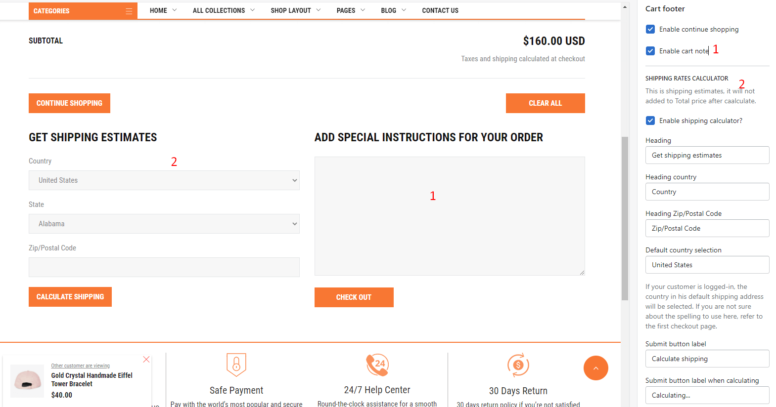
This section include 1 option: Enable continue shopping
This section include options:
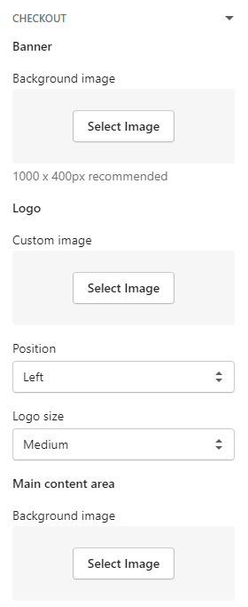
From Customize (Theme Editor)Theme settingsCheckout
Please read again at here
This section include 2 options:
- Enable title: show page Title.
- Enable content: show the content of the page.
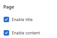
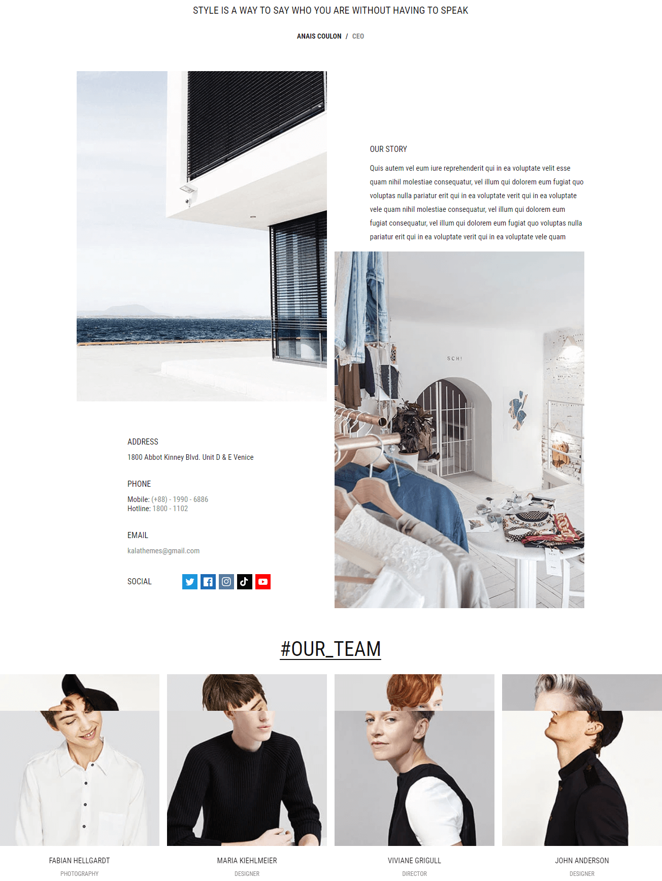
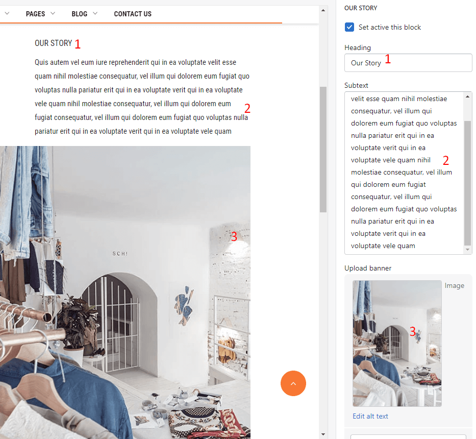
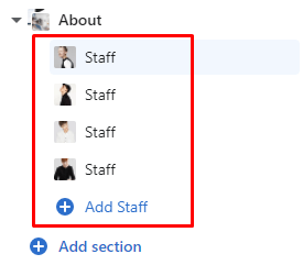
By default, this section has been disabled. You can enable it by clicking to eye icon near the About text.
This section include 2 options:
- Enable title: show page Title.
- Enable content: show the content of the page.
By default, this section has been disabled. You can enable it by clicking to eye icon near the About text.
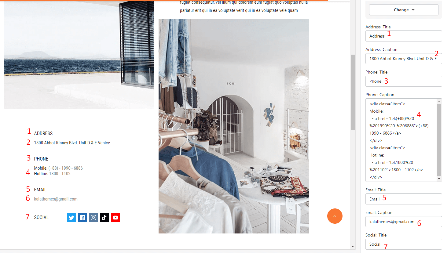
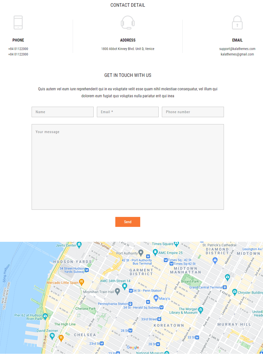
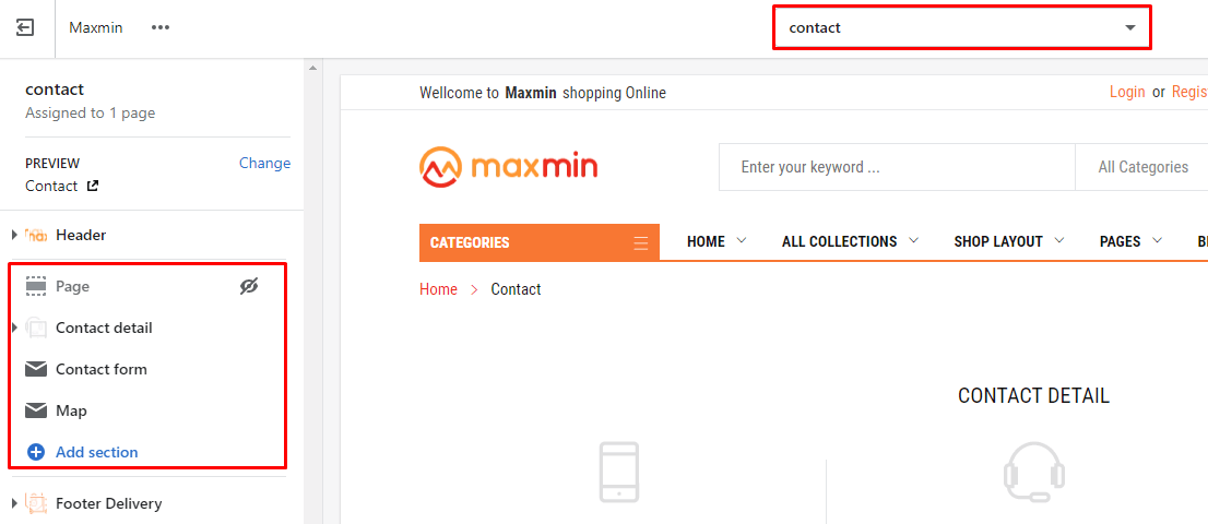
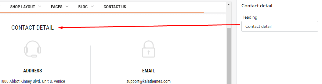
This section include option:
- Heading
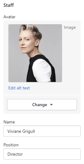
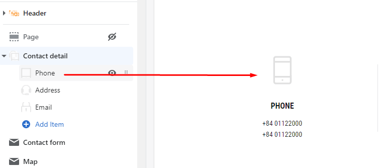
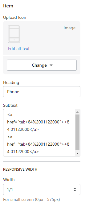
Under Contact detail section, will list all Information blocks. You also can click to Add Item button to add a new or more. Each Item include option to show icon, Heading, Subtext and Responsive width.
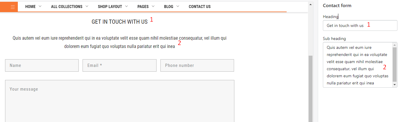
This section include 2 options:
- Heading
- Sub heading
This section include options:
- Display on
- Layout
- Map iframe
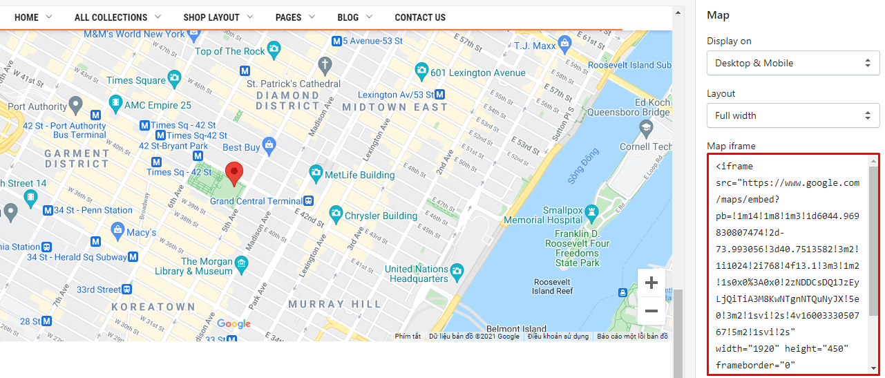
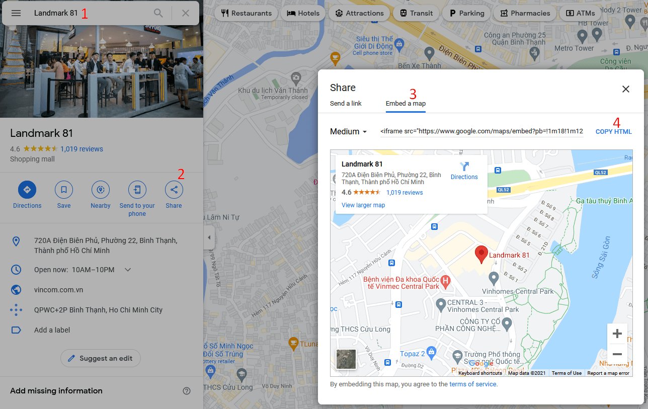
Follow below image to know how to get the Map iframe
This section include 2 options:
- Enable title: show page Title.
- Enable content: show the content of the page.
By default, this section has been disabled. You can enable it by clicking to eye icon near the About text.
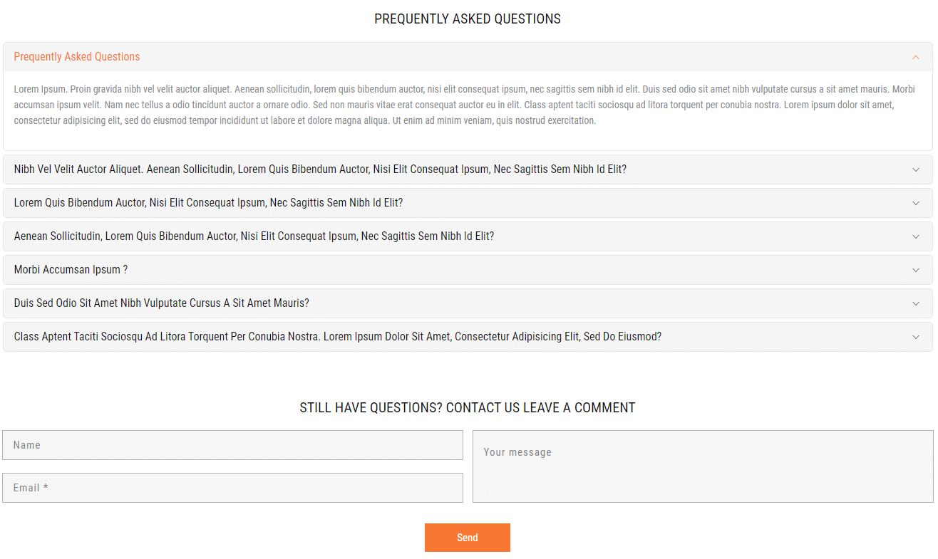
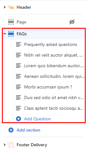
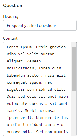
This section include options to control Questions and Form:
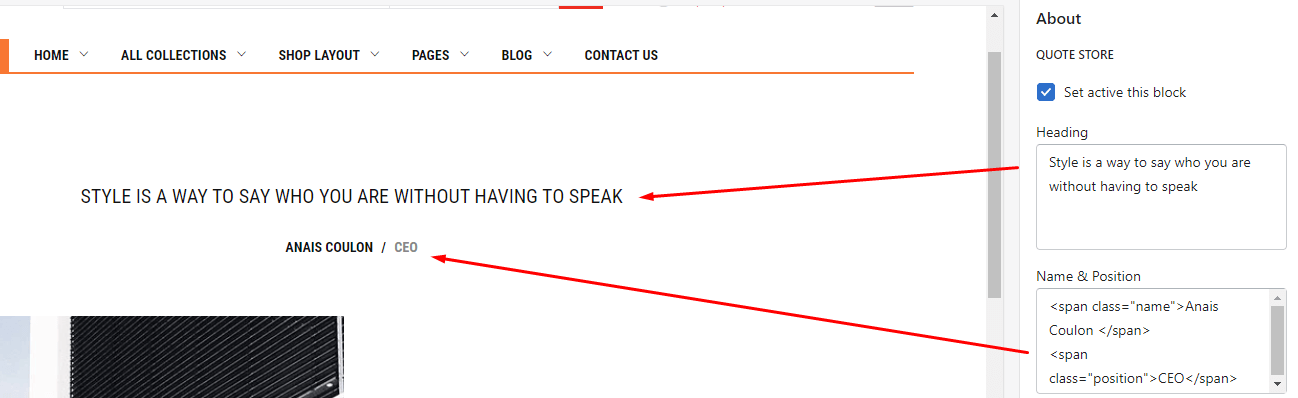
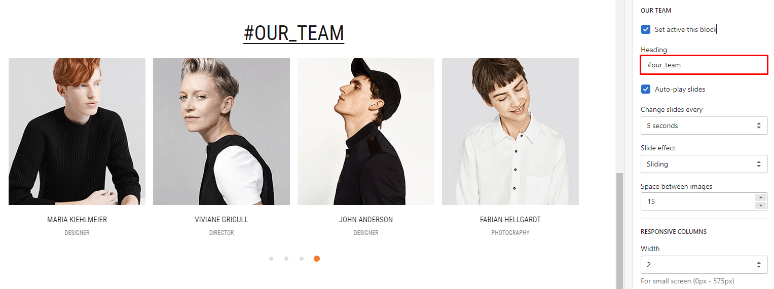
- Set active this block
- Heading
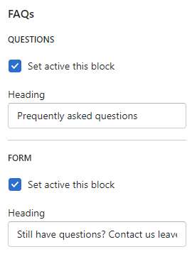
Under FAQs section, will list all question blocks. You also can click to Add Question button to add a new or more. Each Item include option to show Heading and Content.
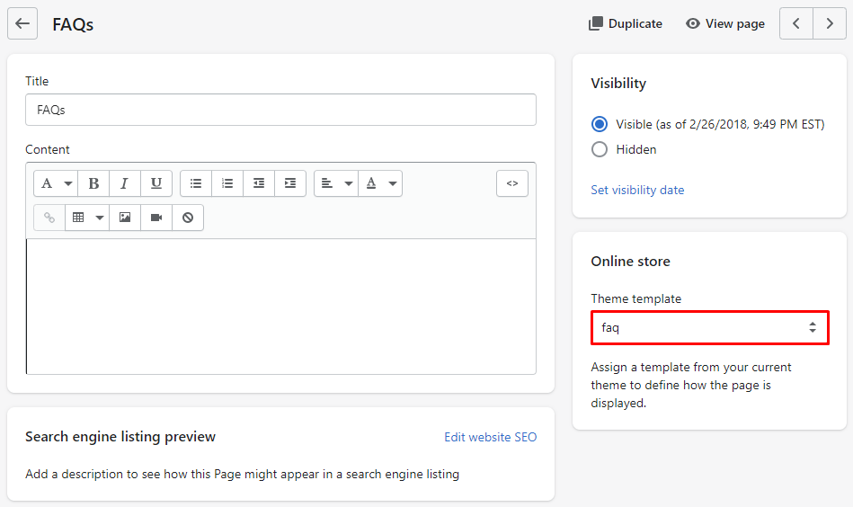
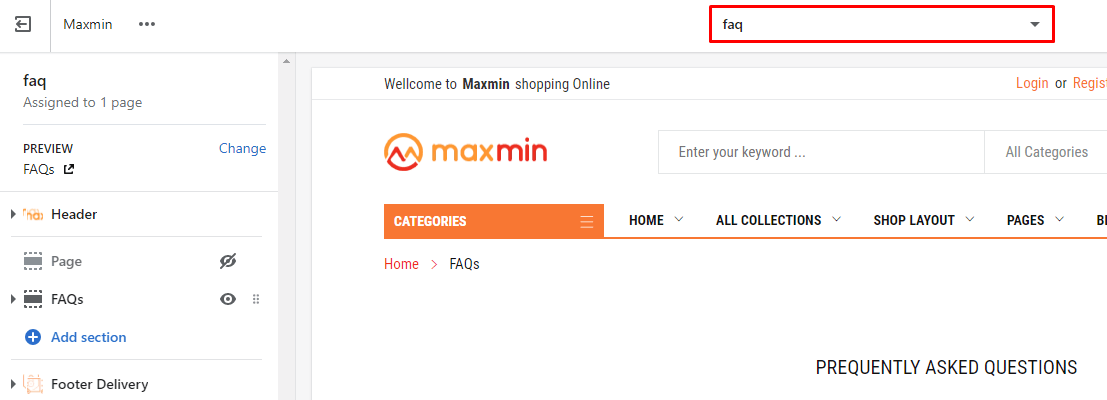
This section include 2 options:
- Enable title: show page Title.
- Enable content: show the content of the page.
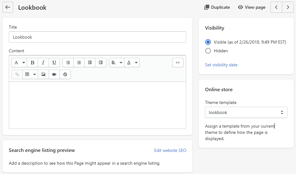
By default, this section has been disabled. You can enable it by clicking to eye icon near the About text.
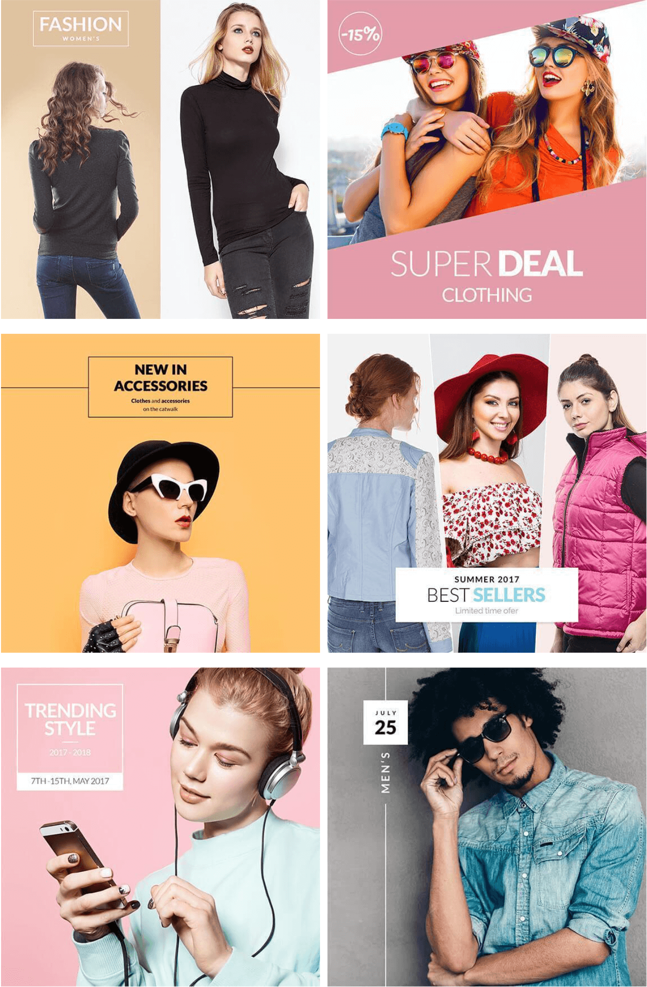
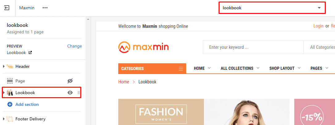
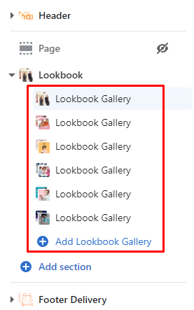
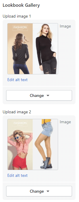
Under Lookbook section, will list all question blocks. You also can click to Add Lookbook Gallery button to add a new or more. Each Lookbook Gallery include option to upload 3 images.
This section include 2 options:
- Enable title: show page Title.
- Enable content: show the content of the page.
This section include 2 options:
- Enable title: show page Title.
- Enable content: show the content of the page.
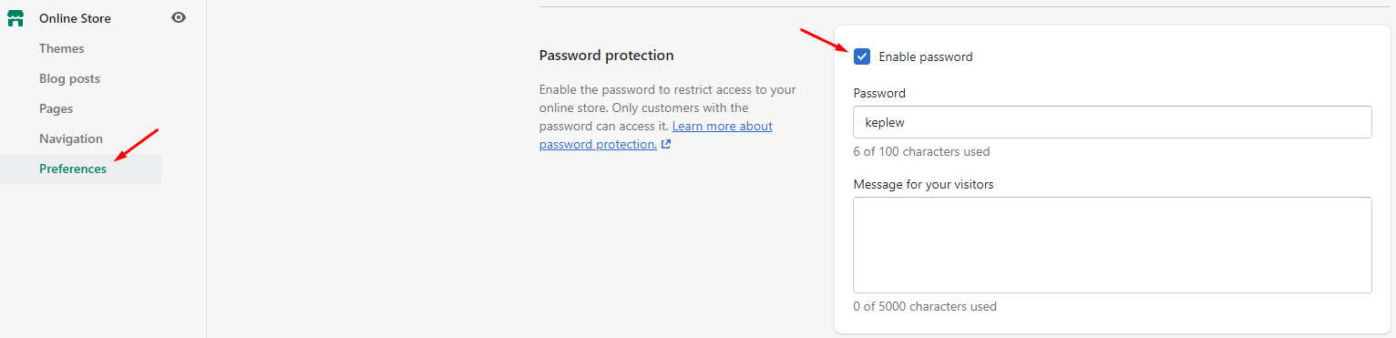
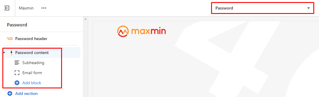
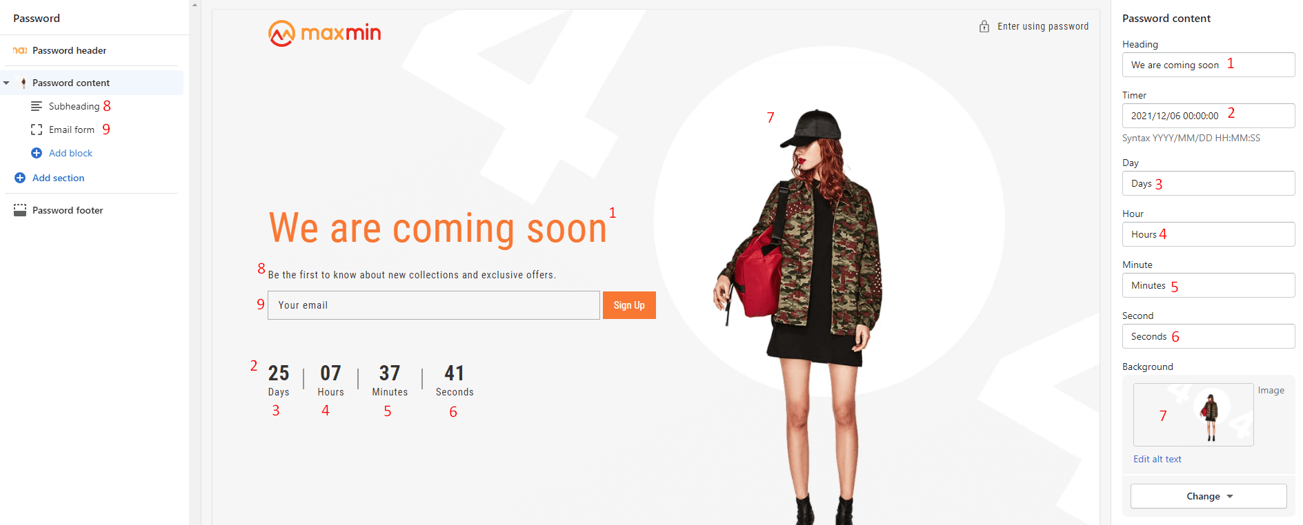
This is the Password page. It will show when your store has Password protection option is enabled.
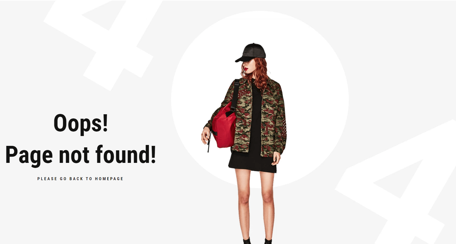
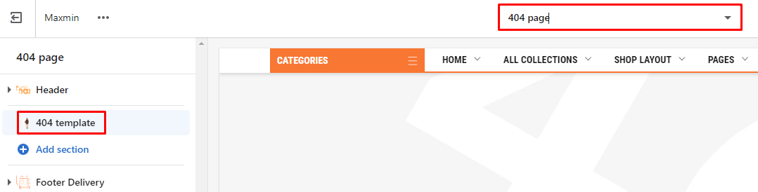
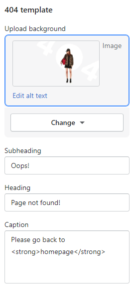
This page will show when you access the wrong link (page not found).
Any text in the theme that can not be found in these above Settings, can be found here.
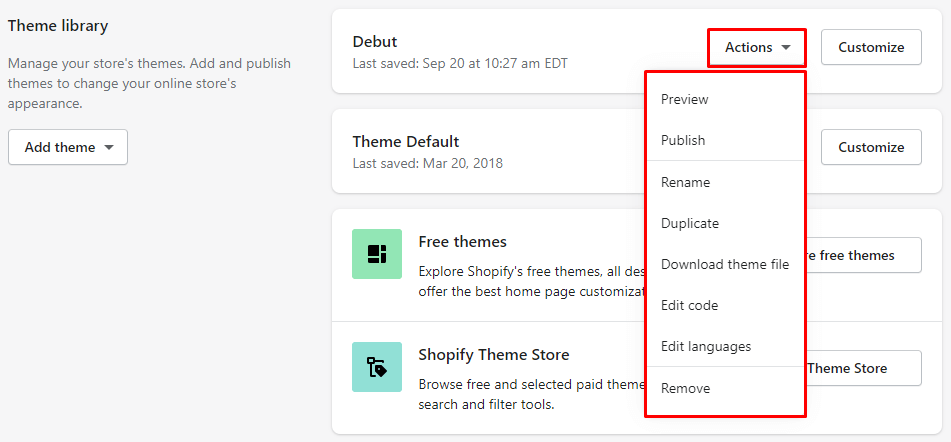
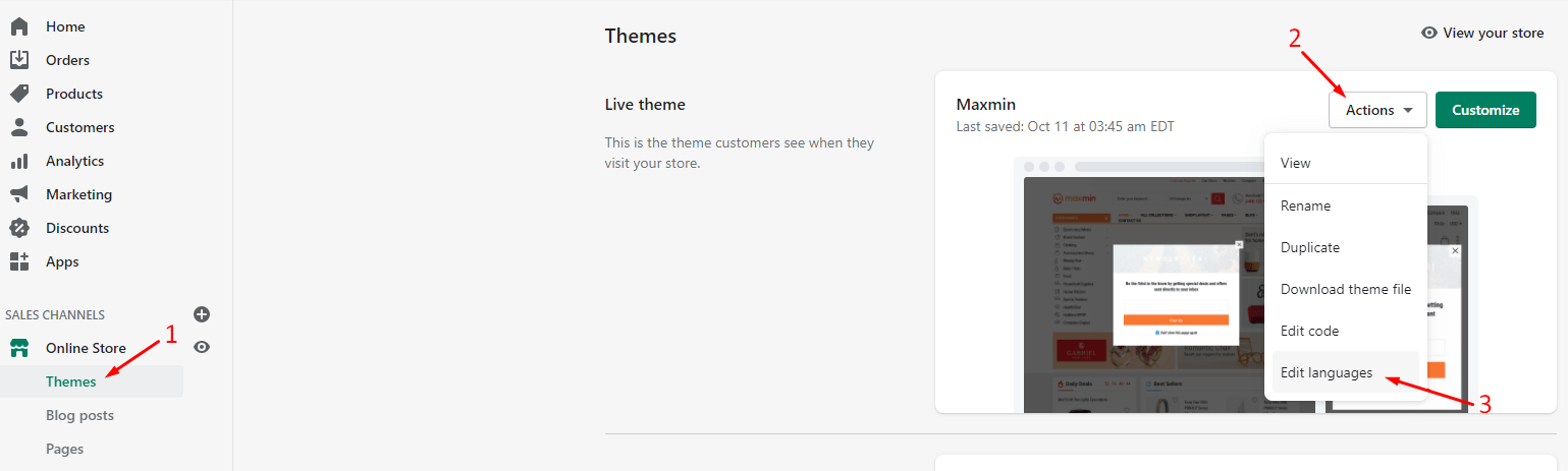
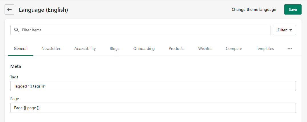
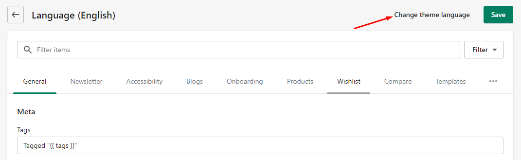
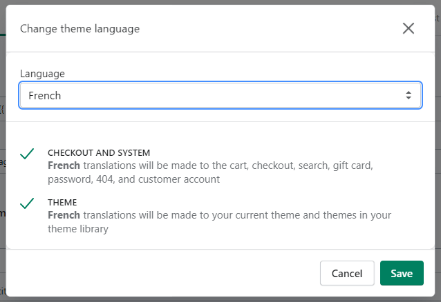
From Your Shopify AdminOnline StoreThemesActionsEdit Language
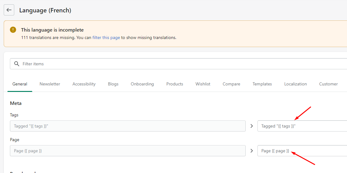
In default Maxmin 5.x.x version only supports English Text. The listing translate Text displayed. Each page will list in a different tab.
You can type the original text (display text) in Search tool
{{..}}Reversion 19
ImprovementOptimate Video element in slideshow
fixedSlider bug in Safari browser.
Reversion 18
ImprovementBug fixes and Improvements
Reversion 17
ImprovementNew Source base on Shopify Online Store 2.0 (Sections Everywhere)
ImprovementSpeed up the site
UpdateAll Menu now support Mega menu
UpdateAjax functions
New6 Collections Layout
New7 Product Types
New7 Product Layout
NewAuto Product variants filter
NewCollection Banners Slider
NewUpsell Products slider
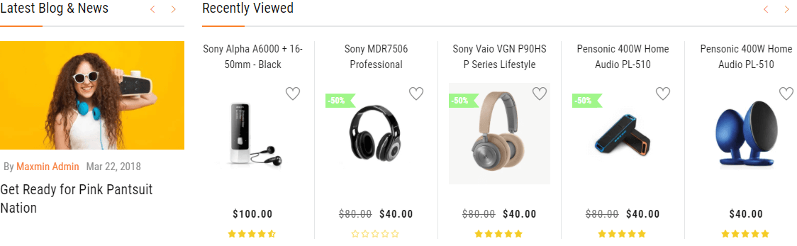
NewRecently viewed products
NewAuto Completed Search
NewSuggestion products
NewTerms & conditions Checkbox
NewGuarantee Safe Checkout listing
NewCookies Bar
NewDynamic Recommendations
Reversion 16
ImprovementSpeed up the site
NewAdded the Buy Now button.
New Added sub collections function.
Reversion 15
ImprovementConvert SCSS to CSS
Reversion 14
ImprovementSpeed up the site
Reversion 13
fixedSearch bar and Mobile bar broken in Mobile
fixedFilter Mobile change method show
Reversion 12
ImprovmentSpeed up the site
Reversion 11
fixedTags Filter in Collection page don't working
Reversion 10
PublishInitial release
If you have any question not included in this help file, please feel free to post it on our Support system https://kalathemes.freshdesk.com/. Thank so much!
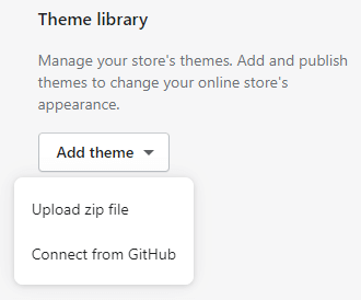
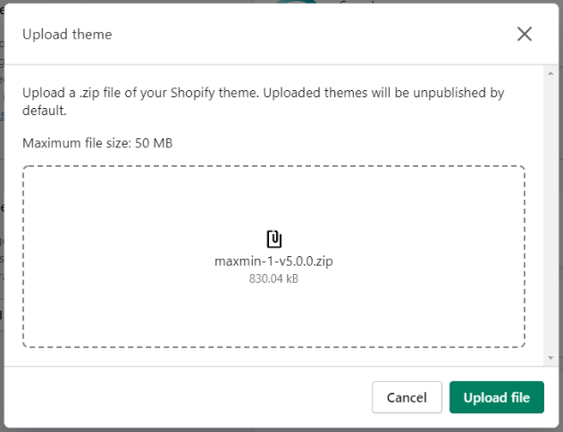
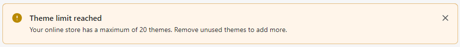
 can not click to upload and install the theme.