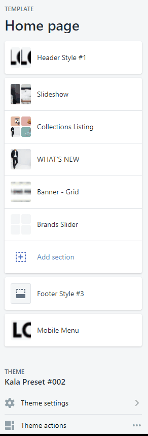
Header/Footer Sections
Header Settings
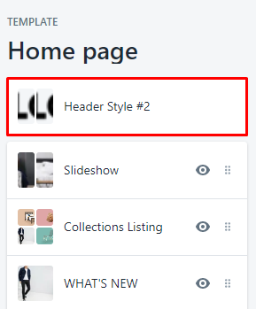
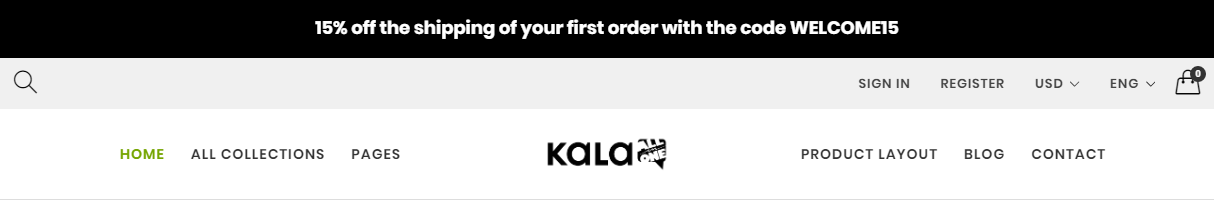
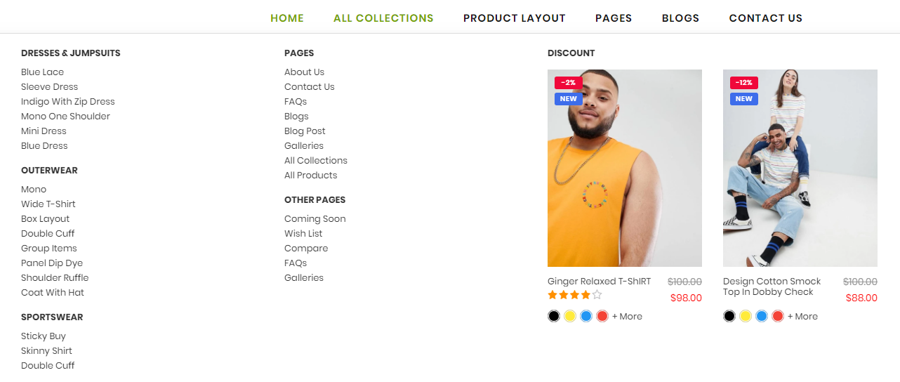
Kala All-in-One included 12 Header layout (Desktop view). First of all, you need select the layout that you want use in the Theme Settings > Header settings
After change new style, need back to Sections tab to get new Header section settings.
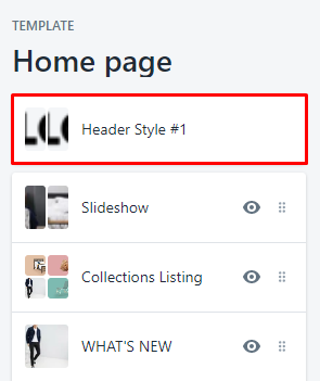
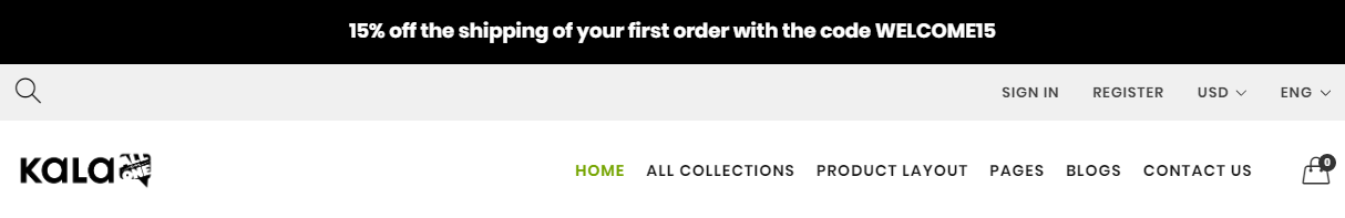
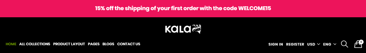
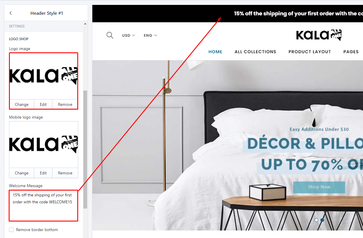
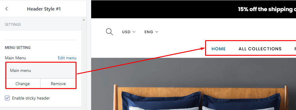
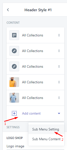
Header Style #1
From Sections listing of Customize (Theme Editor) > select Header Style #1 section
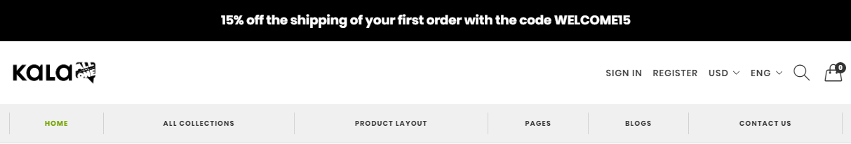
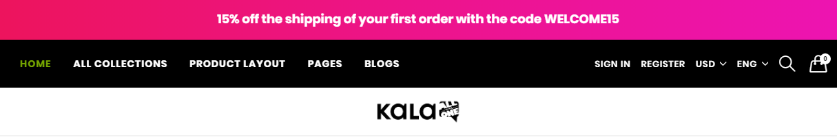
Header Style #2
From Sections listing of Customize (Theme Editor) > select Header Style #2 section

Header Style #3
From Sections listing of Customize (Theme Editor) > select Header Style #3 section
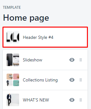
Header Style #4
From Sections listing of Customize (Theme Editor) > select Header Style #4 section
Header Style #5
From Sections listing of Customize (Theme Editor) > select Header Style #5 section

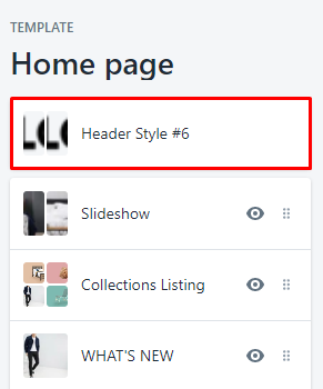
Header Style #6
From Sections listing of Customize (Theme Editor) > select Header Style #6 section
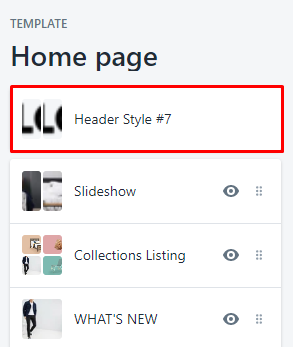
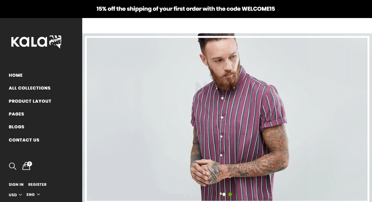
Header Style #7
From Sections listing of Customize (Theme Editor) > select Header Style #7 section
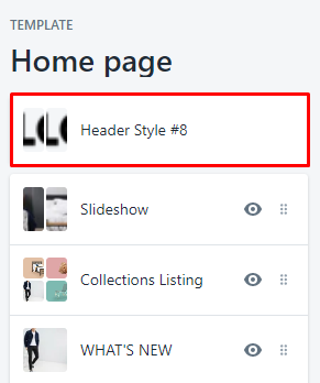
Header Style #8
From Sections listing of Customize (Theme Editor) > select Header Style #8 section
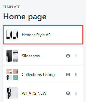
Header Style #9

From Sections listing of Customize (Theme Editor) > select Header Style #9 section
Header Style #10

From Sections listing of Customize (Theme Editor) > select Header Style #10 section
Header Style #11

From Sections listing of Customize (Theme Editor) > select Header Style #11 section
Header Style #12

From Sections listing of Customize (Theme Editor) > select Header Style #12 section
Header layout only different the layout. The options are the same. Below explain options of Header layout.
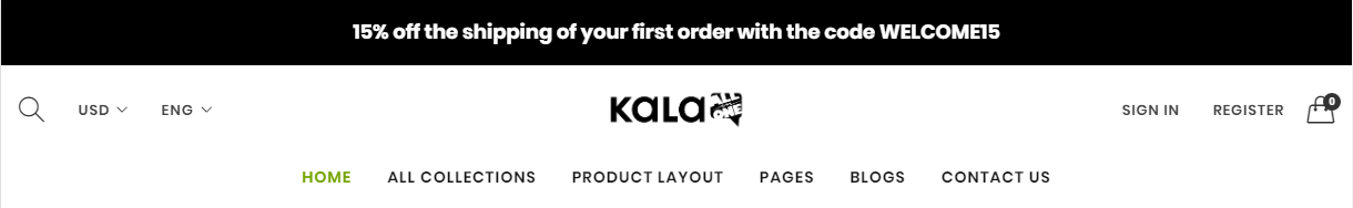
Logo and Welcome bar
Menu Setting
Dropdown menu
Please follow the guide at here
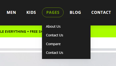
Mega menu
Mega menu function only work on Desktop view.
You can added unlimited Mega menu with multi-columns from 1 to 6 columns.
Each Mega Menu have column types:
-
Navigation (Link list) with 1 or more Links
-
Product
-
Article
-
Custom block (HTML content)
-
Image
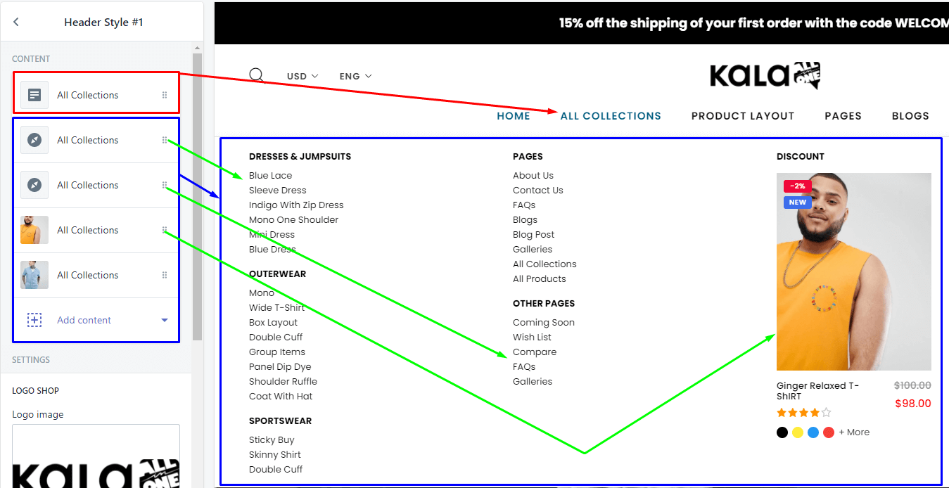
To setup Mega Menu, you need go to Header Style # section, at the Content area:
- Step 1: click to
 and select
 Sub Menu Setting
The Important is Target field and Number of column field. You must input the menu name that existed in the Main menu into it.
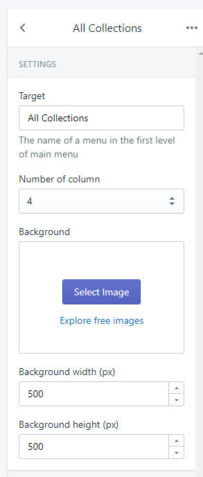
Example: Your currently Main menu is: HOME, All Collections, WOMEN, MEN, BABY & KIDS, SHOP, PAGES, BLOG . And want setup menu All Collections is Mega menu. You need input the text All Collections into the Target field
Then select the column(s) that you want show in Mega menu conent. Select in Number of column selectbox.
You also can config the Background of Mega menu.
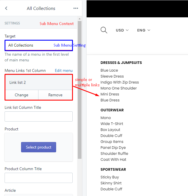
- Step 2: click to and select
Sub Menu Content
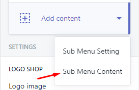
The Important is Target field. You must input the menu name that input in Step 1. Continue example is All Collections text
Then you can config these options: Navigation link, Product, Article, Custom block and image.
Example create the All Collections menu have Mega menu with 3 columns and content is Navigation multi links (multiple rows) and image.
Explain for Sub Menu Content
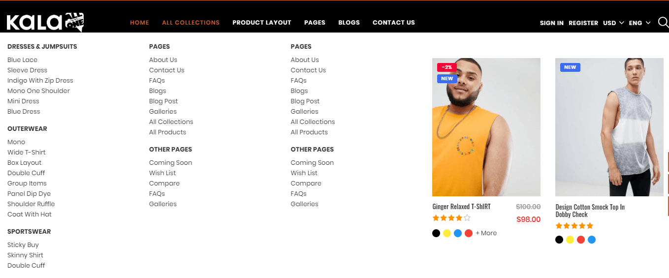
Result of example:
Do the same way for other menu want become Mega menu.
Troubleshooting
Login/Register or User icon Link don't appear
Your Shop setting currently is disabled Customer account.
From your Shopify admin, go to Settings > Checkout > Customer accounts and select option to enable Customer account such as Accounts are optional or Accounts are required
How to setup Currency
Please follow the guide at here
How to setup Navigation (Menu)
Please follow the guide at here
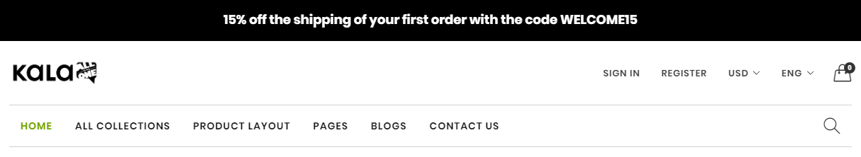
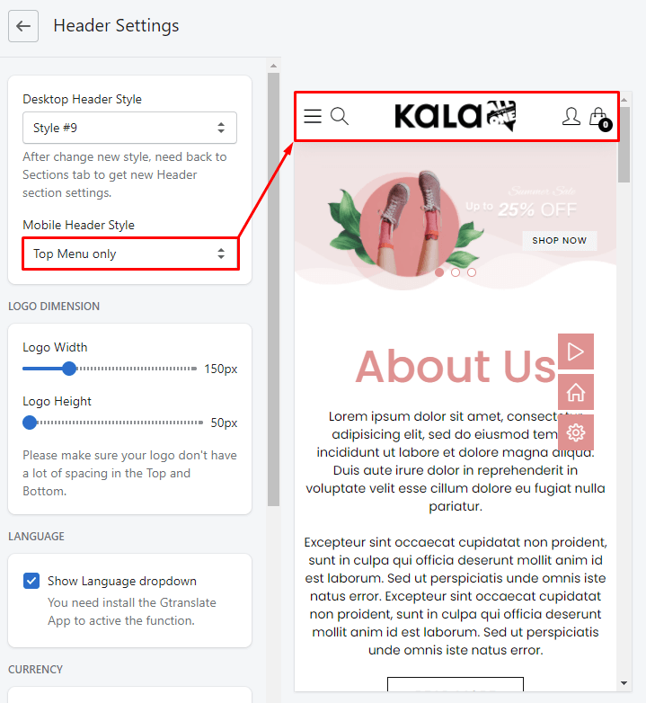
Mobile Menu
From update version v6.1.38 Mobile menu will include 2 Mobile Menu options. You can select one at Theme Settings > Header Settings > Mobile Header Style > select Top and Bottom Menu or Top Menu only.
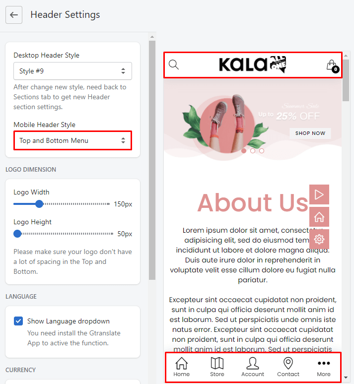
To Control the settings for Mobile Menu, back to Sections listing of Customize (Theme Editor) > select Mobile Menu section
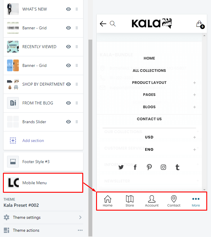
You will see options to control the Mobile Menu at bottom of the screen
-
Mobile Logo
-
Collections Link (Store icon)
-
Menu Links (... More icon)
-
Contact Information (Email, Telephone)
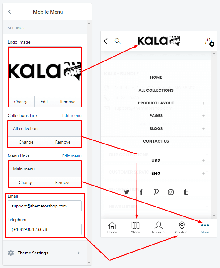
If you want change the icons or text or working method, please submit new conversation.
Footer Settings
Kala All-in-One included 4 Footer layout (Desktop view). First of all, you need select the layout that you want use in the Theme settings > Footer settings
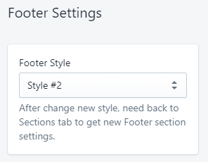
After change new style, need back to Sections tab to get new Footer section settings.
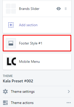
Footer Style #1
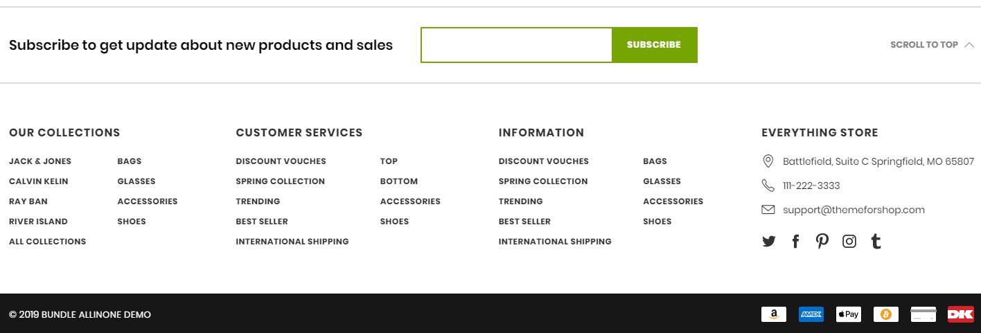
From Sections listing of Customize (Theme Editor) > select Footer Style #1 section
-
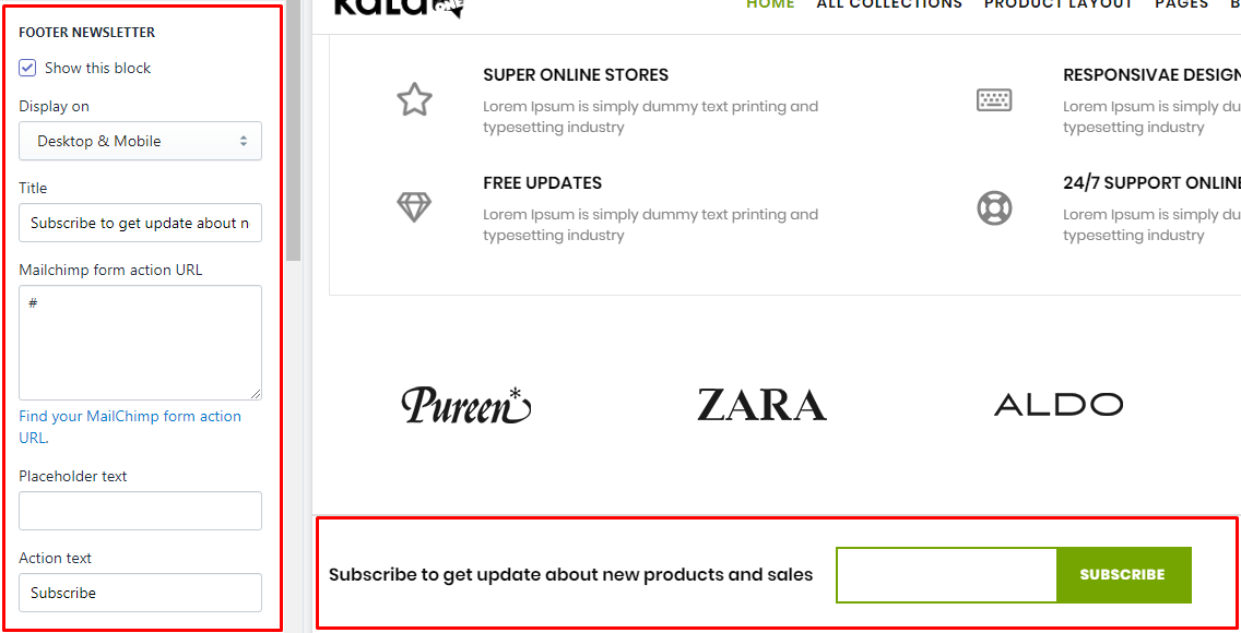
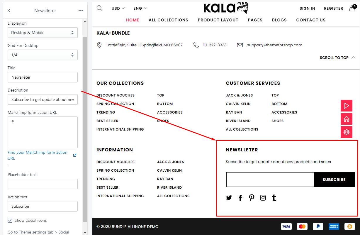
Footer Newsletter: These fields for this block content: Display on, Grid For Desktop (Mobile will show full width), Title (Heading), Mailchimp form action URL ( how to get it here), Placeholder text and Submit button text (Action text).
-
Footer Main Content: Add content with type is "Link List" or "About".
-
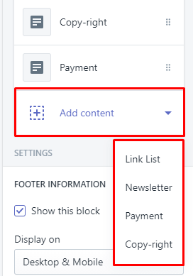
Footer Bottom: Add content with type is "Copy-right" or "Payment".
To add element for Footer Main Content and Footer Bottom you need click to the existed content or click to Add content button and select element type.
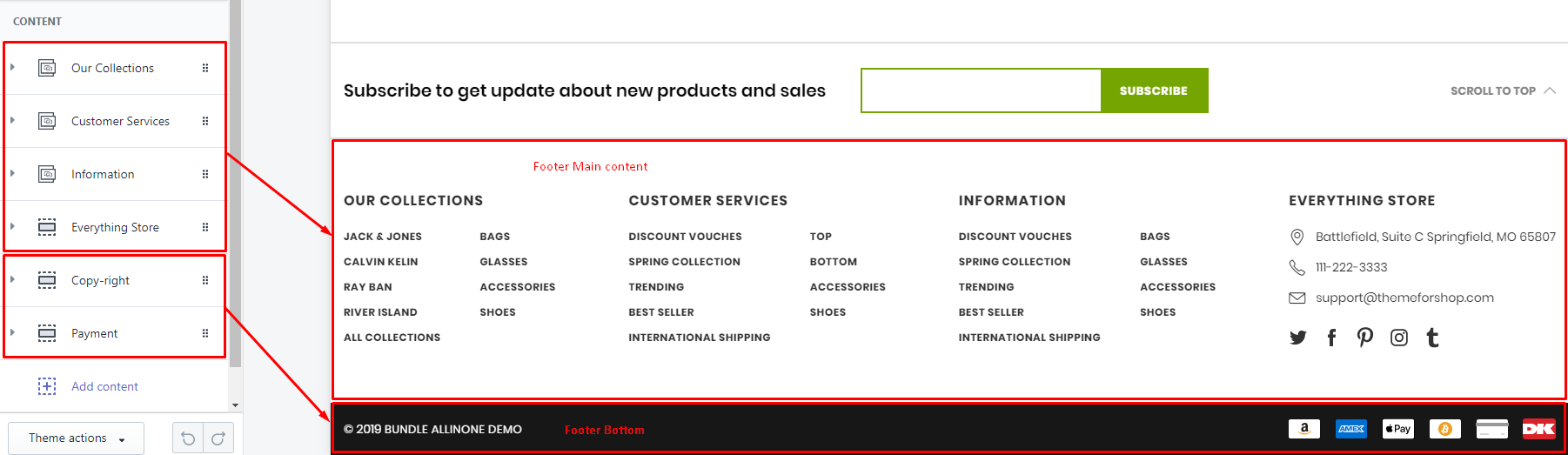
existed content
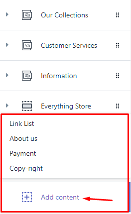
add new content
Below guide for these elements for Footer #1
1. Footer Newsletter
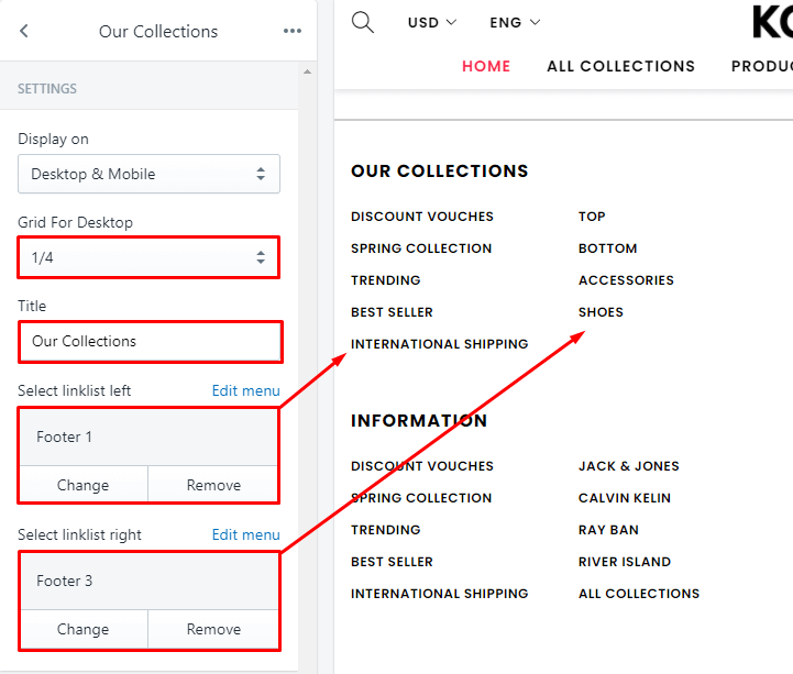
2. "Link list" element for `Main Content`
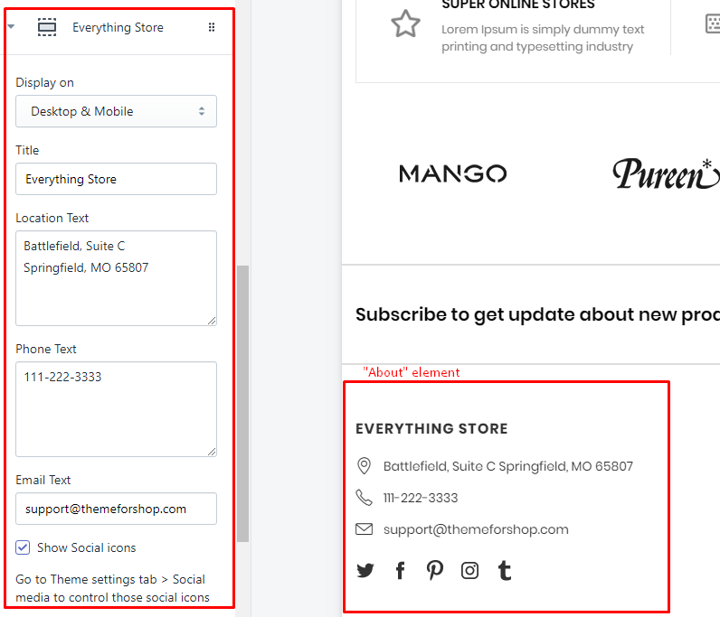
3. "About" element for `Main Content`
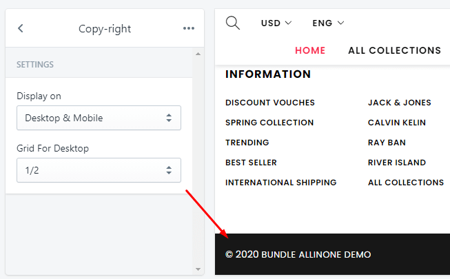
4. "Copy-right" element for `Bottom`
5. "Payment" element for `Bottom`
There are 2 method to show Payment: by default logo and custom logo.
-
Shopify Default Payment Logo: you need input the name of payment method that you want show. Example, want show
visalogo, you need inputvisainto thePayment to showfield. -
Custom Payment logo: only need upload your custom logo for Payments. Recommend size for payment logo is 38x24.
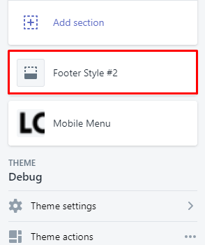
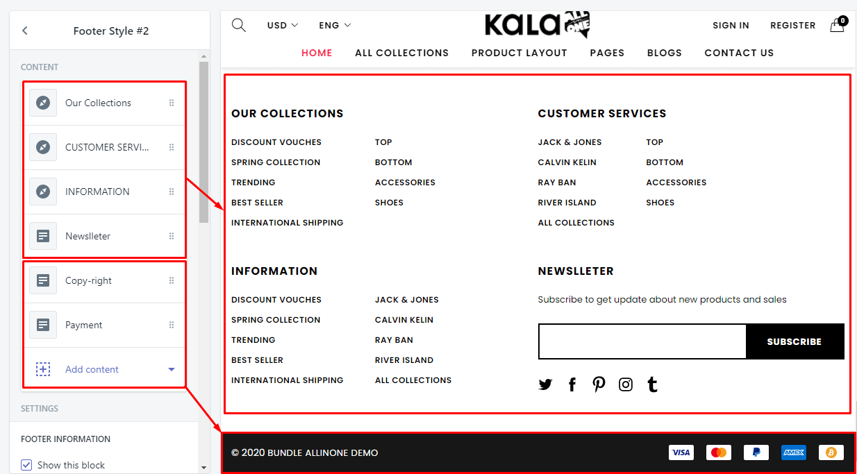
Footer Style #2
From Sections listing of Customize (Theme Editor) > select Footer Style #2 section
-
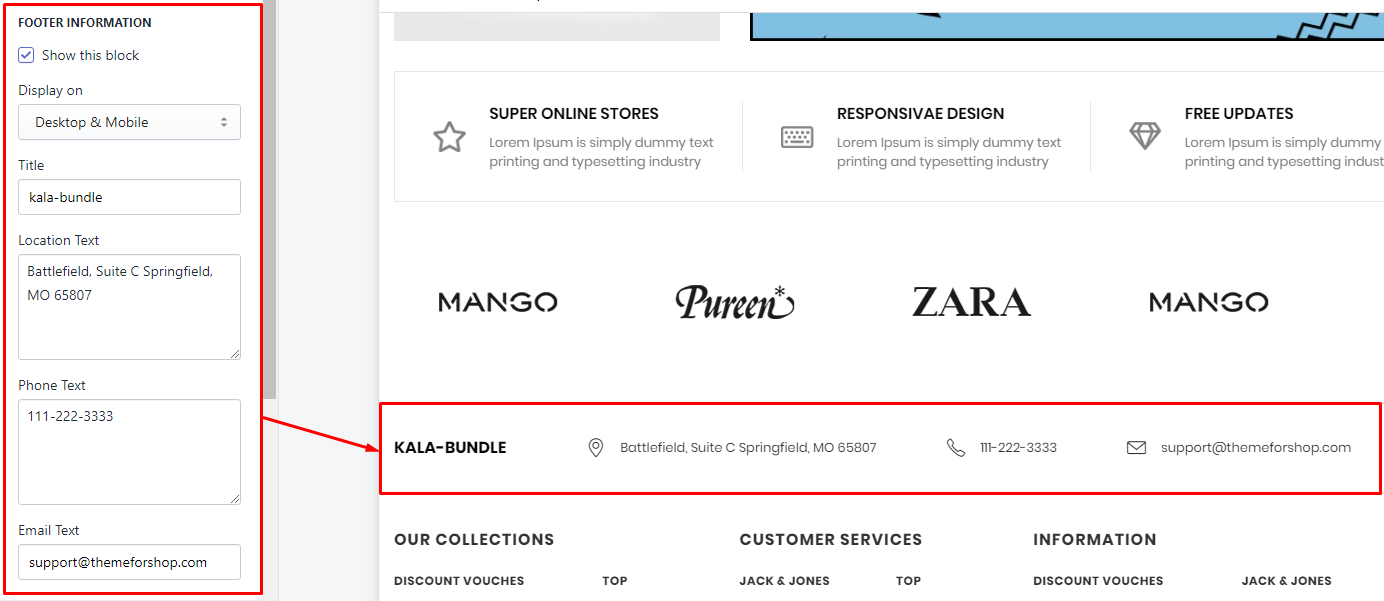
Footer Information: show the block information of your store.
-
Footer Main Content: Add content with type is "Link List" or "Newsletter".
-
Footer Bottom: Add content with type is "Copy-right" or "Payment".
To add element for Footer Main Content and Footer Bottom you need click to the existed content or click to Add content button and select element type.
existed content
add new content
Below guide for these elements for Footer #2
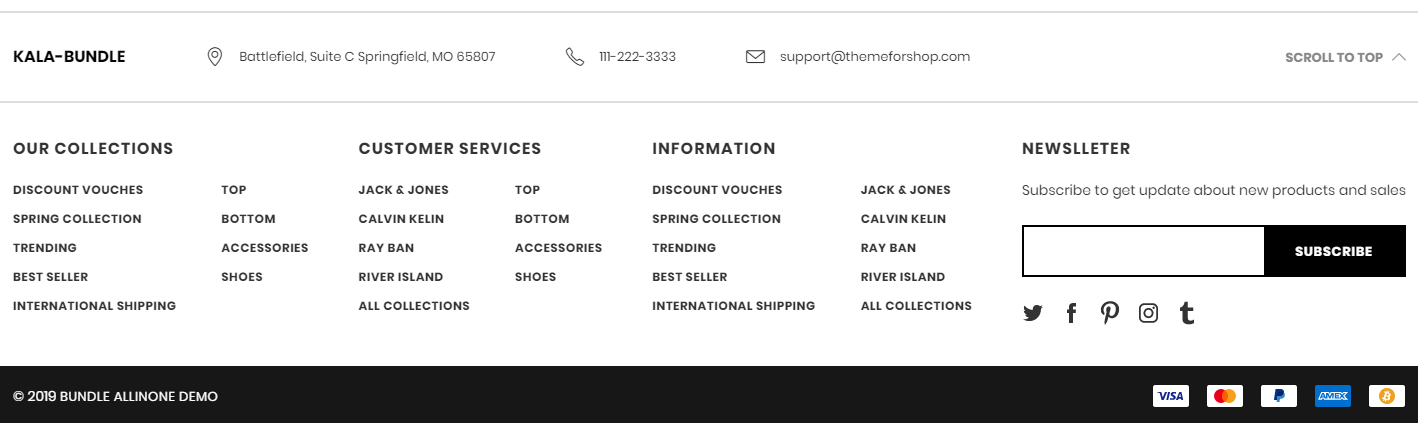
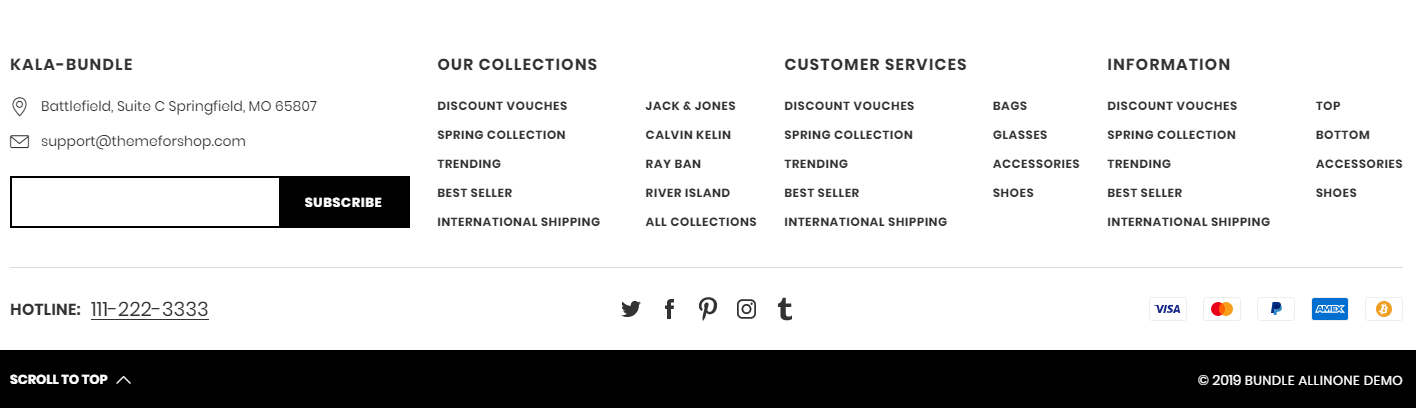
1. Footer Information
2. "Link list" element for `Main Content`
3. "Newsletter" element for `Main Content`
4. "Copy-right" element for `Bottom`
5. "Payment" element for `Bottom`
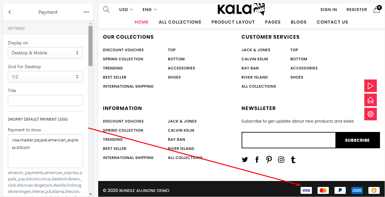
There are 2 method to show Payment: by default logo and custom logo.
-
Shopify Default Payment Logo: you need input the name of payment method that you want show. Example, want show
visalogo, you need inputvisainto thePayment to showfield. -
Custom Payment logo: only need upload your custom logo for Payments. Recommend size for payment logo is 38x24.
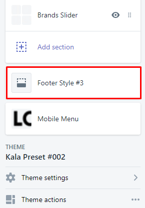
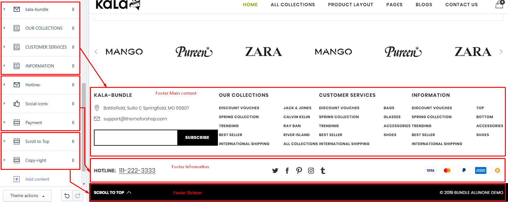
Footer Style #3
Note: from the Theme version 6.1.16 the old Footer 3 - Dark mode have been removed and replaced by Footer 4 of Theme version 6.1.15 or lower.
From Sections tab of Customize (Theme Editor) > select Footer Style #4 section
-
Footer Main Content: Add content with type is "Link List" or "About".
-
Footer Information: Add content with type is "Phone Contact" or "Social icons" or "Payment"
-
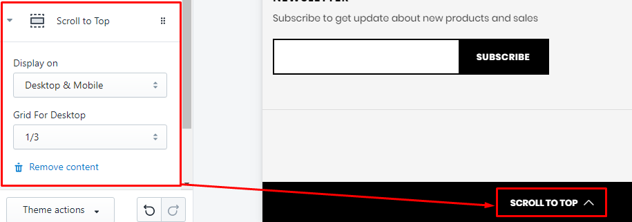
Footer Bottom: Add content with type is "Copy-right" or "Scroll to Top".
To add element, you need click to the existed content or click to Add content button and select element type.
existed content
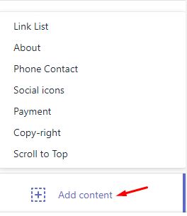
add new content
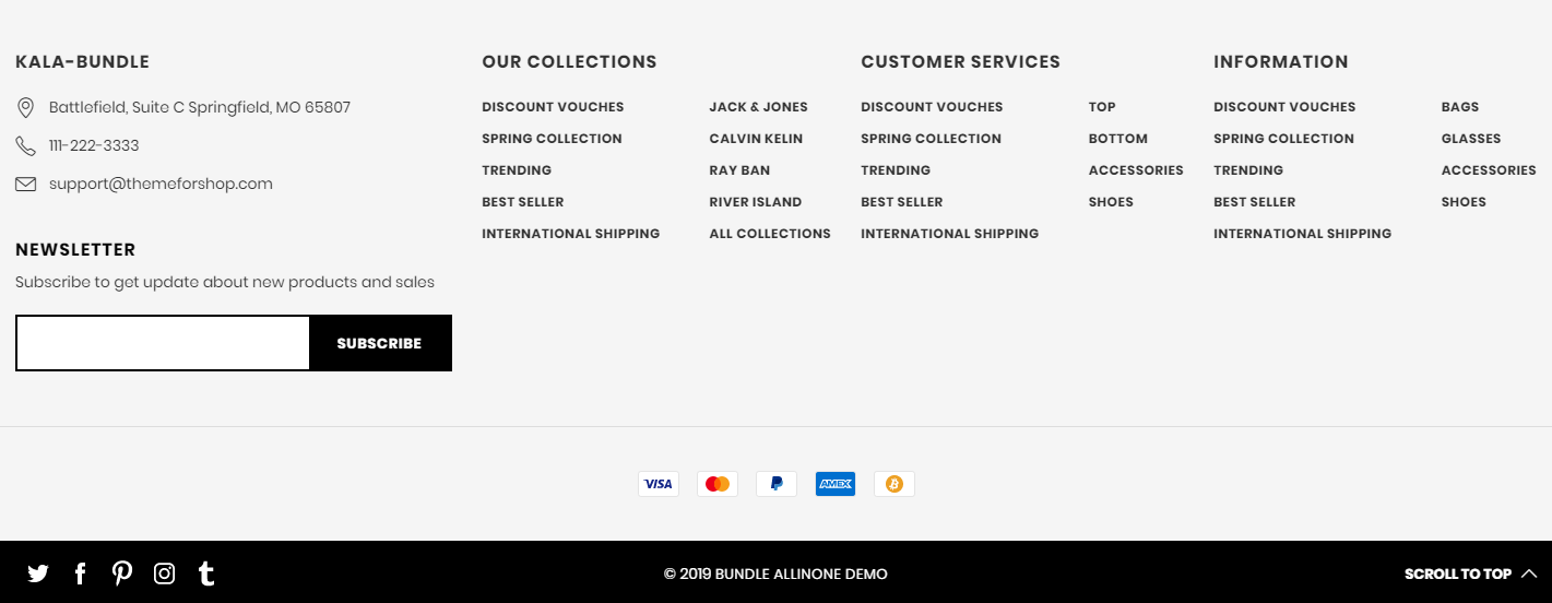
Below guide for these elements for Footer #4
1. "Link list" element for `Main Content`
2. "About" element for `Main Content`
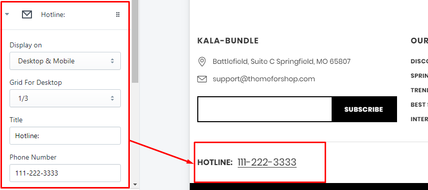
3. "Phone Contact" element for `Information`
4. "Social icons" element for `Information`
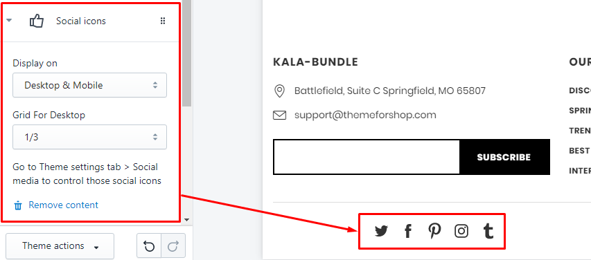
To control these Social icons, you need back to Theme settings tab, follow guide
5. "Payment" element for `Information`
There are 2 method to show Payment: by default logo and custom logo.
-
Shopify Default Payment Logo: you need input the name of payment method that you want show. Example, want show
visalogo, you need inputvisainto thePayment to showfield. -
Custom Payment logo: only need upload your custom logo for Payments. Recommend size for payment logo is 38x24.
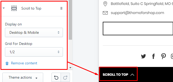
6. "Scroll to Top" element for `Bottom`
7. "Copy-right" element for `Bottom`
"Copy-right" element for Bottom
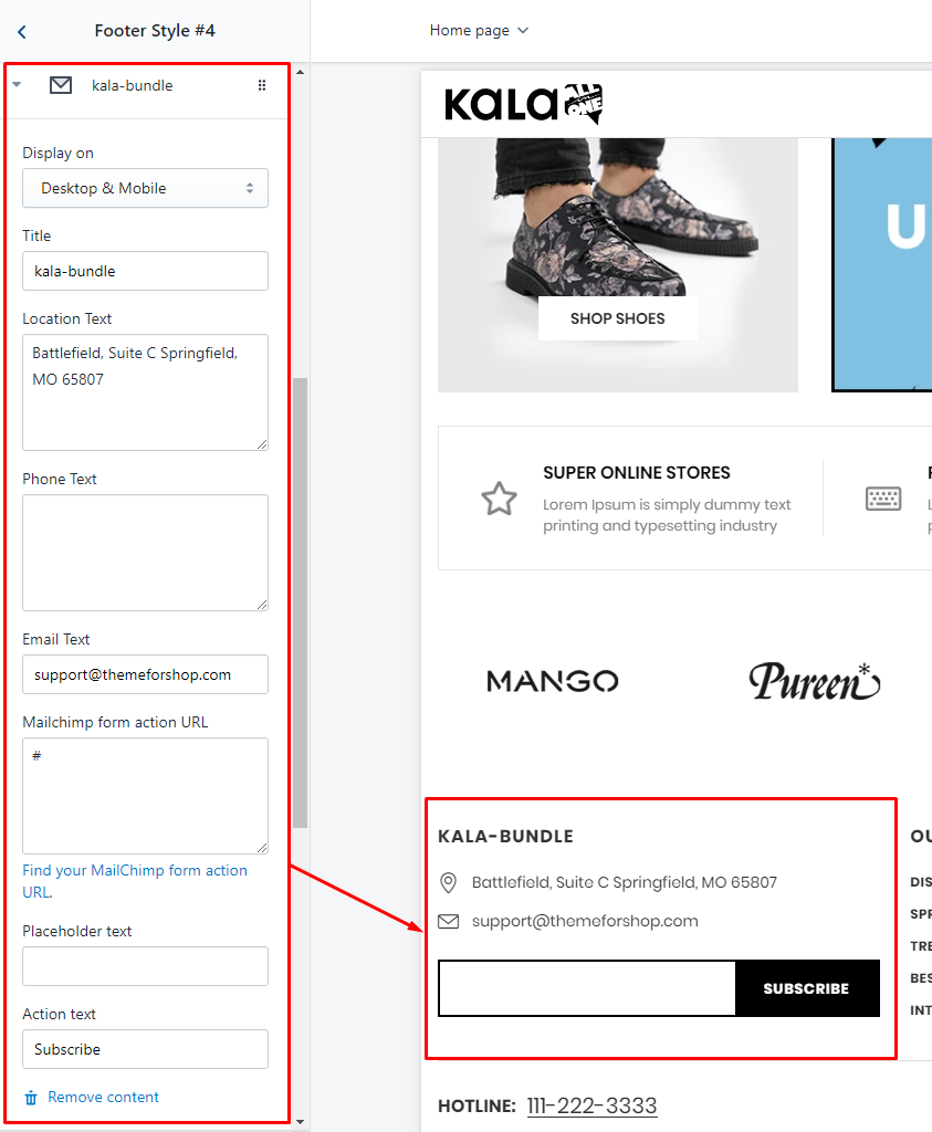
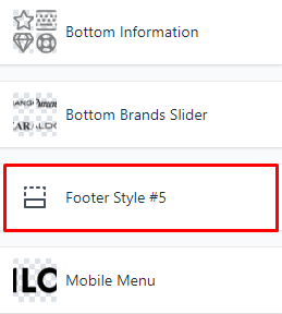
Footer Style #4
Note: from the Theme version 6.1.16 the Footer 4 is the Footer 5 of Theme version 6.1.15 or lower.
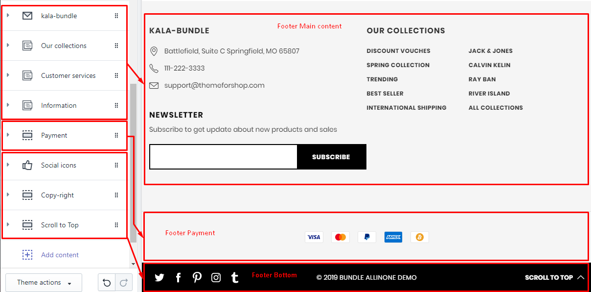
From Sections tab of Customize (Theme Editor) > select Footer Style #5 section
-
Footer Main Content: Add content with type is "Link List" or "About".
-
Footer Payment: Add content with type is "Payment"
-
Footer Bottom: Add content with type is "Social icons" or "Copy-right" or "Scroll to Top"
To add element, you need click to the existed content or click to Add content button and select element type.
existed content
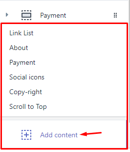
add new content
Below guide for these elements for Footer #4
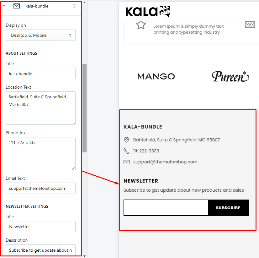
1. "About" element for `Main Content`
2. "Link list" element for `Main Content`
3. "Payment" element for `Payment`
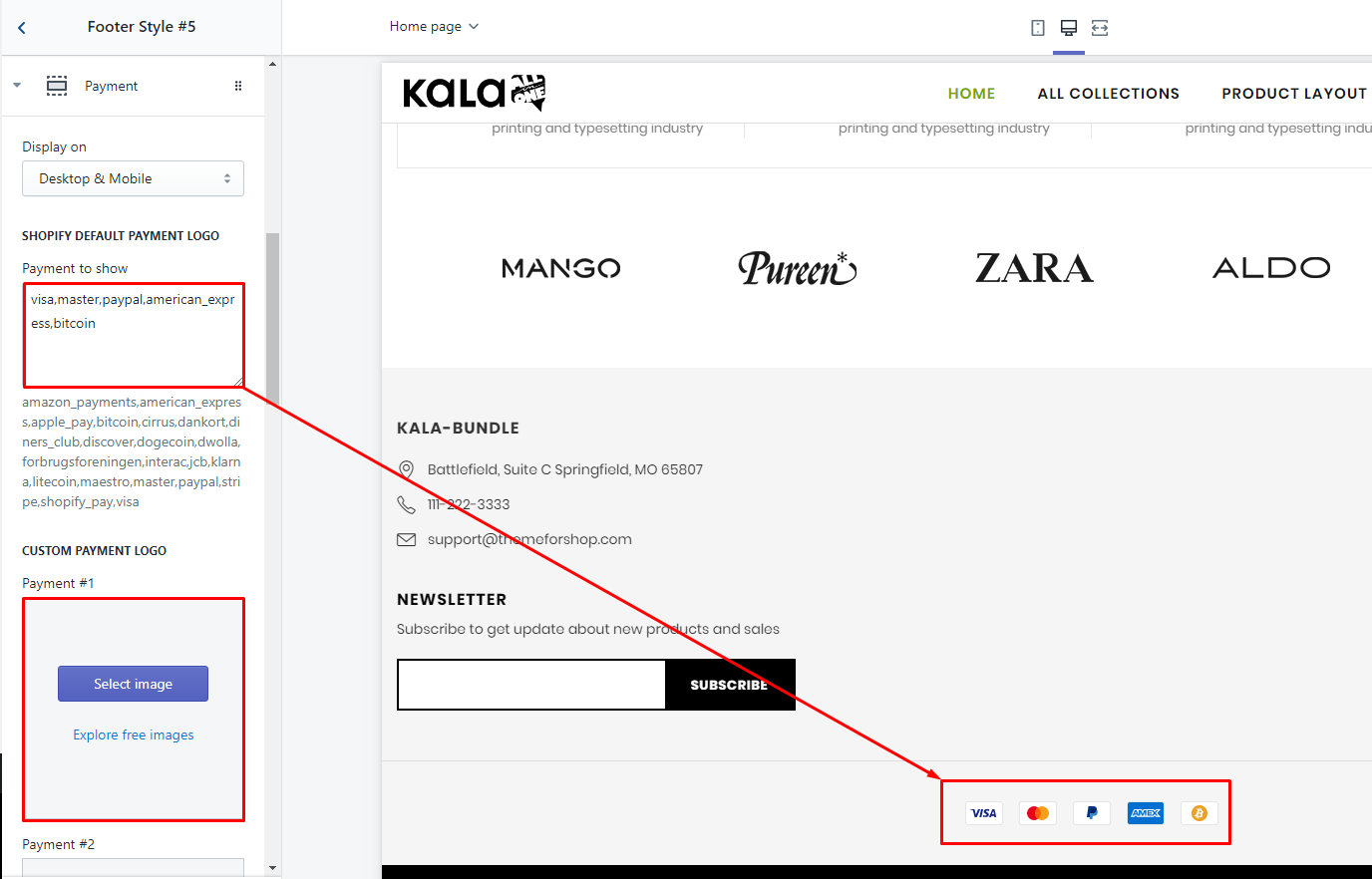
There are 2 method to show Payment: by default logo and custom logo.
-
Shopify Default Payment Logo: you need input the name of payment method that you want show. Example, want show
visalogo, you need inputvisainto thePayment to showfield. -
Custom Payment logo: only need upload your custom logo for Payments. Recommend size for payment logo is 38x24.
4. "Social icons" element for `Information`
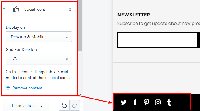
To control these Social icons, you need back to Theme settings tab, follow guide
5. "Copy-right" element for `Bottom`
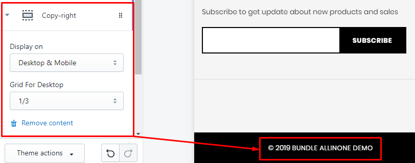
"Copy-right" element for Bottom
6. "Scroll to Top" element for `Bottom`